
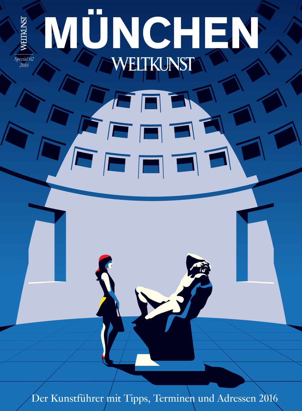
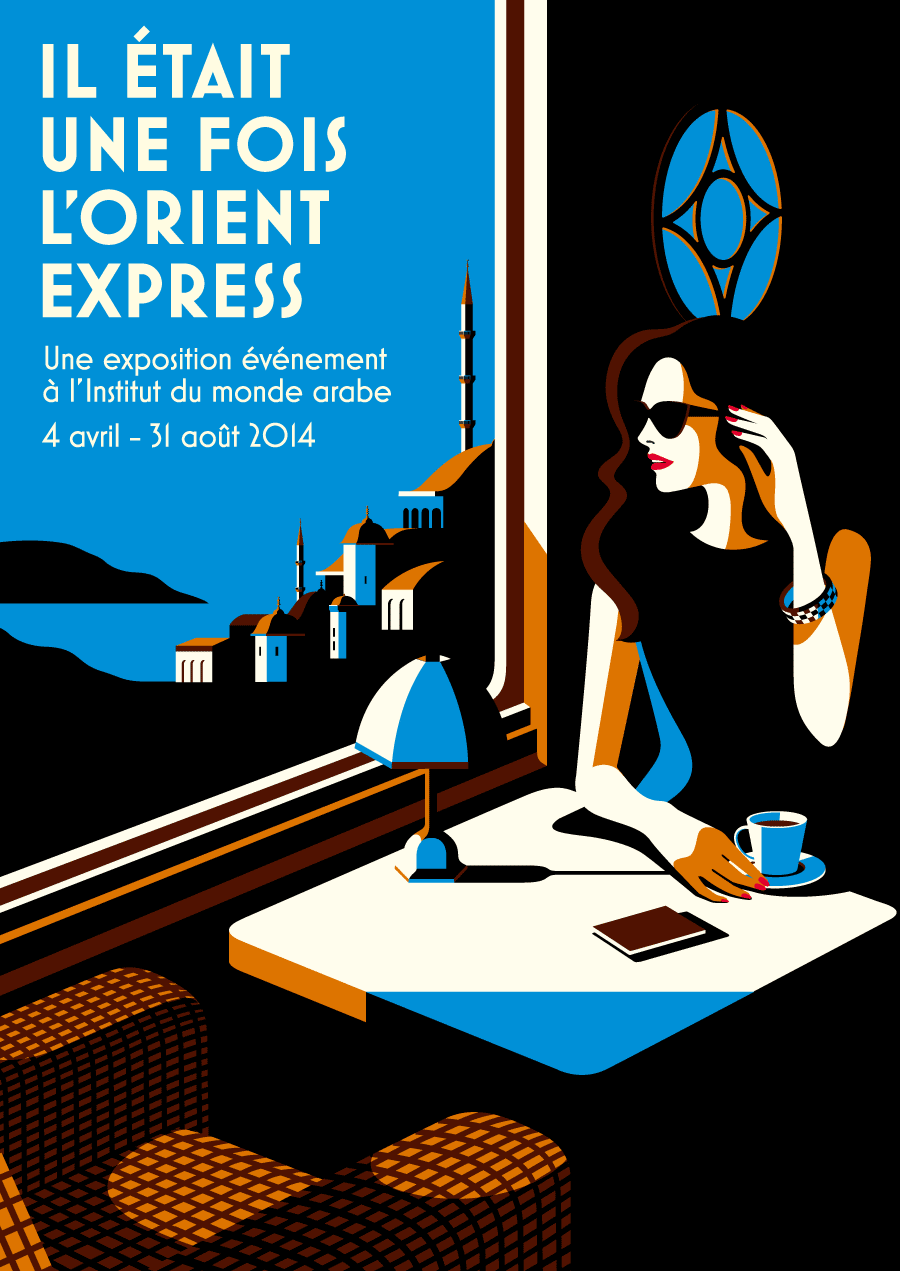
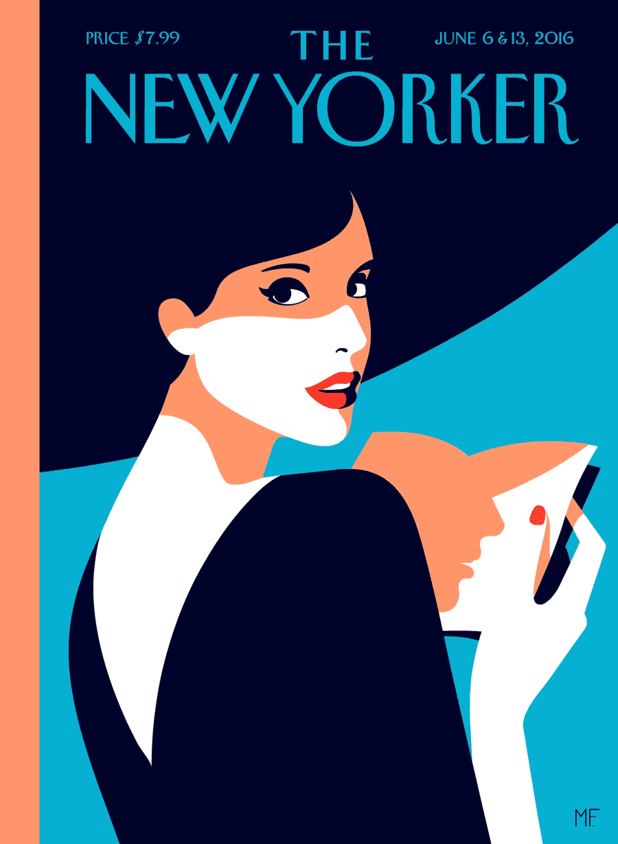
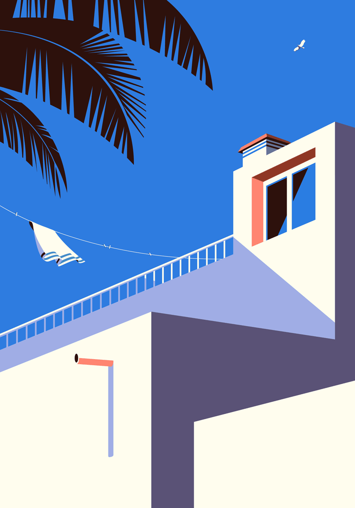
Malika Favre is a London-based designer and illustrator, raised in Paris, France. In her digital art, she characterizes her bold, yet simple style with her use of positive/negative space and color. She has derived her inspiration from beauty, whether it be inspired by the female body, travel, or fashion. Malika’s clients include The New Yorker, Vogue, Sephora, and Penguin Books, amongst many others.
“I seek to reduce the lines and colours in my work as far as possible. I’m fascinated by simplicity, the plays on form and counterform.” – Malika Favre, 2018


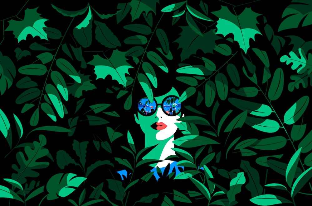

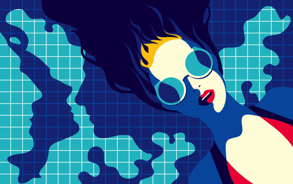
When browsing her artwork, some of the main characteristics I noticed about her art style were:
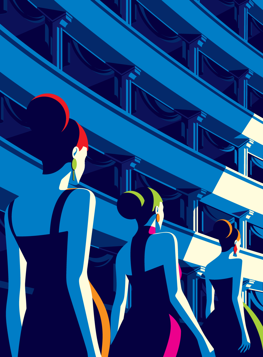
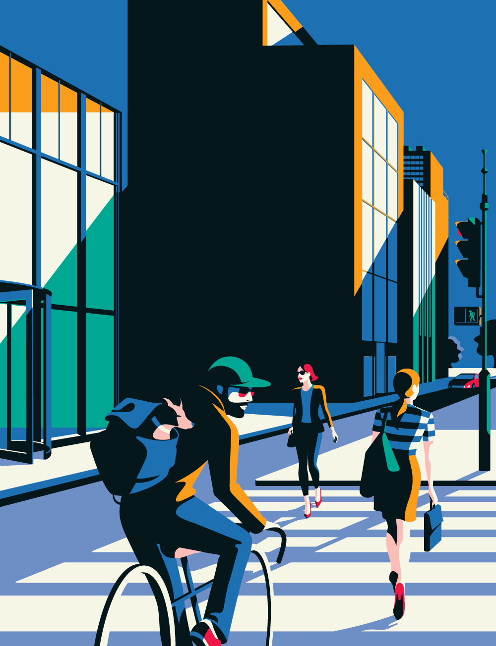
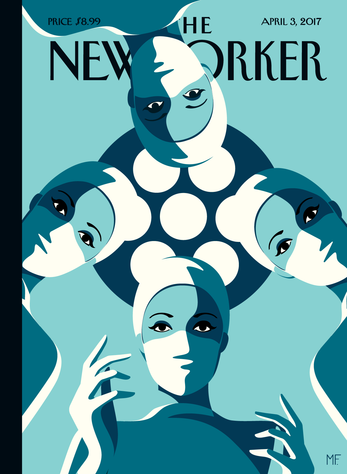
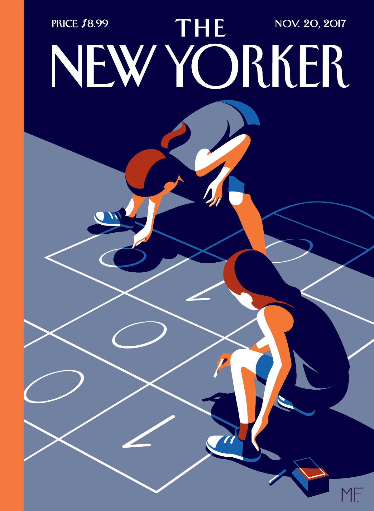
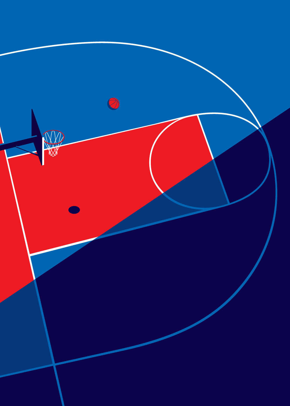
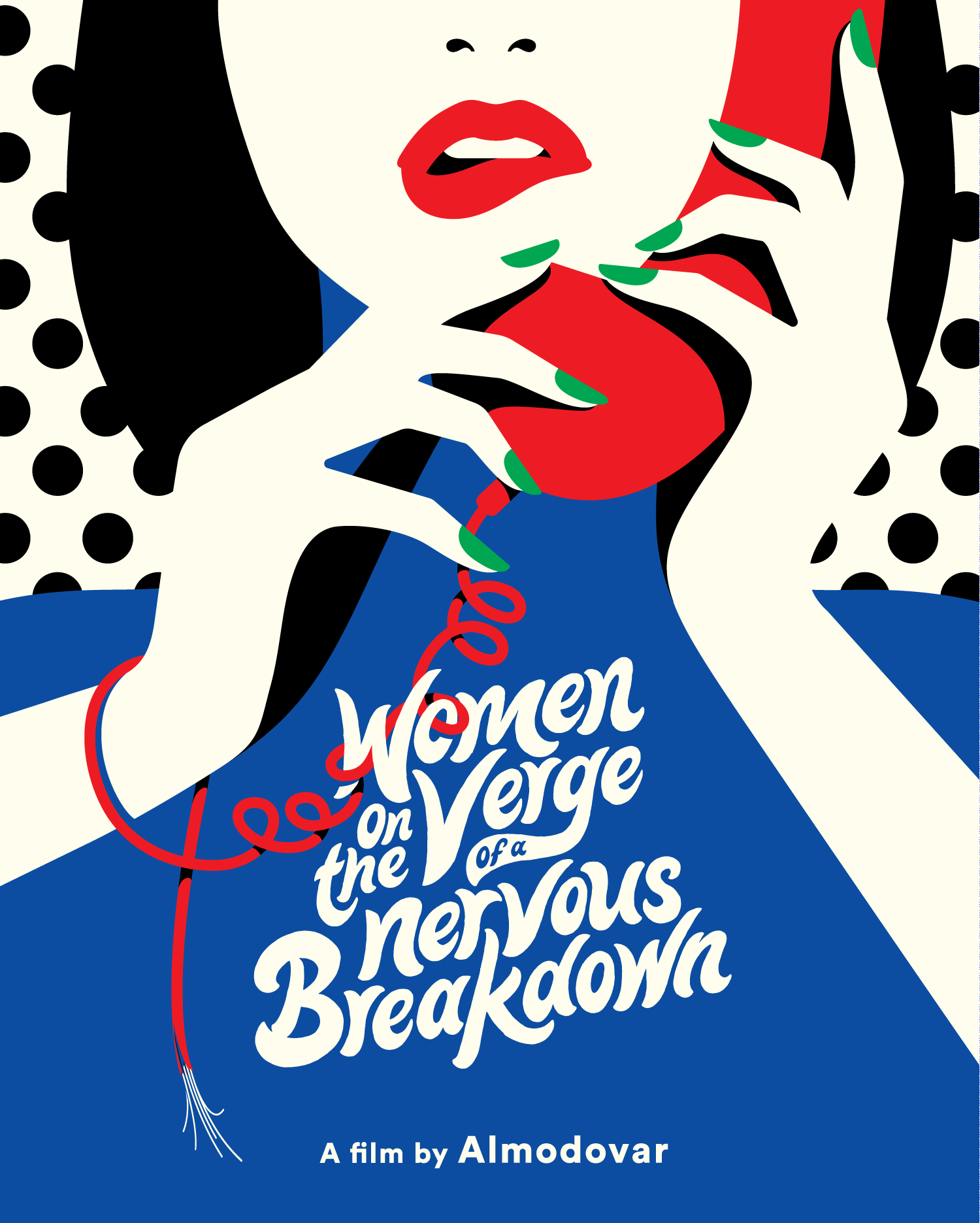
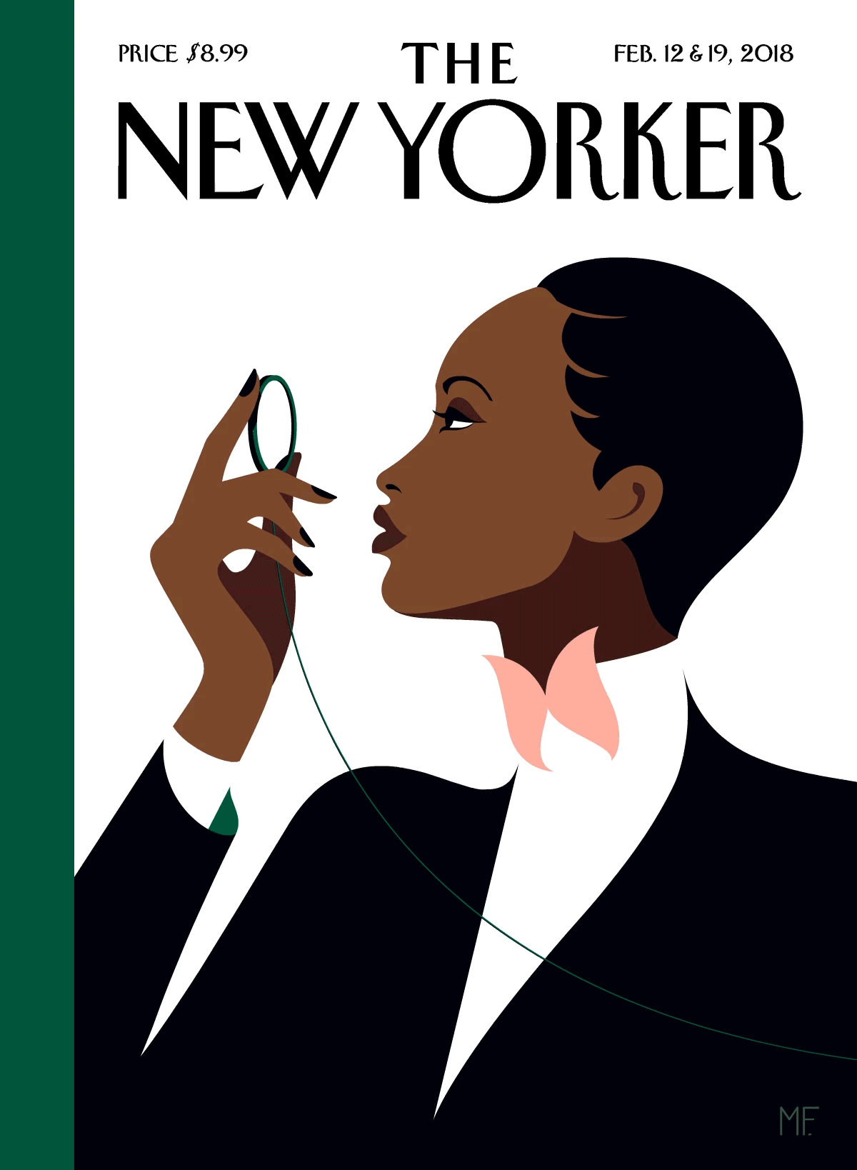
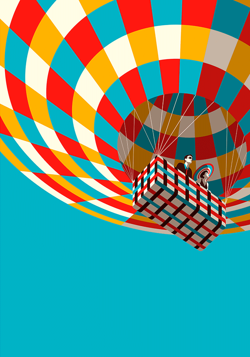
- She doesn’t outline her objects, and therefore her pictures look like they are comprised of shapes, rather than lines. She uses simple geometric shapes, as well as an abundance of curves and patterns.
- I admire how she normally only uses about four or five colors. The colors tend to follow a harmonic color scheme, following themes such as complementary, split complementary, monochromatic, analogous, triadic, and tetradic. The colors make distinct shadows and highlights in her work.
- Most of her artwork includes women, and usually emphasizes their lips and eyes. Also, she focuses on scenery, including bodies of water, foliage, and architecture.
- I think she uses interesting angles and framing to accentuate edges, curves, and shadows.
And finally, to unveil my attempt at mimicking her art style, with the curtains pulling back and fanfare playing in the distance, ta da!
Explore more of Malika Favre’s work here.