Ah, the day of reckoning has come! Thank god I’ve been stocking up on beans and shotgun shells! But of course, we all know what our new currency will be: hand sanitizer. But after looking at my closet filled with gallons of Purell, I realized that their logo is… fine. It’s not the best, but it serves its purpose. So, why did I choose to redesign this brand? Well, they have truckloads of money coming in, and what else was I going to do during quarantine?
The History
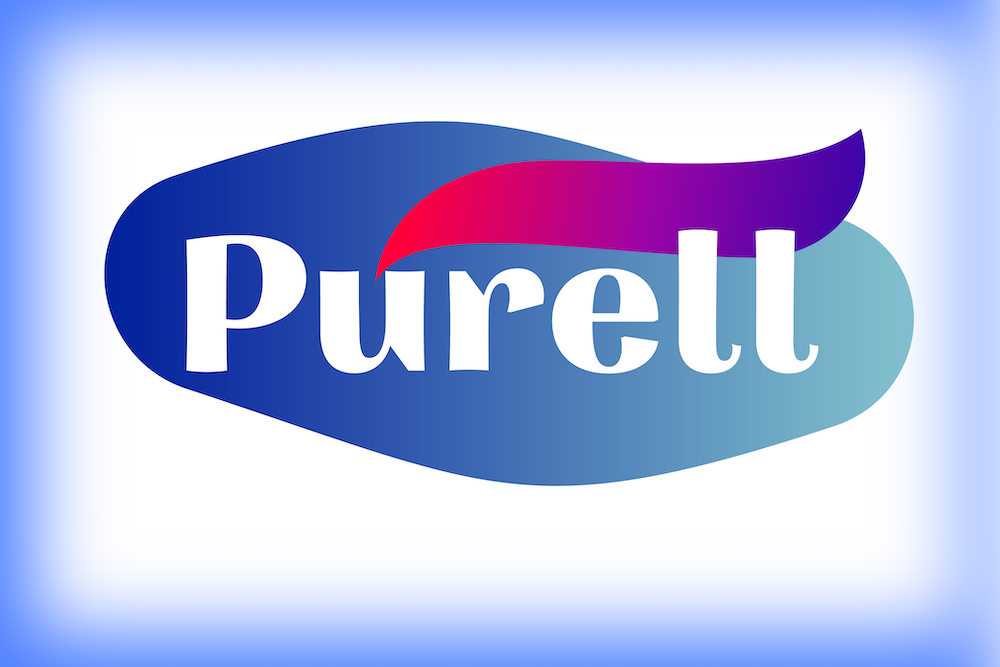
![]()
Um… well, there wasn’t really any history that I, a certified idiot, could find. But the one and only logo has some nice touches. The colors are iconic and simple, and use the tried and true clean cool base color with a flash of warm! I also like the gradient on the flare, as I’m a huge fan of a gradient. It always adds some details, as well as texture. But I felt I could add more, so I change it up a bit. Let’s see what I did!
The Change
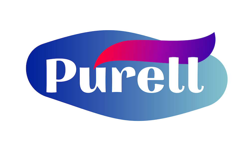
So not a lot of changes, but the ones I did were pretty big. The first change was the shape. My inspiration came from the shape of a germ. Currently, the logo is this stiff swoosh, and I felt that loosening it up would give it some character, as well as make room for the extras that you’ll see later. I also added a gradient, with an opacity fade, which gives it depth and has a cool effect on the bottle. The next change was the swoop. I gave it a size boost and really expanded on the colors of it. I now feel it really becomes the center point. Lastly, I changed the font to something with a little more character. But I felt that this logo wasn’t quite complete yet, so I added some signature branding elements.
The Extras
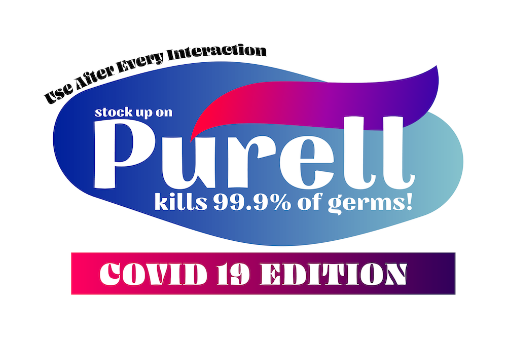
WOW! Talk about extra. I had some fun with this. I mean, this is the perfect time to really target consumers. The extras fill up the space nicely and give it a bit of a cluttered feel, while still being manageable. The COVID 19 edition is just a little marketing ploy to take advantage of the hysteria :).
The Bottle
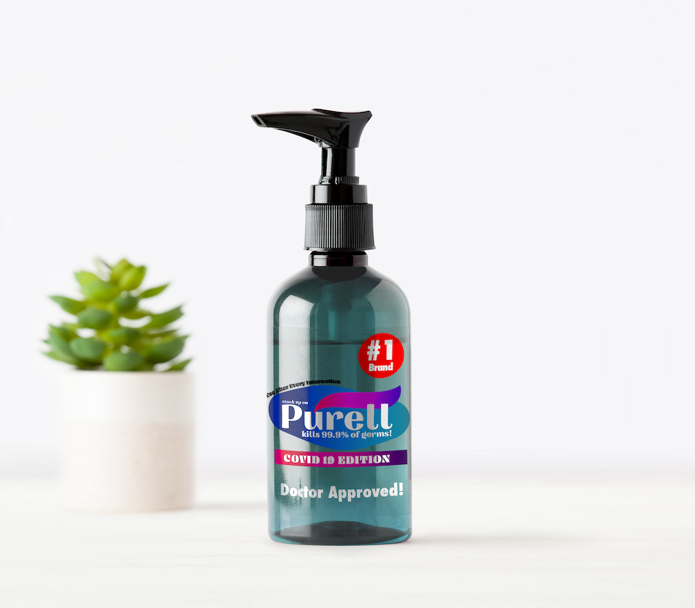
Would you look at that? I would buy at least a carton of that beauty. With the few extra eye-catchers, I really feel like this product turned out nicely!
The Conclusion
Well, that’s it! I know you’re all grabbing for a bit of entertainment right now, so may I recommend to take a look at some of my other fine posts? Well, this has been a crazy time with no signs of stopping, but at least we can all quarantine with Animal Crossing, right? Right. So I’m gonna go cry. I mean, do some work. Thanks for reading, and stay safe!