And we’re back! (Otherwise known as me, myself and I.) Let’s talk logos! The public face of a company. You’ll never look at a blue ‘F’ anymore without thinking of a certain company. Branding is a big deal. However, companies can still fail miserably at making a good logo. It’s not their fault; times change, trends come and go. For my new column, I’m going to redesign logos that have already been redesigned. With Adobe Illustrator and plenty of places to choose from, I have plenty of ideas and much to be done.
Up First: Instagram.
While some see Instagram as a pastime, the reality is that it’s a tech company. Google, Facebook, Microsoft, and so many other companies have followed the recent trend: minimalism! Yes, let’s take all of the character and details out of something, what a great idea! In all seriousness, minimalism is an important style and can be done well and look amazing. But most of the time, a company will present its name in Sans Serif font along with a simple icon. For my first, I tried my best to update Instagram in accordance with this trend, while also staying true to the feel and character of the company.
History
![]()
As time went on, things got simpler, but using a consistent icon: the camera. Now you can see O° and think of Instagram. a lens and flash became the thing people thought of. Yet what also annoyed me about the new minimal logo was the frame. An app is already a round-edged rectangle, and yet they added one in the logo as well. It’s weird. It also goes against the other apps’ look.
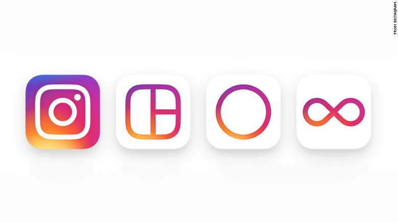
This is Instagram and its three “spinoff” icons: Layout, Hyperlapse, and Boomerang. I really like the three spinoff logos. Clean, similar but distinct, still in keeping with the same great color palette. And yet for the main app, they went crazy. They flipped the colors and made it feel kind of cluttered. So for my logo, I tried to keep it in line with the others.
Redesign
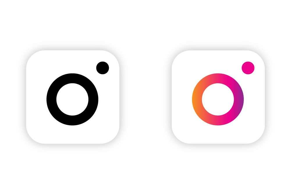
![]() This is the symbol logo. It’s simple, and yet you know which company it’s from, which demonstrates that once you establish a strong brand, you don’t need a lot to remind people. With a simple gradient on the main circle and a solid color for the dot, it feels clean. And it feels connected to the rest of the saga.
This is the symbol logo. It’s simple, and yet you know which company it’s from, which demonstrates that once you establish a strong brand, you don’t need a lot to remind people. With a simple gradient on the main circle and a solid color for the dot, it feels clean. And it feels connected to the rest of the saga.
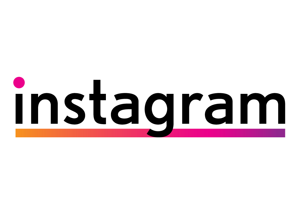
This is the text logo. While basic, it includes all of the brandings from the symbol: The color and the dot. In my estimation, it doesn’t even need the ring. Another thing I added is the way the g cuts off the line. It’s not super fancy, but, It adds a cool effect and highlights the text itself.
Comparisons
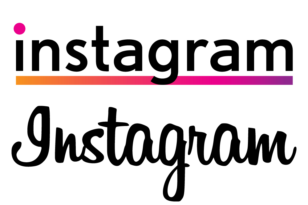
Taking the text from script to sans serif moves the logo into the new generation. Even after the minimalism logo change, this vintage script stayed the same. Now it goes with the feel more. ![]()
Although this isn’t a huge change, it feels fresh and uncluttered.
Black and White
Finally, this is the black and white version. Just to show how powerful Instagram has become, that with just a barebones logo, it’s immediately recognizable.
Conclusion
That does it for Instagram! Minimalism all the way. Now you could do this with every company, but things would get boring fast. Which is why following trends isn’t always the solution to branding. Sometimes taking big leaps and creative decisions can also be great, as you’ll see in later posts. But with Instagrams look and feel, it just works. Thanks for sticking with me for this whole time on ReReDesign!