We have finally reached the end! It’s been a crazy couple of months given the whole ‘global pandemic’ kerfuffle. I’ve redesigned some of my favorite brands, but for my last post in this cycle, I have decided to make an original logo. Jacob Logo Design is my design ‘company’ which has officially been launched this year so it needs a logo. So that’s what I’m doing here today. With no history to cover, let’s jump right into the final product.
The Logo
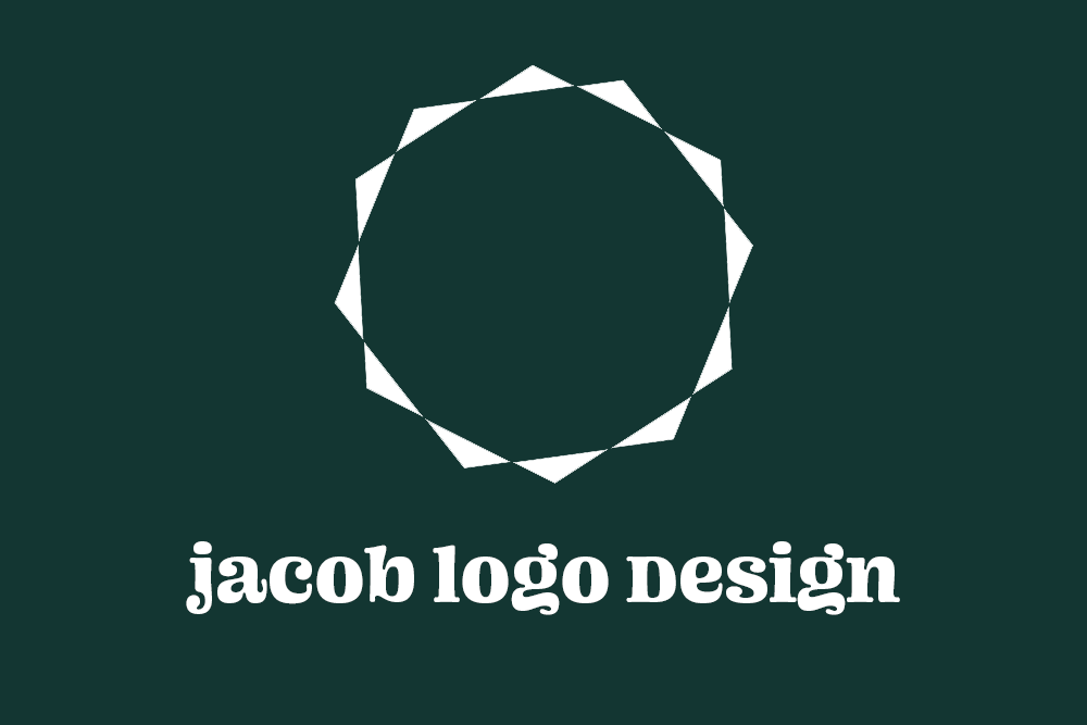
![]()
Here it is, my own logo. I decided to go with a simple shape, that can be used for a variety of branding purposes. I started by overlapping 2 polygons and then played around with the pathfinder settings. I wanted to create a unique shape, and liked this idea of a ring, making it absorb the background into it, taking up as little space as possible. It also reminds me of the sun and the feeling of brightness. I also chose this nice dark green color, as it feels earthy and grounded, while also interesting.
Text
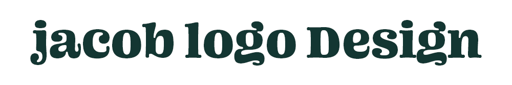
The name is a very important part of a business. It’s what represents the brand. But even more important is the presentation of that name. The font, the color, and the overall feel of a logo is supposed to encapsulate the feel of the company. The font I chose is called “Ohno Blazeface”. It’s one of my all-time favorite fonts. It feels fun with its exaggerated curves and crazy squiggles, but it is also is a serif font that keeps it classy. I also chose to make the letters lower case, except for the D. I love the way a lower case logo feels while wanting the signature D look, so by shrinking the font a pixel or two, I can give it the same x-height while keeping it bigger.
Business Card
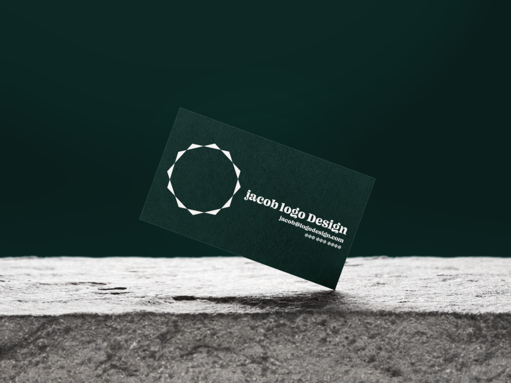
This is a mockup of the type of branding style this logo could take on a physical business card. It’s simple, modern, and feels very open. If I do eventually get business cards, this is what I would want it to look like.
Conclusion
Well, that’s it! My last hurrah. Well not really, but next cycle I do plan to be focusing on more original designs where I don’t have to conform to the preset branding. Thank you for looking at my column, ReReDesign. Thanks to my editors for helping me with this passion project of mine, and I’ll see you all soon. Thanks!