Begin typing your search above and press return to search. Press Esc to cancel.

Sunset Media Wave

Sunset Media Wave

Primary Navigation

  • Columns
    • Ambitious Animation Batteries
    • Art of the Arts
    • CLAY’SMIND
    • Centralize
    • Datura
    • Fast Past
    • Here Lai’s Our Truth
    • Imaginary Paint
    • Inside the Riptide
    • Is This The Real Life
    • Journey to the Pilot
    • Motion of the Ocean
    • Paper Alien
    • Postcards From
    • The Perfect Ballad
    • Very Real
  • Browse
    • Art
    • Culture
    • Fashion
    • Food
    • Games
    • Music
    • Opinions
    • Photos
    • Stories
    • Travel
    • Video
    • Waves
  • Archive
    • 11.5 x 14
    • A Comedian’s Guide to Being Funny
    • After the Storm
    • And Dim Sum More
    • A Pause for Sanity
    • A Thousand Sleepless Nights
    • Cut & Paste
    • Child Wonder
    • Behind the Scenery
    • Between the Seams
    • BLOODSDREAM
    • BookME
    • City Beats
    • Paragon Gem
    • Cotton Candy Melodies
    • Come with Chloe…
    • Cover Story
    • Creating the Happy
    • Dessert Pervert
    • Earth to Belle
    • Ethereality
    • Esther-fied
    • Exposure
    • Fashion Obscura
    • Fashion Soup for the Sartorial Soul
    • Feeling Nostalgic
    • Feel the Beat
    • Find Your Voice
    • Follow the Yellow Brick Road
    • From Zero to a Game
    • Golden Hour
    • Haikus and Things Askew
    • Hay Fever
    • Heart-to-Art
    • Here For a Pun Time
    • Here’s the Dish
    • Idioms 4 Idiots
    • In Castaway Bottles
    • It’s 420, Everybody Scream
    • Jenn’s Jams ♪
    • Just 3D It
    • Learning My ABCs
    • Letters of Abstraction
    • Let’s Talk About Sex
    • Los Cassettes de los Recuerdos
    • Love Out Loud
    • M&M
    • Meiflowers
    • Midnight Snack Homeshake™
    • Mint in Canthem
    • Mixed Vegetables
    • Musique Nonstop
    • Out of the Closet
    • Psychic Psychedelia
    • Postcards from the Bay
    • Paper Planes
    • Pens + Headsets
    • Preschool Philosophy
    • Psychic Psychedelia
    • Pumpernickel Party
    • Quiet On Set
    • Rags with Tags
    • Reel Snacks
    • Rendered Maximum
    • Satircal Society of Scintillating Sentences
    • School Deconstructed
    • Sidestreet Runway
    • Sonder Street Studios
    • Soy
    • Style and Substance
    • Suicide Notes to Myself
    • Symphony of Epiphanies
    • Tall Tayles
    • The Aftermath
    • The Art of “Fake” Fake Political Caricatures
    • The Art of Robotics
    • The Builder’s Block
    • The Cheezers Mark
    • The Guest List
    • The Journey of a Juggler
    • The Meme-ing of Life
    • The Real Slim Katie
    • The Significance of Unimportance
    • The Sole Account
    • The Sunset Lifeline
    • The Ultimate Mover’s Guide to Multiverse Travels
    • Tip Jar
    • Trash Talk
    • Train of Thought
    • VPA (Voices Producing Allegiance)
    • Wandering on Cloud Nine
    • Where the Two Worlds Meet
    • Where the Two Worlds Meet
    • YUM!
    • ZINEior YEAR
  • About
    • Apply to Join our Summer Cycle!
    • Meet The Wavers
ReReDesign: (La) Croix
Home
ReReDesign
Art

ReReDesign: (La) Croix


By
Jacob Thompson
.
Published on March 6, 2020. 0

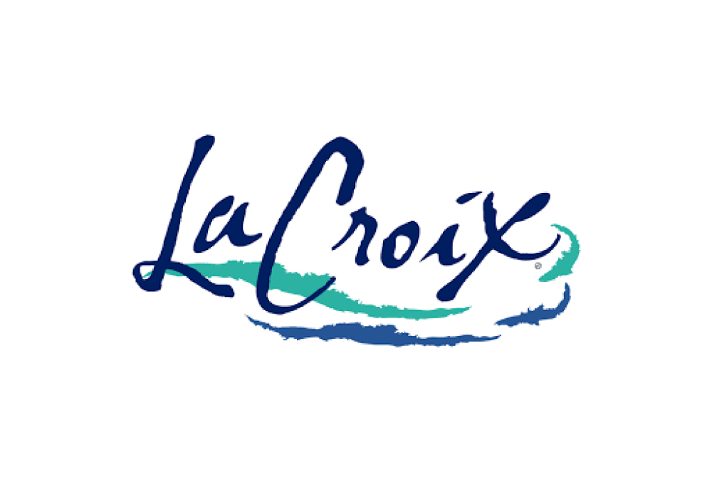
Round 2, here we go! Call me a prissy Californian, but oh man do I love La Croix. Not only the drink, but the logo which is nice, simple, and successful in building a strong brand. I love the unique, script font and those two squiggly colorful lines. So good! That said, I think there’s room for improvement, so let’s see what we can do.

History

La Croix doesn’t have the longest logo history, but there have been some major changes. They began with a Sans Serif font and then moved into a more artsy format, stretching the letters and adding the signature blue and teal stripes. After that, they arrived at the Script font that we all know today.

The New and Improved!

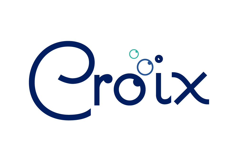
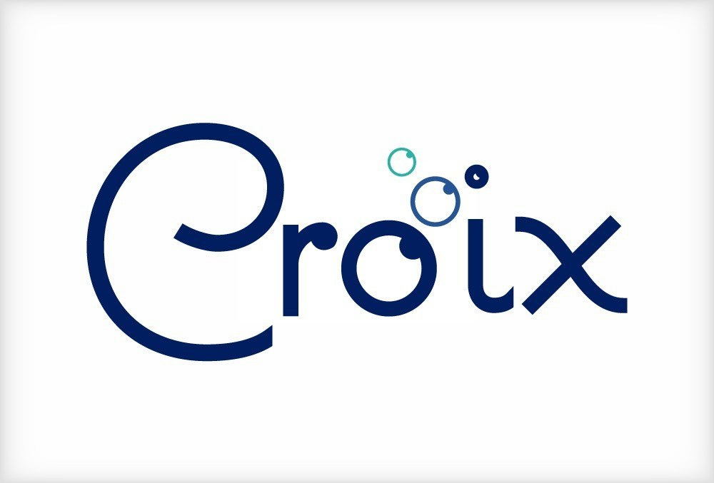
No, your computer is not broken. This new bubbly beverage is dropping the La. It’s unnecessary! Croix means cross in French, and La Croix means… the cross. Yeah, enough said on that one. Let’s talk design! I’ve gone with a less powerful, but more fun, cheery script font. It feels more welcoming and warm, rather than suggesting that you’re too good for some carbonation. The next change is the bubble O’s. This fonts O has a little circle indent, so I used it to add in the colors of the original, without the lines. These bubbles also add an opportunity for branding like the emblem.

The Emblem

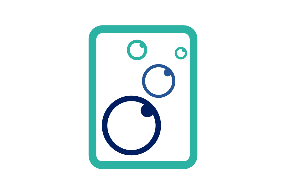
Something brand new to the (La) Croix product line is this little guy! This would be used more for marketing, ads, and their website then on the actual product (as you’ll soon see). It’s just light, shows off the great colors, and is just very bubbly.
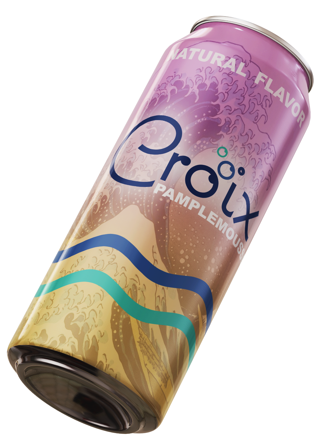
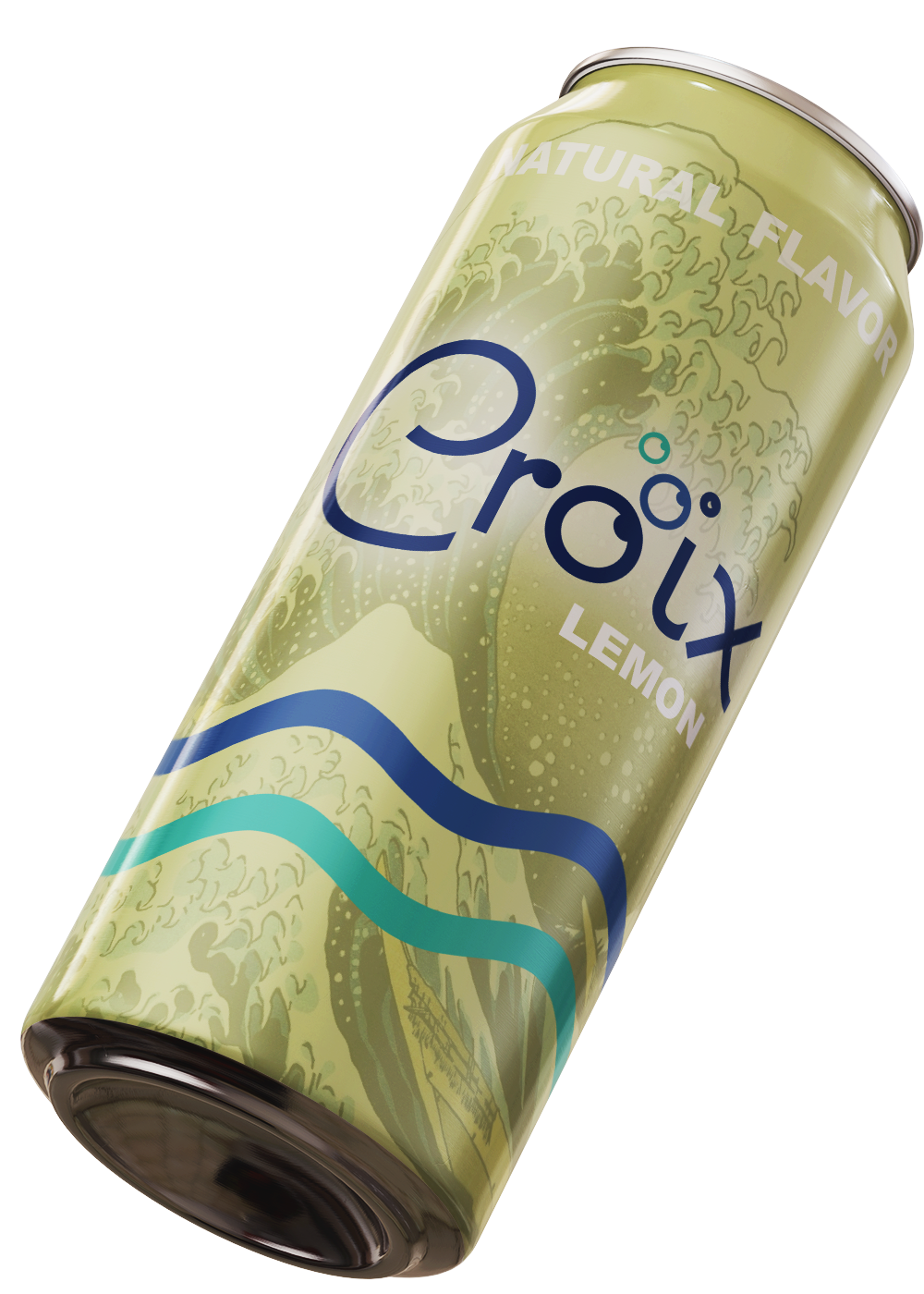
The Product

This new logo would not work well with the current packaging so I developed a new look for the cans. I used a free mockup download where I can design my art and have it magically rendered over the object. I also used this opportunity to add the famous squiggles i couldn’t include in the logo. I also did 3 flavors: pure, pamplemousse (grapefruit for the non-pretentious) and lemon. Enjoy!
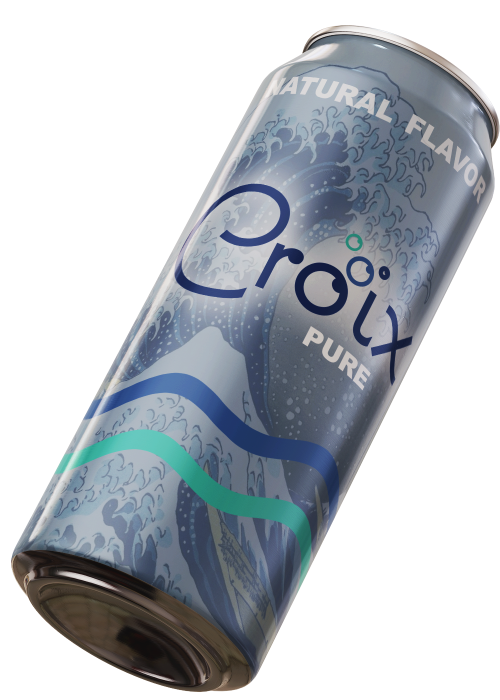


The Conclusion

That’s all for now! I had a lot of fun making this logo, but now I feel like I need to get into more detailed, artsy logos and I really like their aesthetics and want to include it in my work more. Thanks for stopping by!

Related

Categories ArtReReDesign
Tags Jacob ThompsonLa CroixLogoReReDesign

0 likes
avatar

Author

Jacob Thompson

+ There are no comments

Add yours

Cancel reply

2017 © Sunset Media Wave