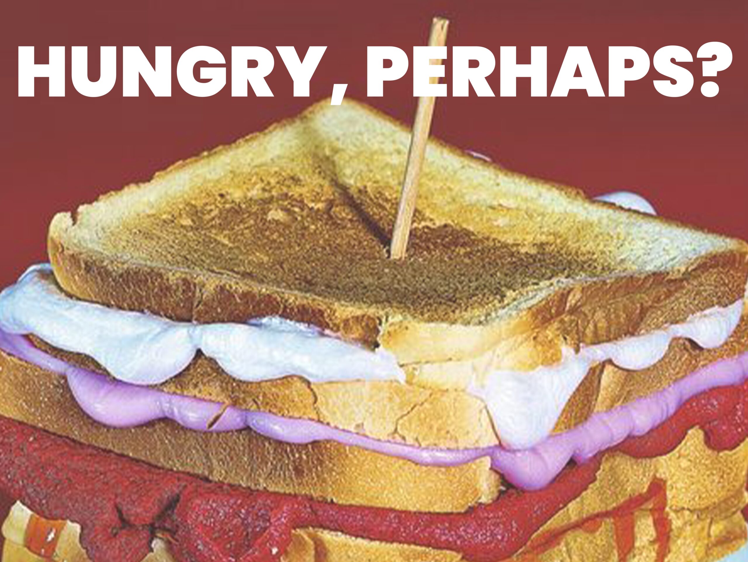
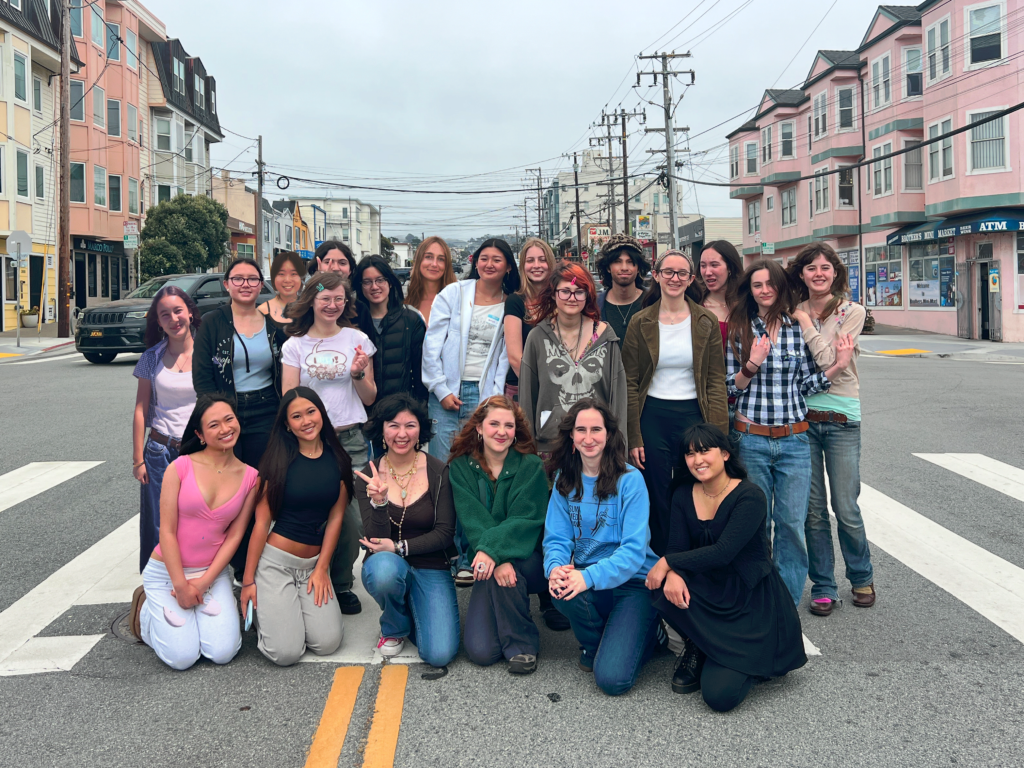
The summer cohort has one question for us: Hungry, perhaps? Hope you brought your appetite cause they’ve cooked up the projects you’ve been craving.
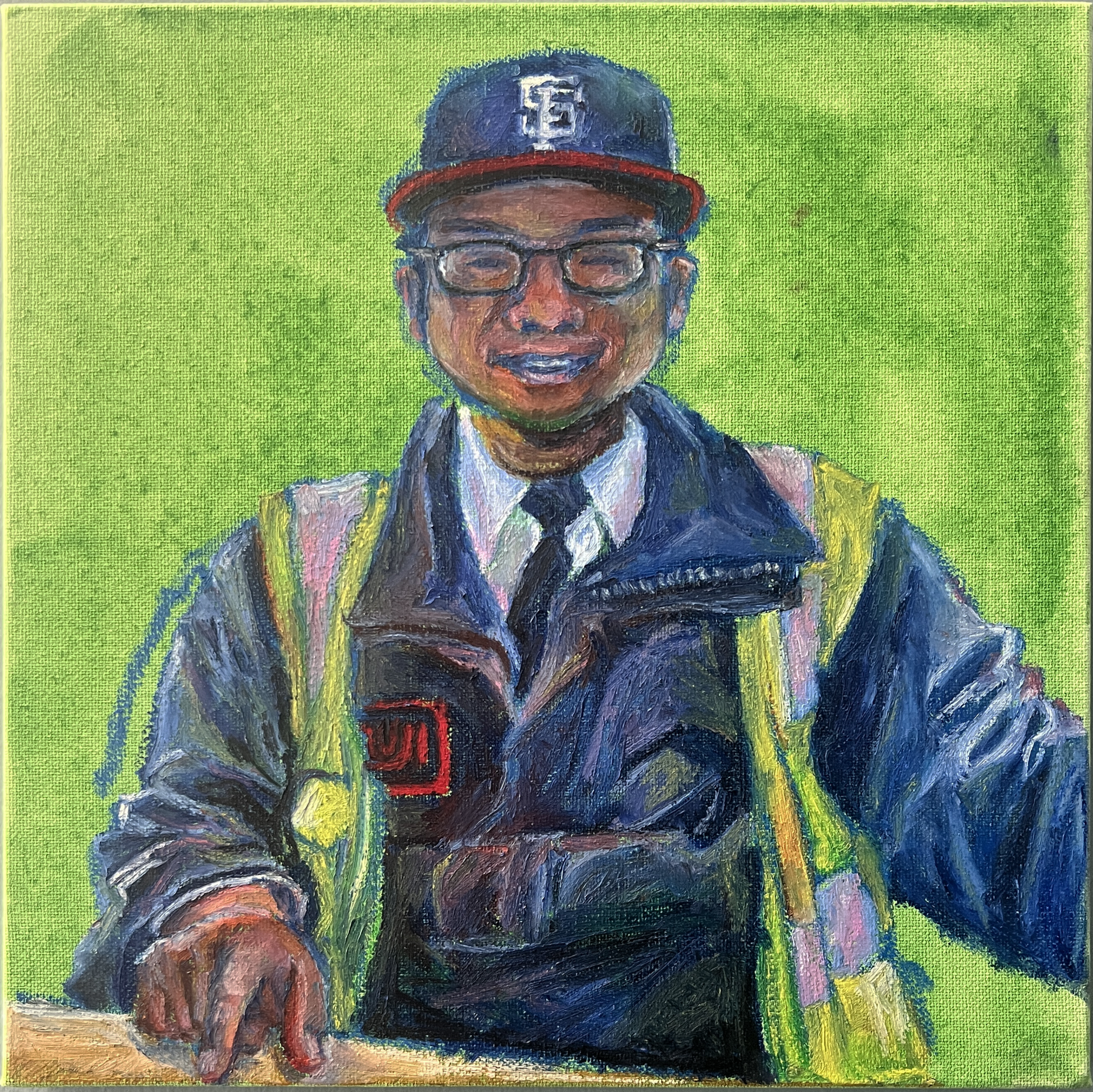
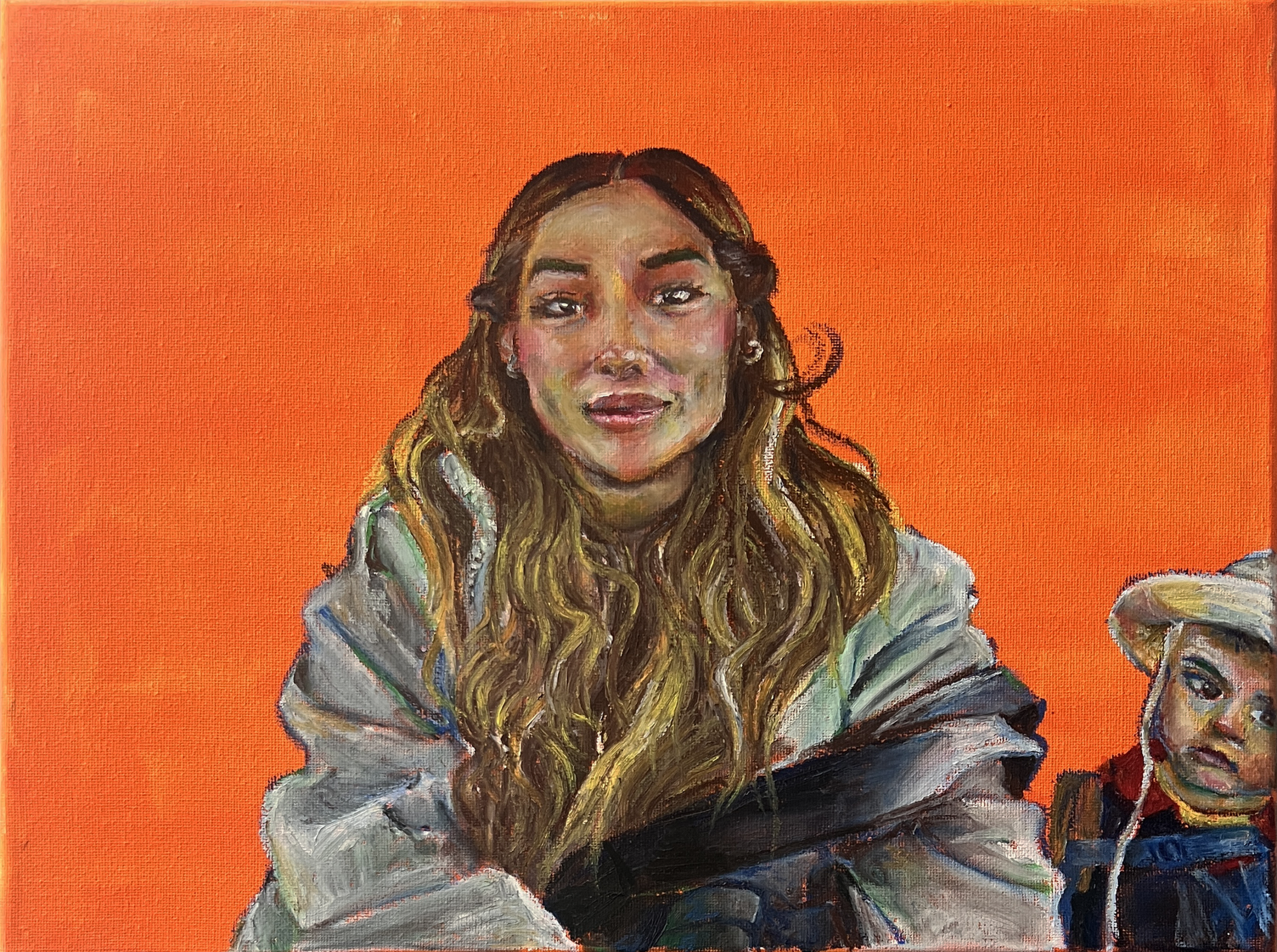
Trinity Joa - The Regulars
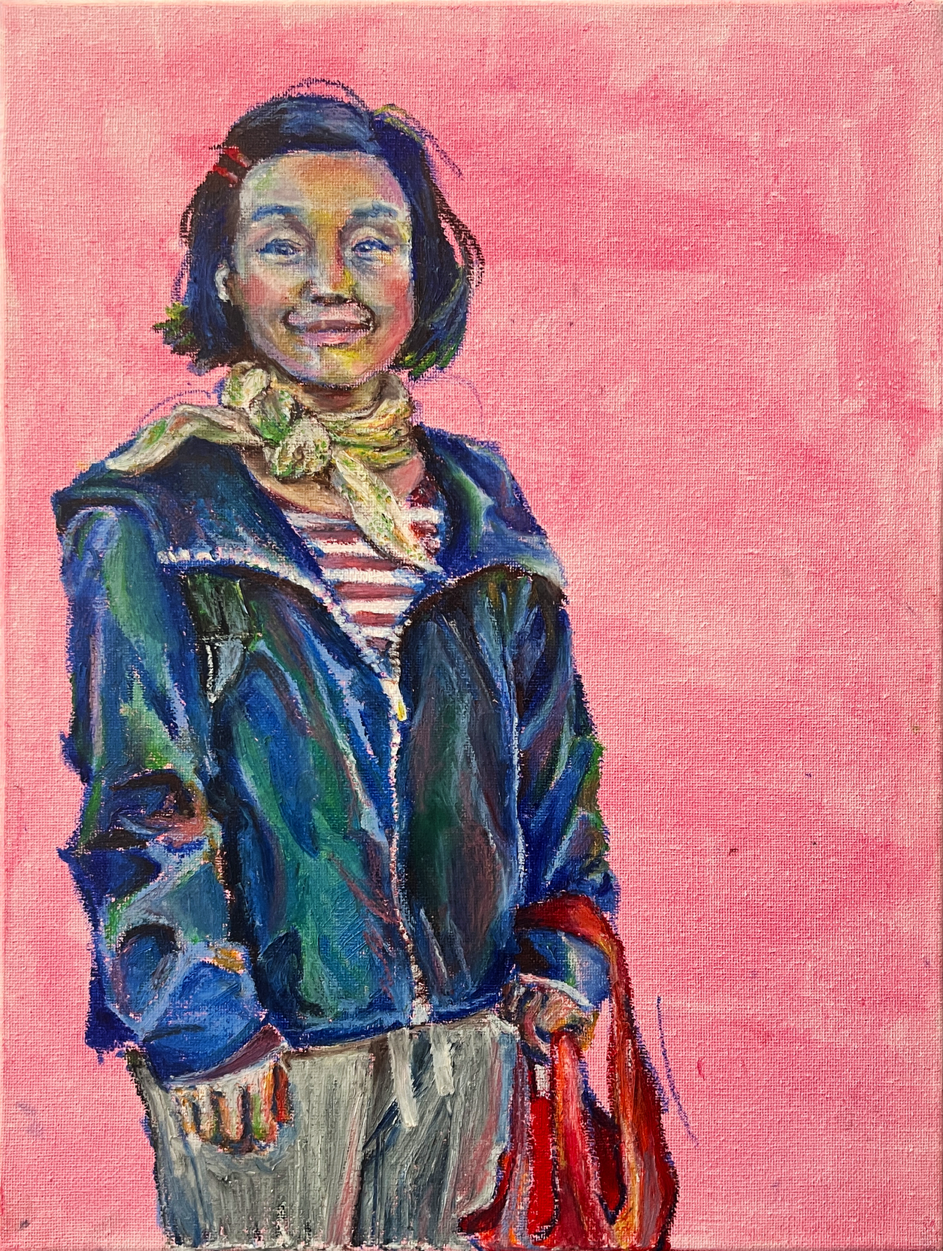
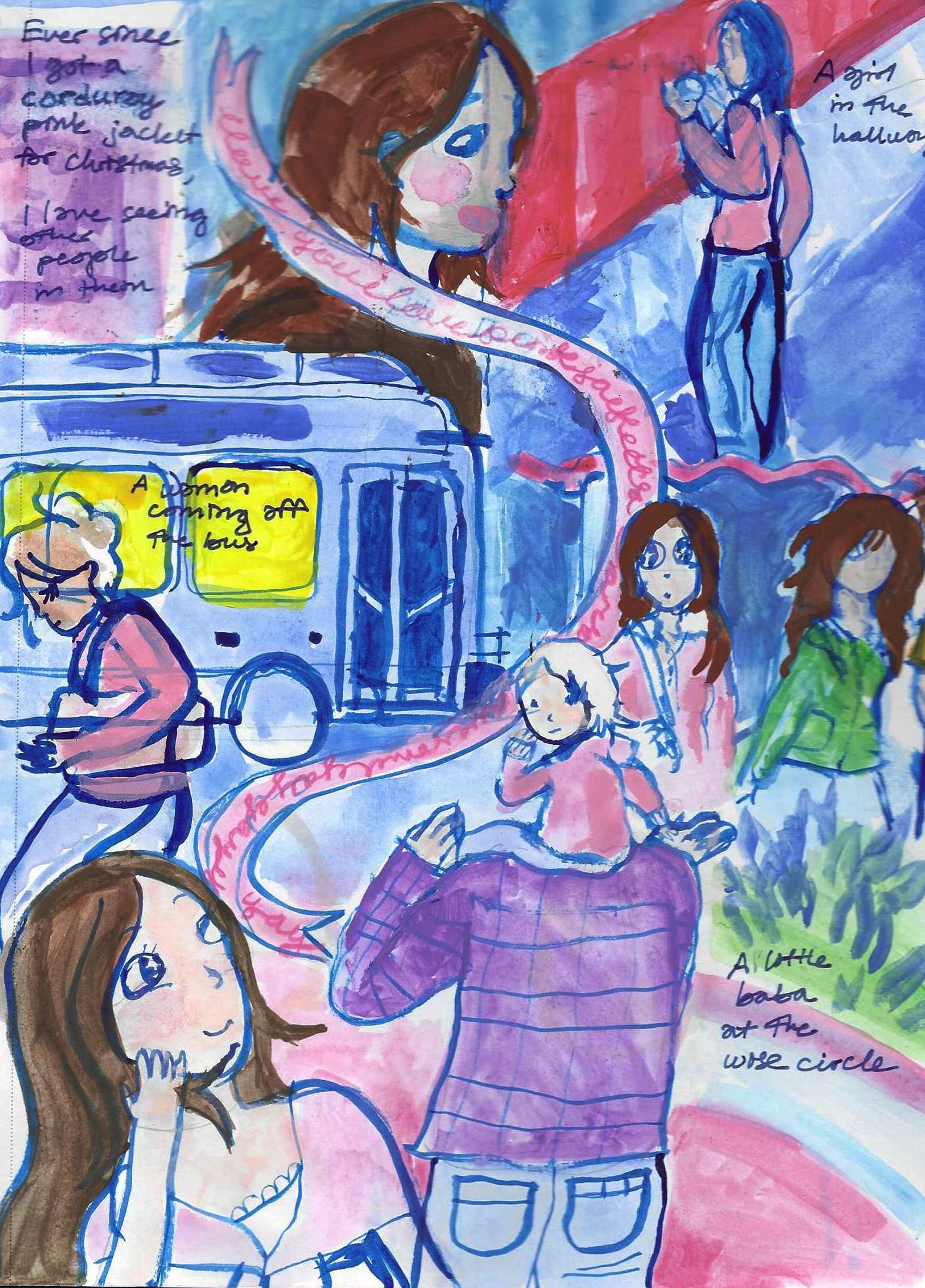
I love MUNI, no matter how slow or janky it may be! It is lovely to see people interact, it is lovely to stare out the window and lovely to pull the yellow cord down and let the driver and the world know that “Alright, I’m getting off here!” Moreover, public transit has shown me the joy in catching glimpses of others’ lives. I’d recognize the regulars from my bus routes anywhere, even though I’ve never spoken to them directly. Despite the fact that we aren’t friends, I am reluctant to call them strangers; after all, we sit across from each other morning after morning. This project is my love letter to MUNI, and to a greater extent the little community in my corner of our public transit system. While working with oil pastels, I’ve started a series of portraits of the regulars on my routes (shoutout the 22, K, and 29!!), with an emphasis on capturing each person’s unique essence and energy. Forcing myself to finally approach these familiar strangers, photograph them, and get to know them just a little bit better.
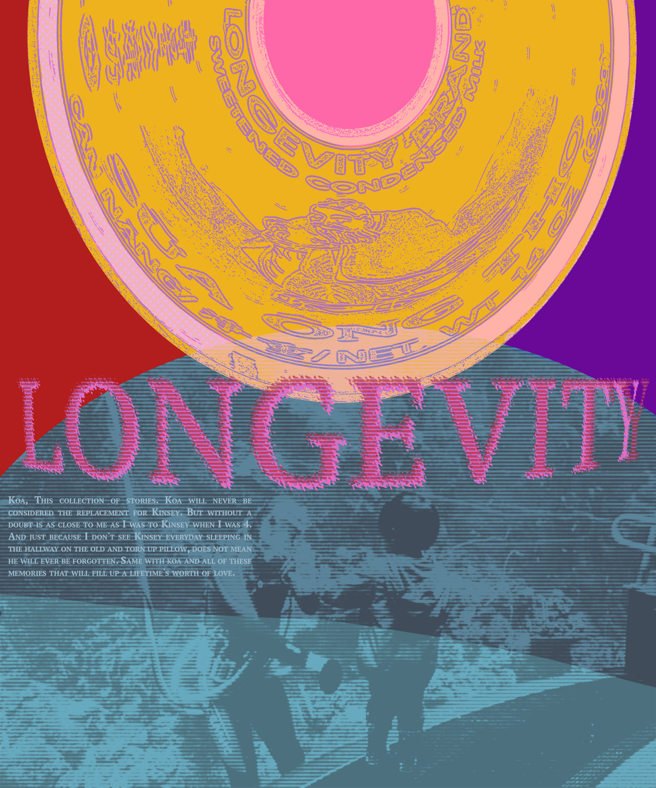
Rena Phan - Coming In Layers
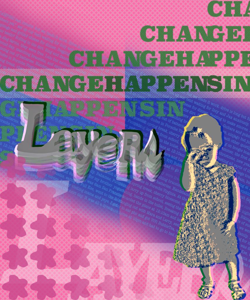
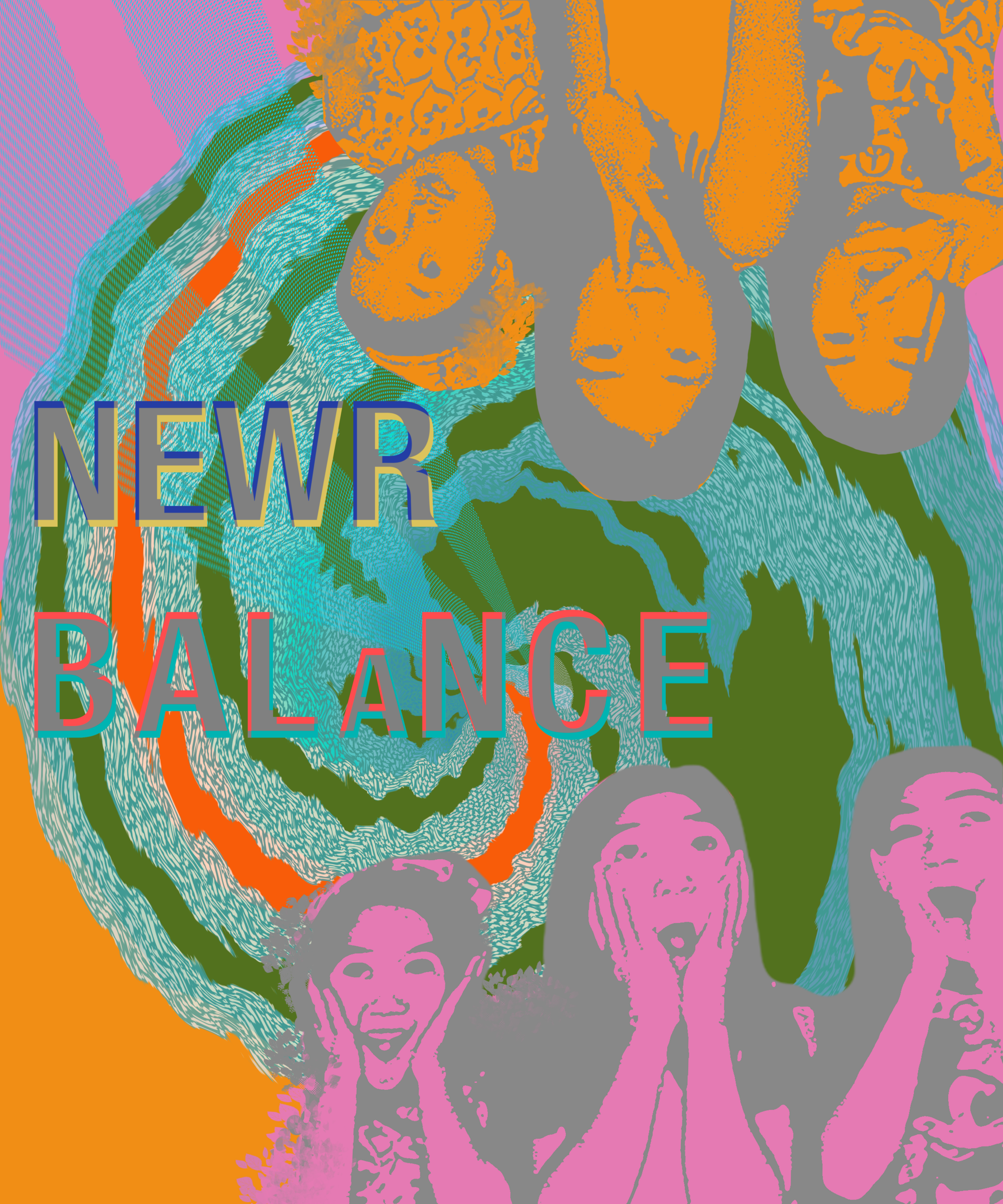
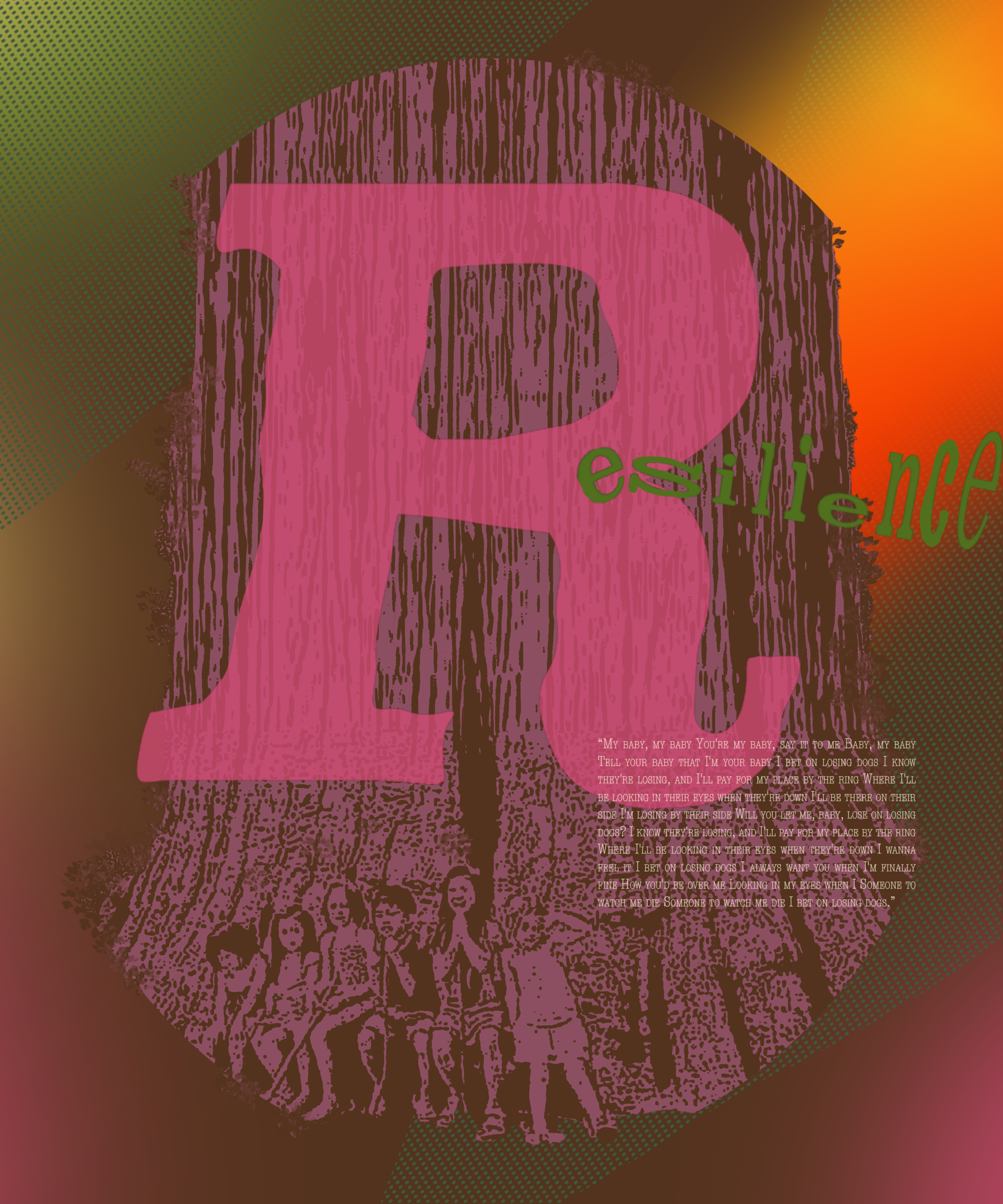
Since I was a young child, vibrant colors and patterns have always caught my eye and brought me joy. I find myself getting mesmerized by anything with odd color combinations and patterns so this cycle I really wanted to represent myself through original palettes and arrangements. I started this summer without a plan, but I found myself reading a memoir I wrote when I was 13, which I incorporated into my project. I added lyrics from Bet on Losing Dogs, a song that really carried me through my sophomore year, as well as photos from when I was 2 to 4 years old that still hold so much meaning to me. Incorporating personal touchstones and momentos into my project gave me the sense that I was being guided with almost no guidance, almost as if a magic wand was pointing me in the right direction despite the fact that i had no master plan. The result is a big, colorful, digital art smoothie: an experimental recipe that feels like it has been years in the making.
Sasha Freeman - Watercolors
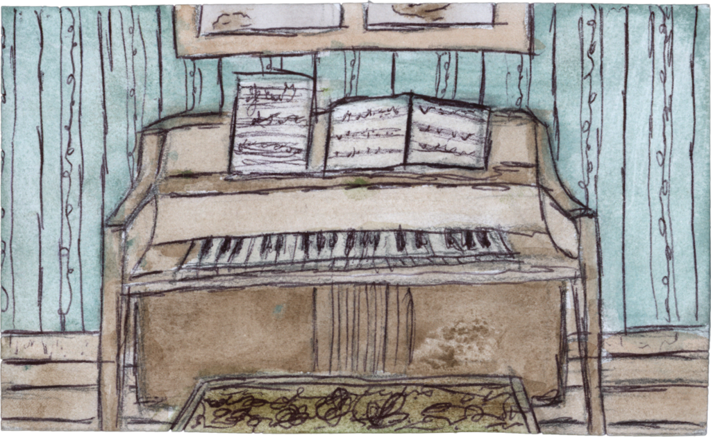
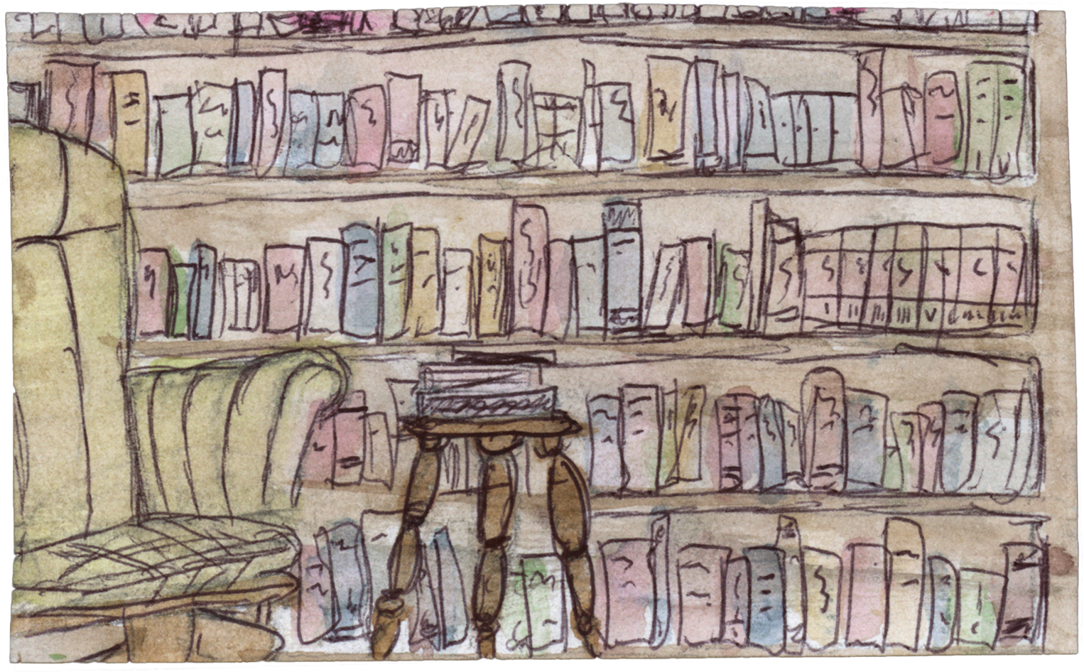
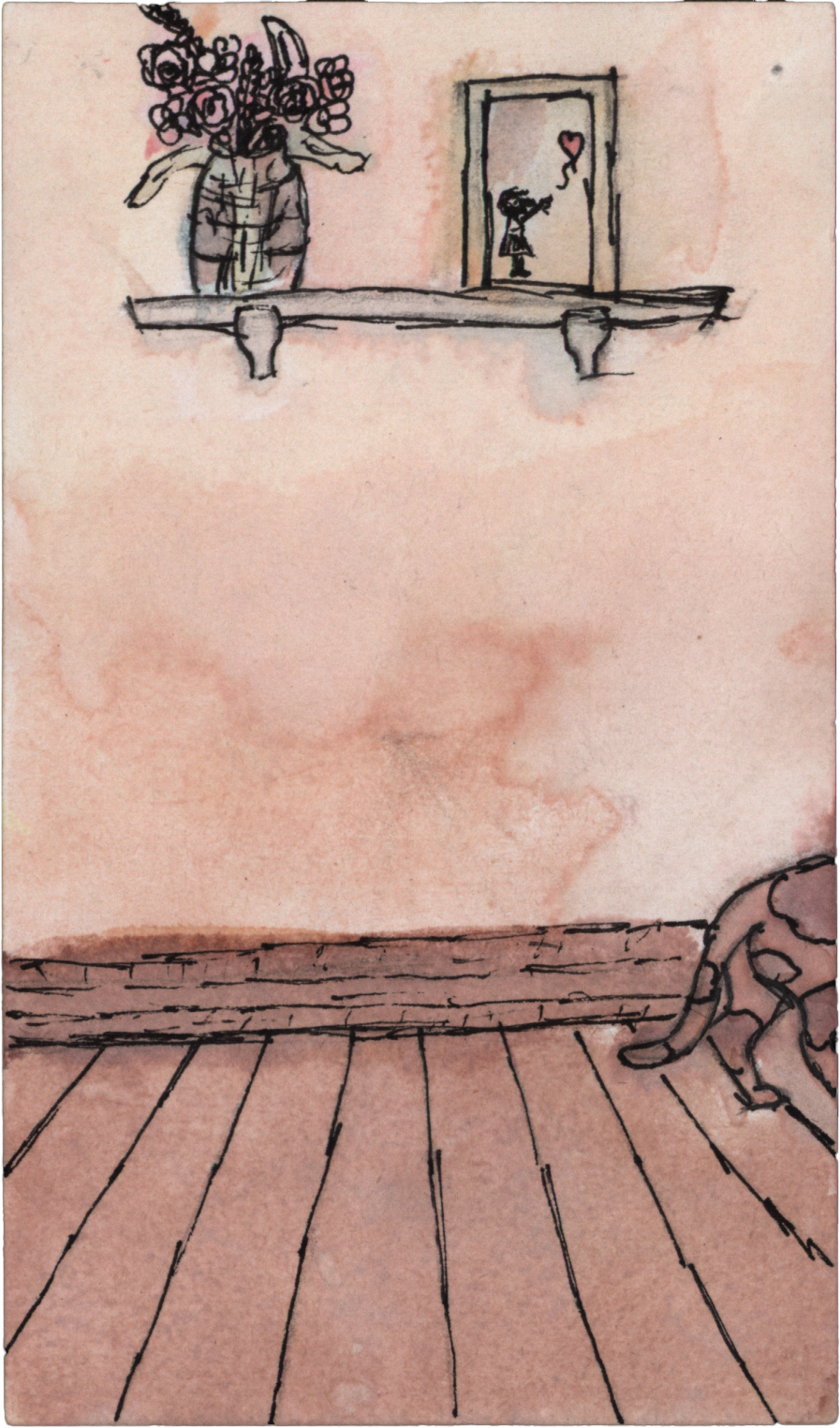
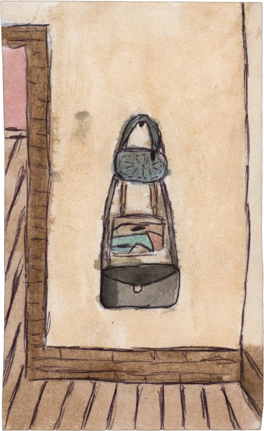
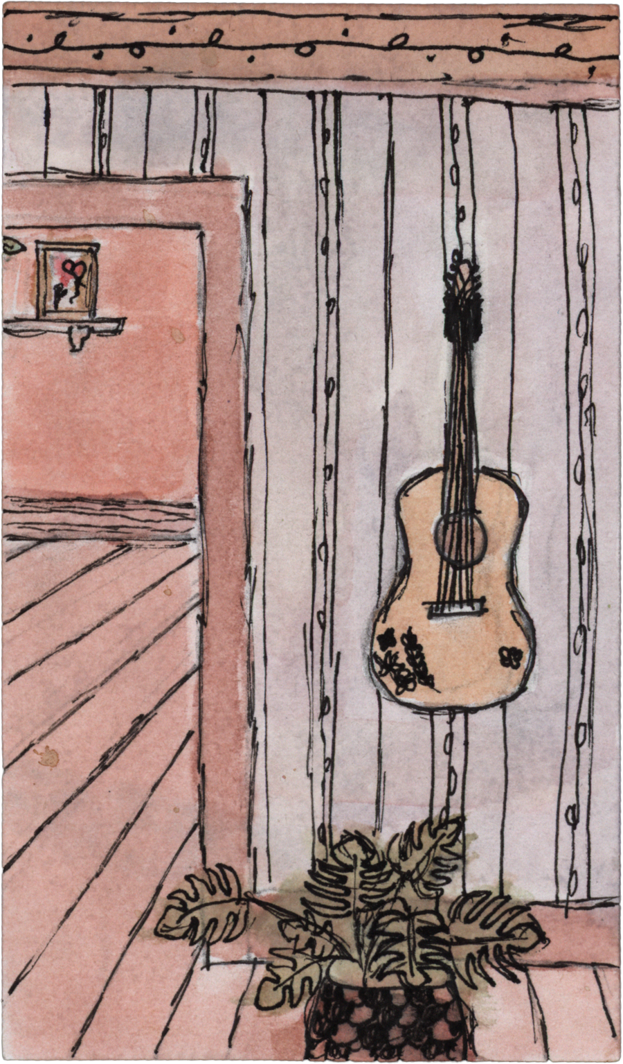
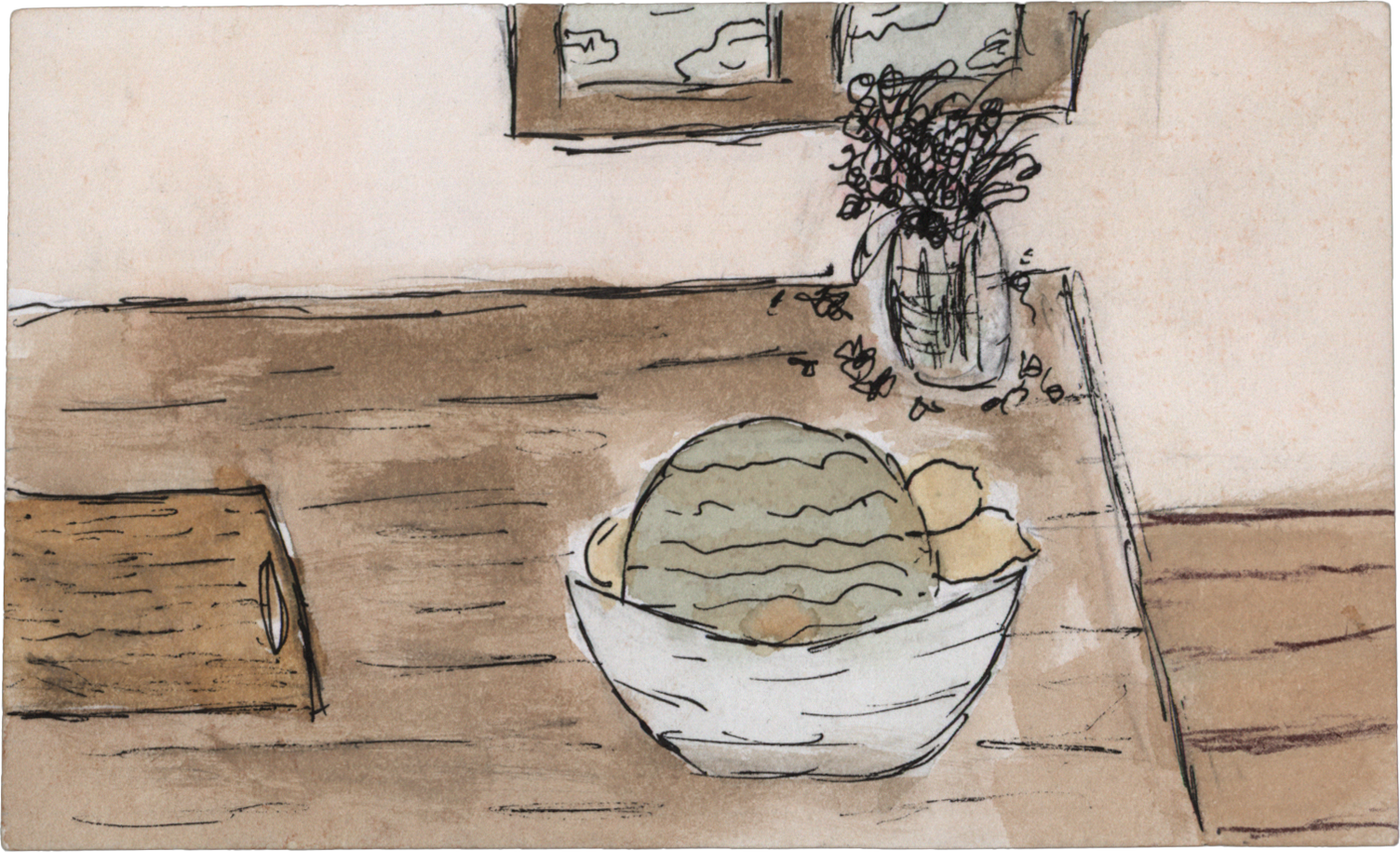
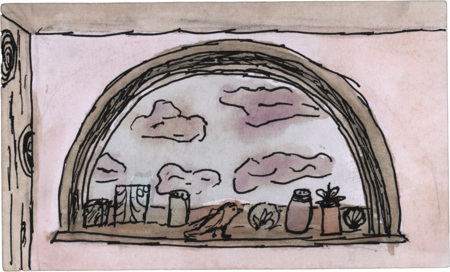
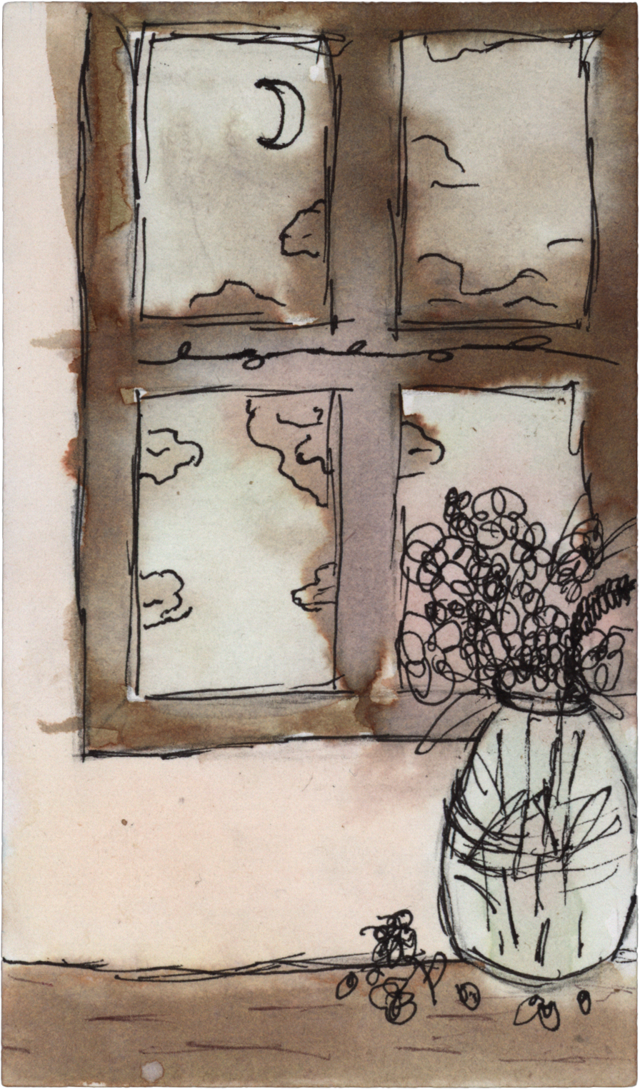
This project is many things to me: the beauty of simplicity, the effects of trying new things, and hours of serenity. I started this project two summers ago out of boredom after looking up watercolor inspiration on Pinterest. Initially, I barely altered the image in my own painting. It was simple and objectively unimpressive, yet I stared at it for inexplicably long stretches of time. Looking at my first painting now, it’s apparent that I messed up the perspective, making the vase hang halfway off the table. But at thirteen years old, I was amazed that I could create something like it, primarily because I’d never even tried it.
I have identified as an artist for years, even before I really created any art or attempted to. When I did make art, it wasn’t made visually. I looked upon unused paint pallets and empty sketchbooks with disdain. I decided to stay away from art done on paper in kindergarten because in art class I saw a classmate effortlessly draw the cat we had been assigned to copy. Mine was a mess of lines that amounted to a visual failure in my eyes. At home, it was my sister who seemed to possess the gift of making compelling art. She would draw or paint and impress people with what she’d created, while my work was merely scribble scrabble.
In middle school, I made friends with some of the most talented artists I know to this day. It seemed they could conjure up anything and it would be proportional and in their unique style. I recall once in seventh grade trying to draw a horse. Although I hadn’t tried very hard, I knew that even if I had it would still look like a four year old’s work. When my friend drew the horse, it actually looked like a horse. In moments like these I felt correct for staying away from visual art.
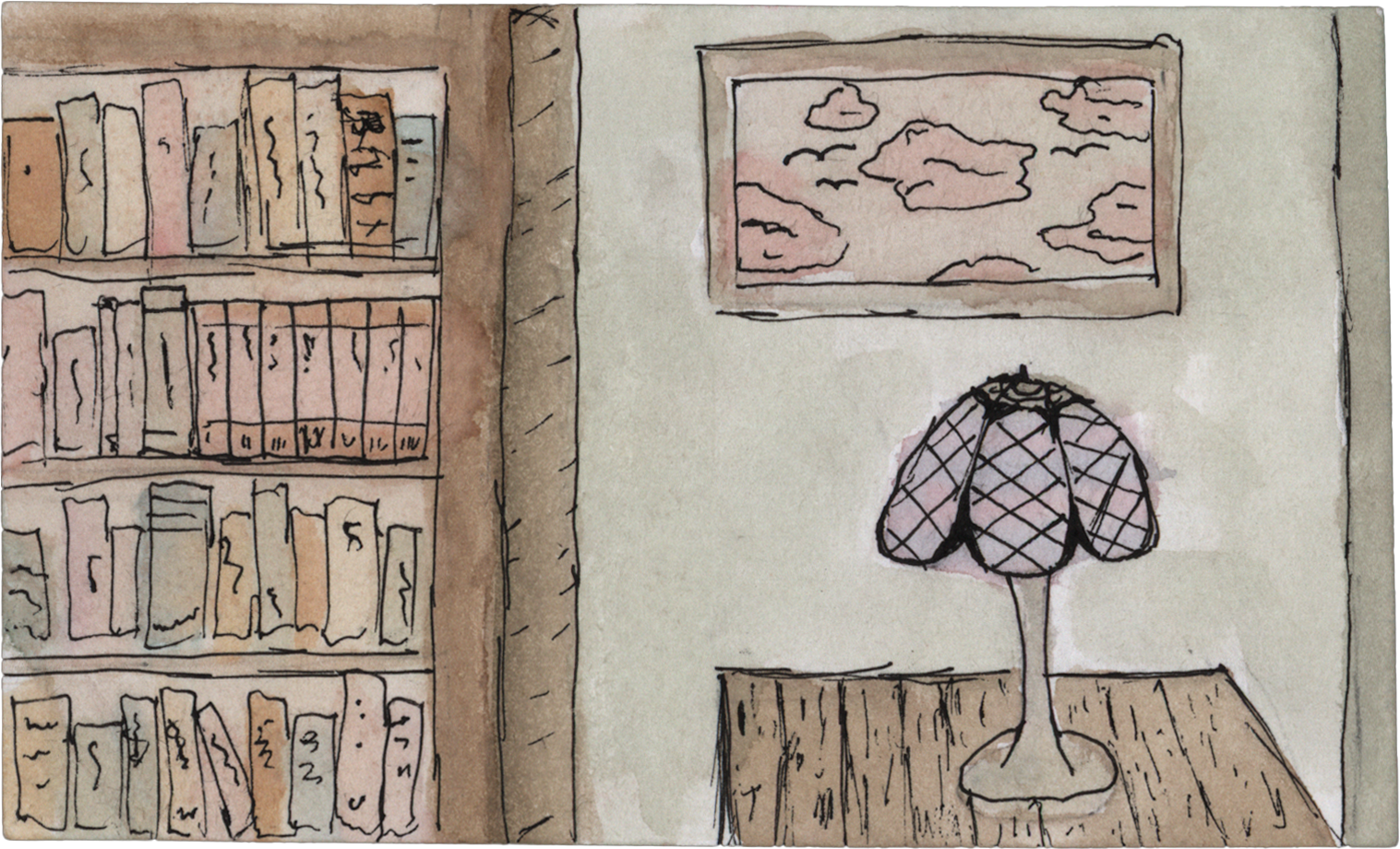
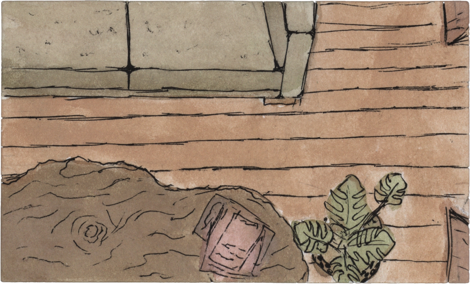
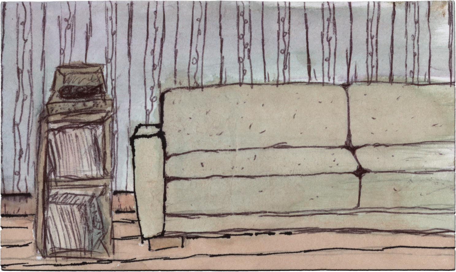
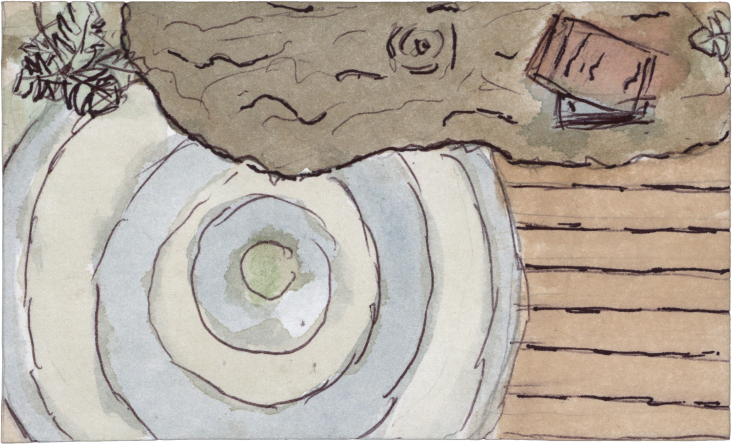
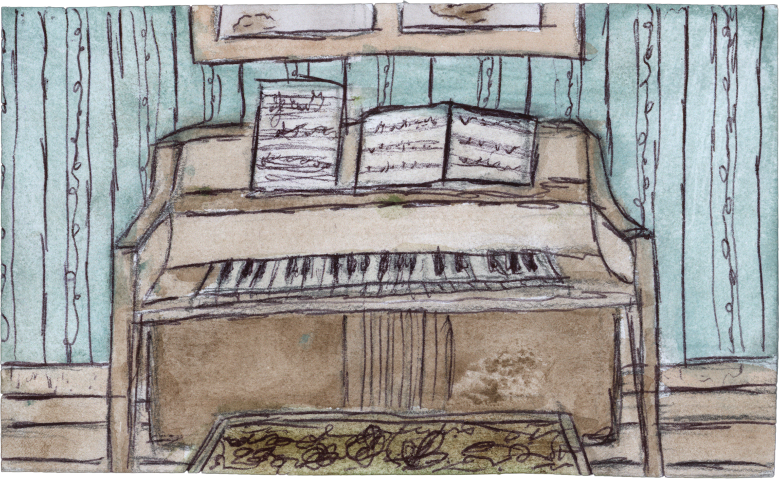
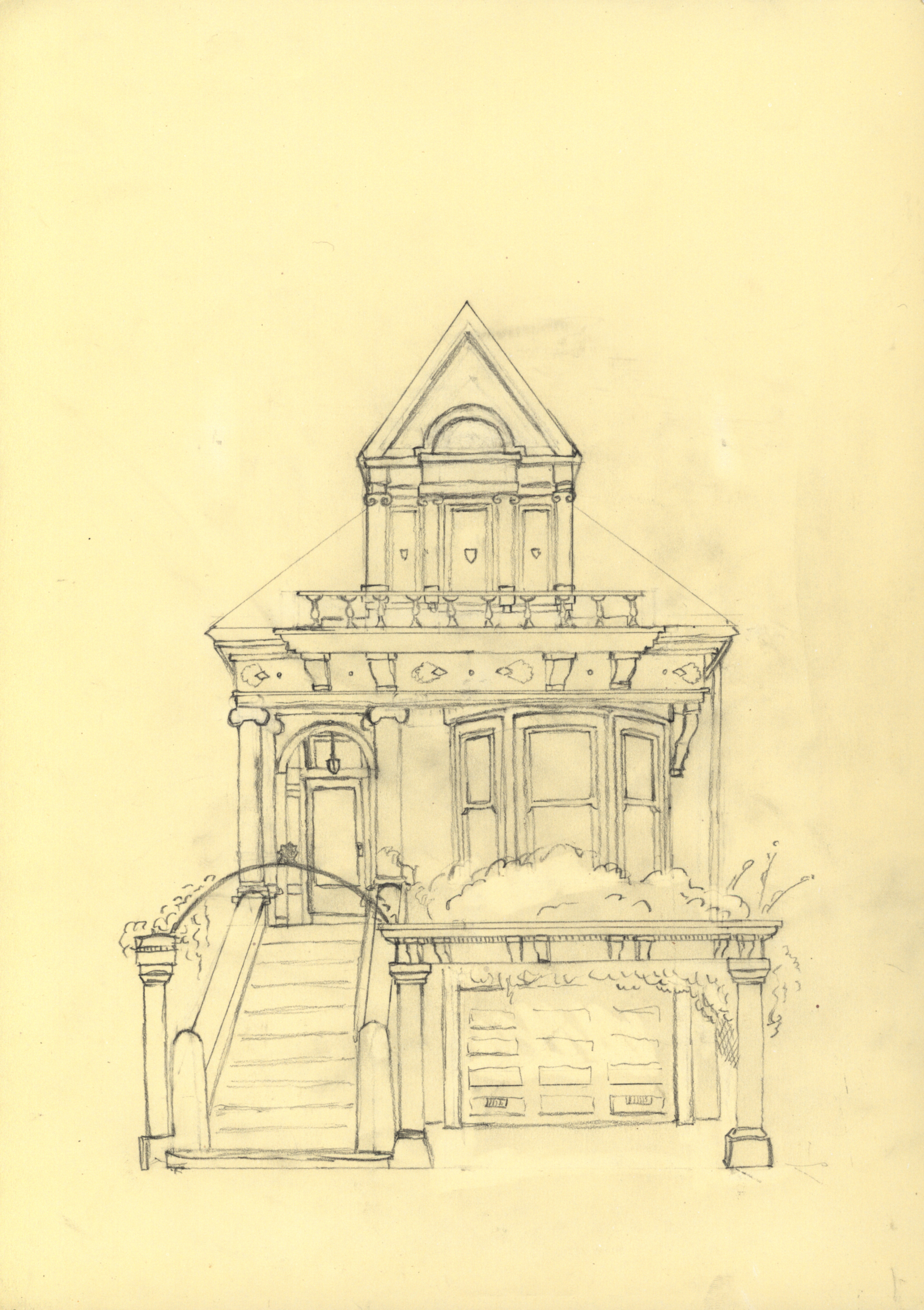
Then I sketched and painted that vase in front of that window and I didn’t hate how it looked. It was then that I realized how much fun I’d had painting it and that I’d been missing out for so many years. That summer I painted on three index cards with Crayola watercolor and when I showed a bunch of friends, they actually liked them. The next summer, I made another three. I learned at this point how relaxed I became while making these paintings. The sketch was the science; studying each line from whatever I referenced the painting off of, seeing how each stroke of my pencil turned into a scene from the imaginary house I kept drawing. The watercolor was fun because it was simple and I liked mixing the colors. My favorite part was using whatever black pen I had to sharpen the meeting of the colors, turn the work into something that made sense, but to do it organically, unconcerned with making these lines perfect.
This project represented something simple in that the house is not anything very meaningful to me. It’s not my home, or my dream home, or someone else’s; it’s just different scenes that caught my eye. But it’s the home of my understanding that art does not need to be perfect or flawless: the lines can be messy, the perspective doesn’t need to be realistic, the proportions don’t need to be proportionate, and the colors don’t need to be harmonious. I like looking at these paintings, and I hope other people do too, but that is not why I made them. I loved the process of creating and I learned that creativity is more limited by expectation than inability.
Abby Landman - Stand Still
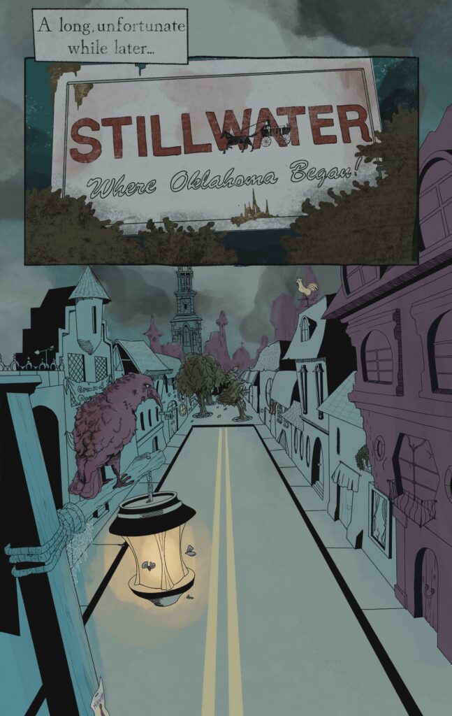
Weather has always been June’s fascination. After coming back from a stint at college and learning about a missing person from her small town, June gets sucked into the world of tornadoes and mysterious happenings. Will she survive this dangerous new world? There’s only one way to know: read the opening pages of my graphic novel, Stand Still!
Sylvia Nickolopoulos - I Wish I Were You Neighbor
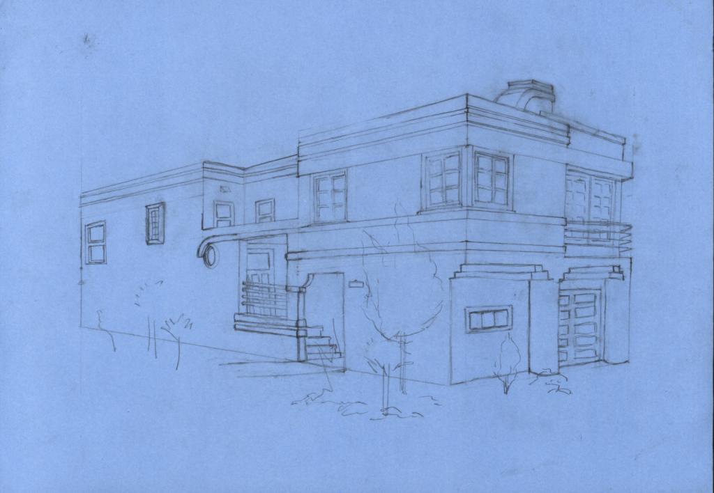
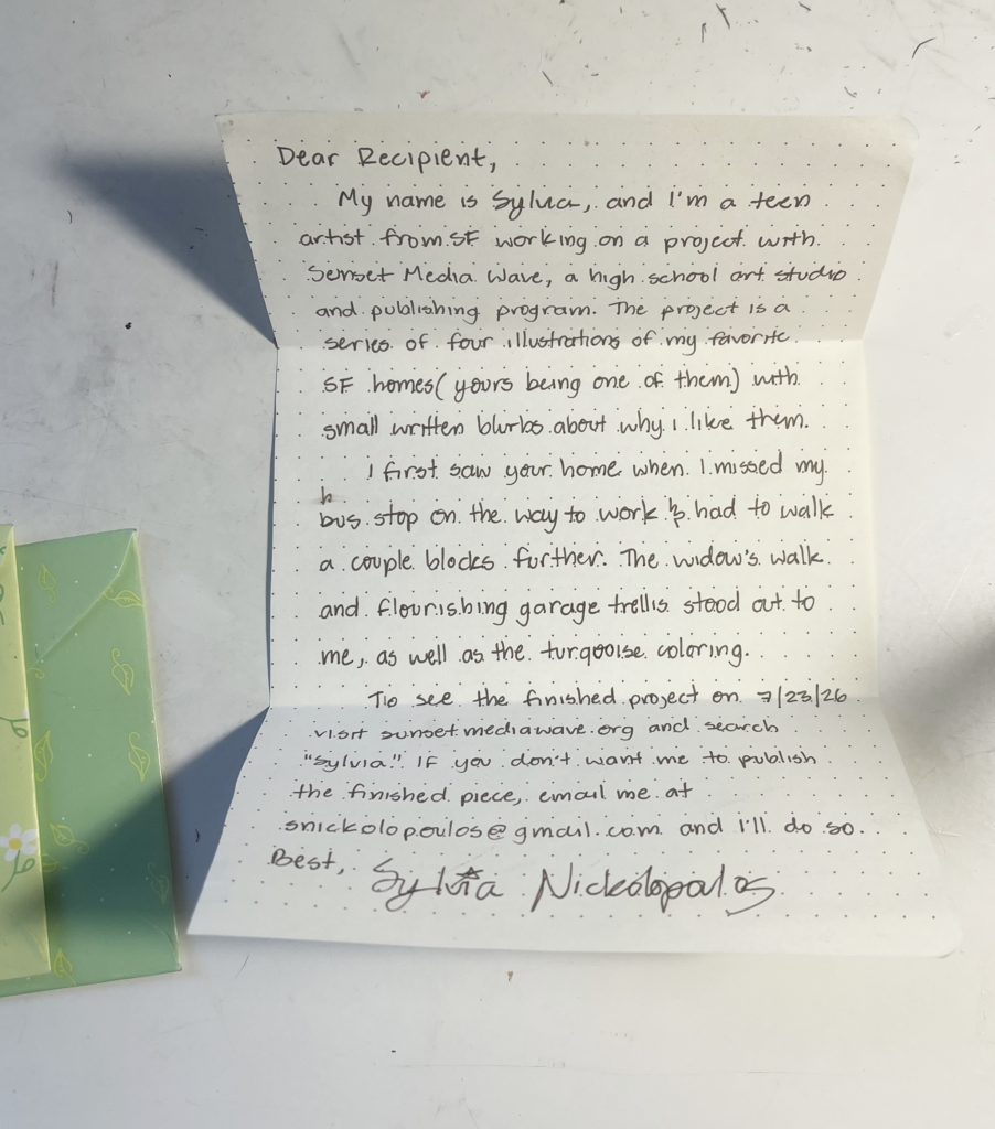
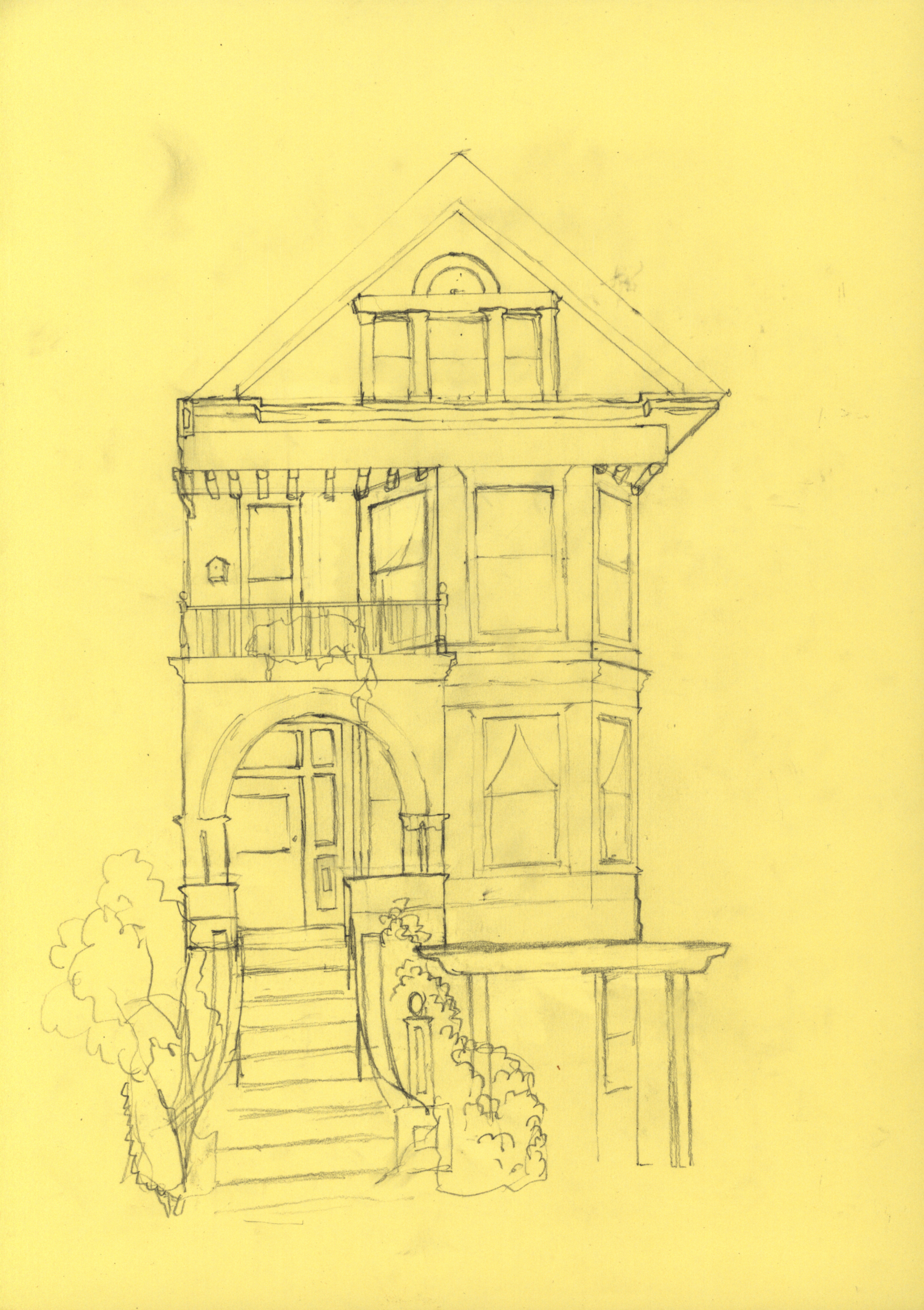
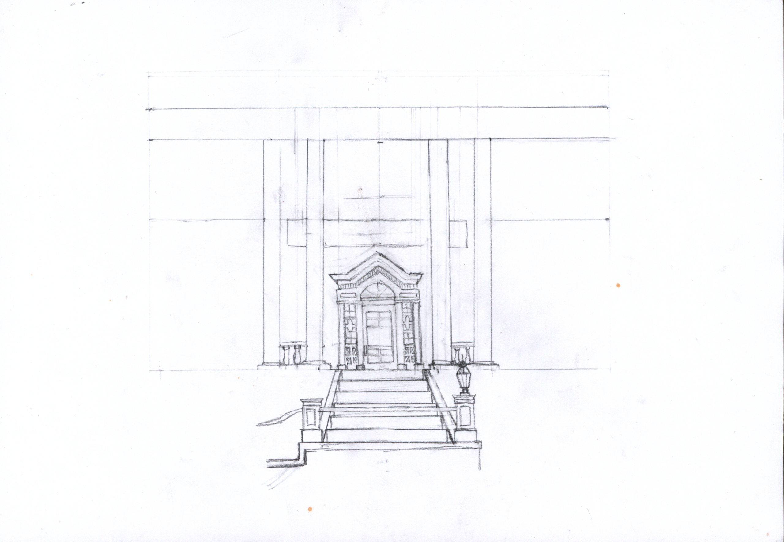
As my childhood time in San Francisco comes to an end, and as college move-in day fast approaches, these illustrations are my way of reminiscing about a time well spent in the best city in the world (I’ll die on this hill). Each drawing is of a real home in San Francisco, that have all earned a spot on my notes app list of favorite houses. After much deliberation, they were selected from a larger pool of homes due to their unique defining characteristics. Come get to know these houses with me;
8245 Geary Blvd, seen on blue paper, exemplifies the Streamline Moderne style of the 1930s. Taking inspiration from cruise ships, the house has a charming small circular window on the north face, and a delightfully blue paint job. I first met this house when on a Thanksgiving walk last year with my Dad.
331 Arguello, seen on cream paper, is a Queen Anne masterpiece. I didn’t do enough sleuthing to confirm, but it’s likely this house has survived both major San Francisco earthquakes. The feature that drew me in was the greenery above the garage, where if you crane your neck to look past you can see a top story widows walk. I stormed past this house in a fury the first time I saw it, as I had just gone to a bus stop too far and was about to be late for work.
2700 York Street, on yellow paper, sticks out like a sore thumb in the neighborhood(for all the right reasons). It has artfully maintained sidewalk gardens that provide a reprieve from the regular Mission neighborhood sun, and even a mural of a redwood tree easily visible on the back of the house. It was a regular site for sore eyes on my early morning walks to my carpool in Junior Year of High School.
1152 Jackson Street, on white paper, is a house that feels like it’s looking down on you. The angle of the hill that this Neoclassical Revival masterpiece sits in is so extreme that it is impossible to get a straight look at the structure. The angle I drew it at is a product of my imagination, but it’s not inaccurate. I first stumbled across this house while speedwalking down Jackson Street to meet a friend in Northbeach, a neighborhood I’ve been to very few times.
I plan to take these drawings with me to college, as a reminder of what home looks like.
Zosia Mosur - Bodies In Law
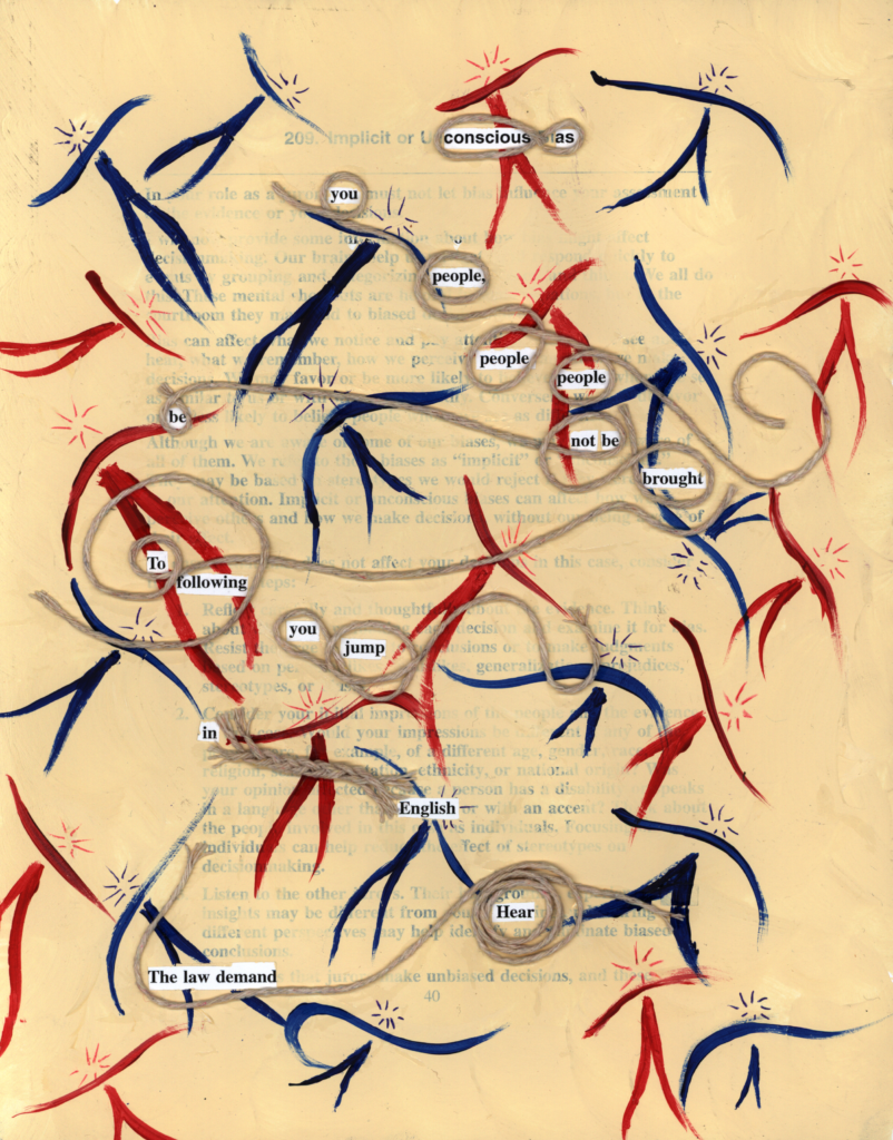
You know those ultra-specific TSA guidelines?The ones where the existence of the rule itself alludes to some air-travel travesty. Like you can just reverse engineer the moment a plane went down because somebody brought Lithium Ion batteries in their carry-on.
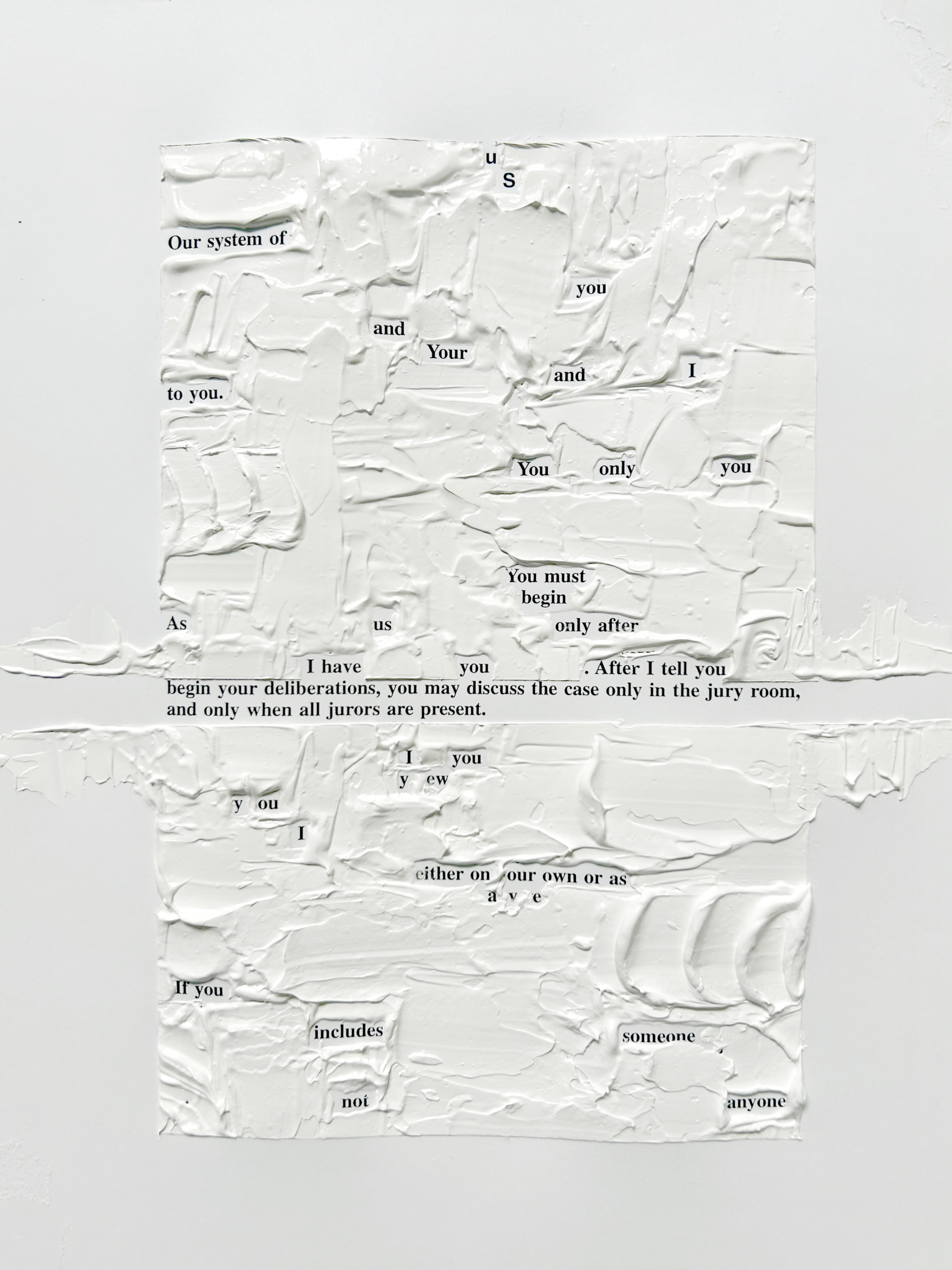
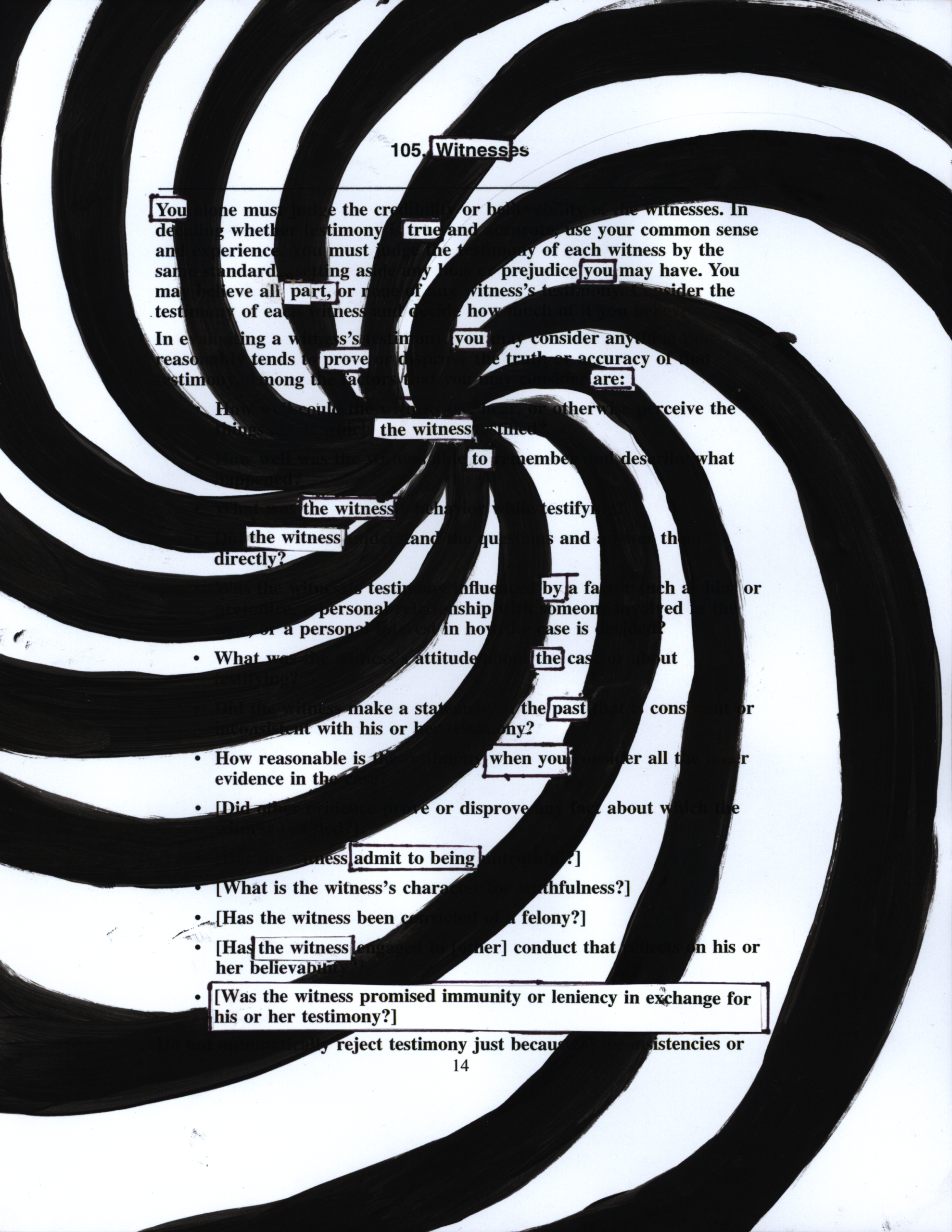
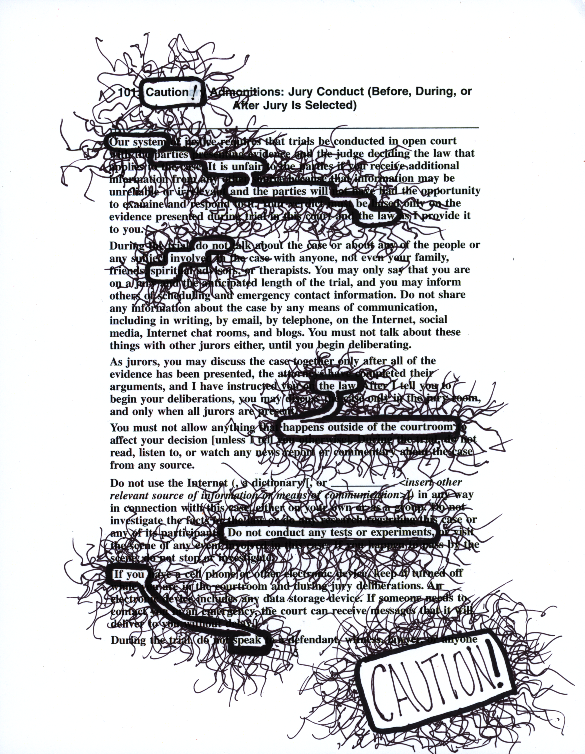
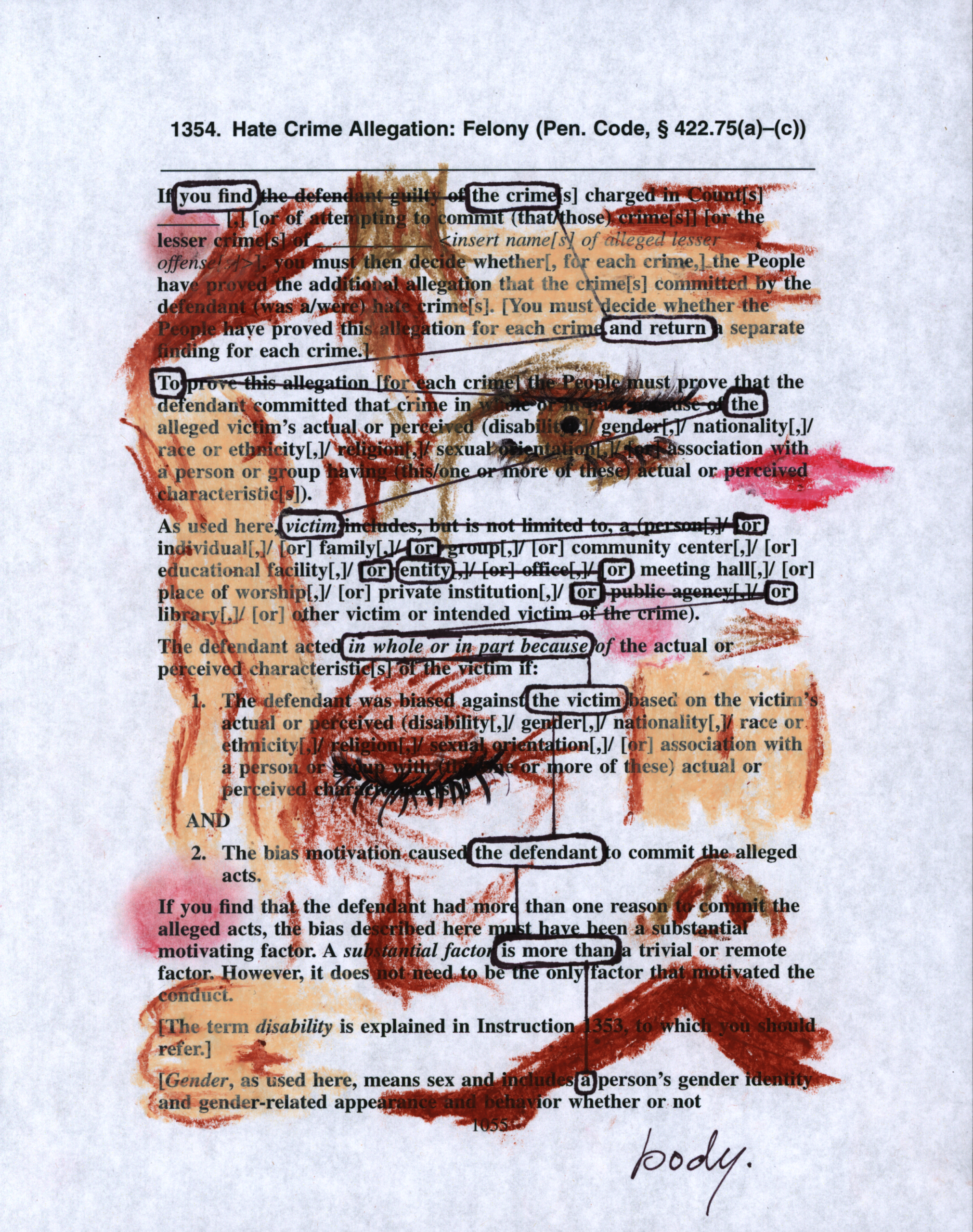
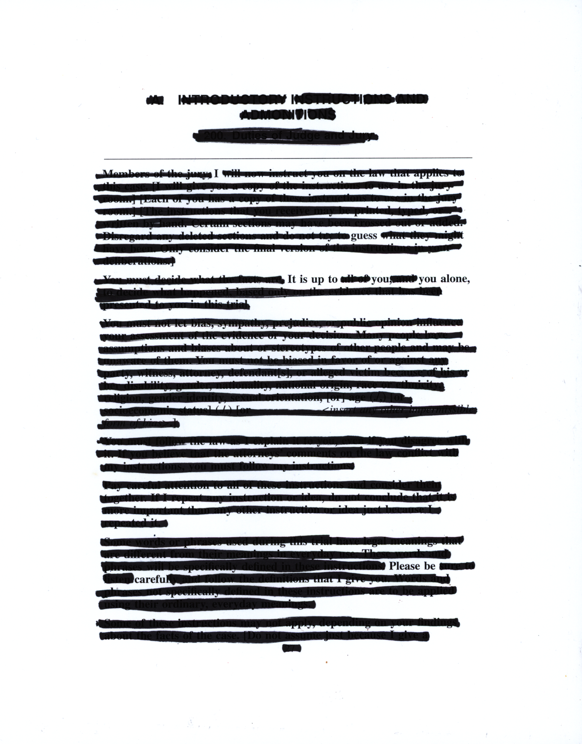
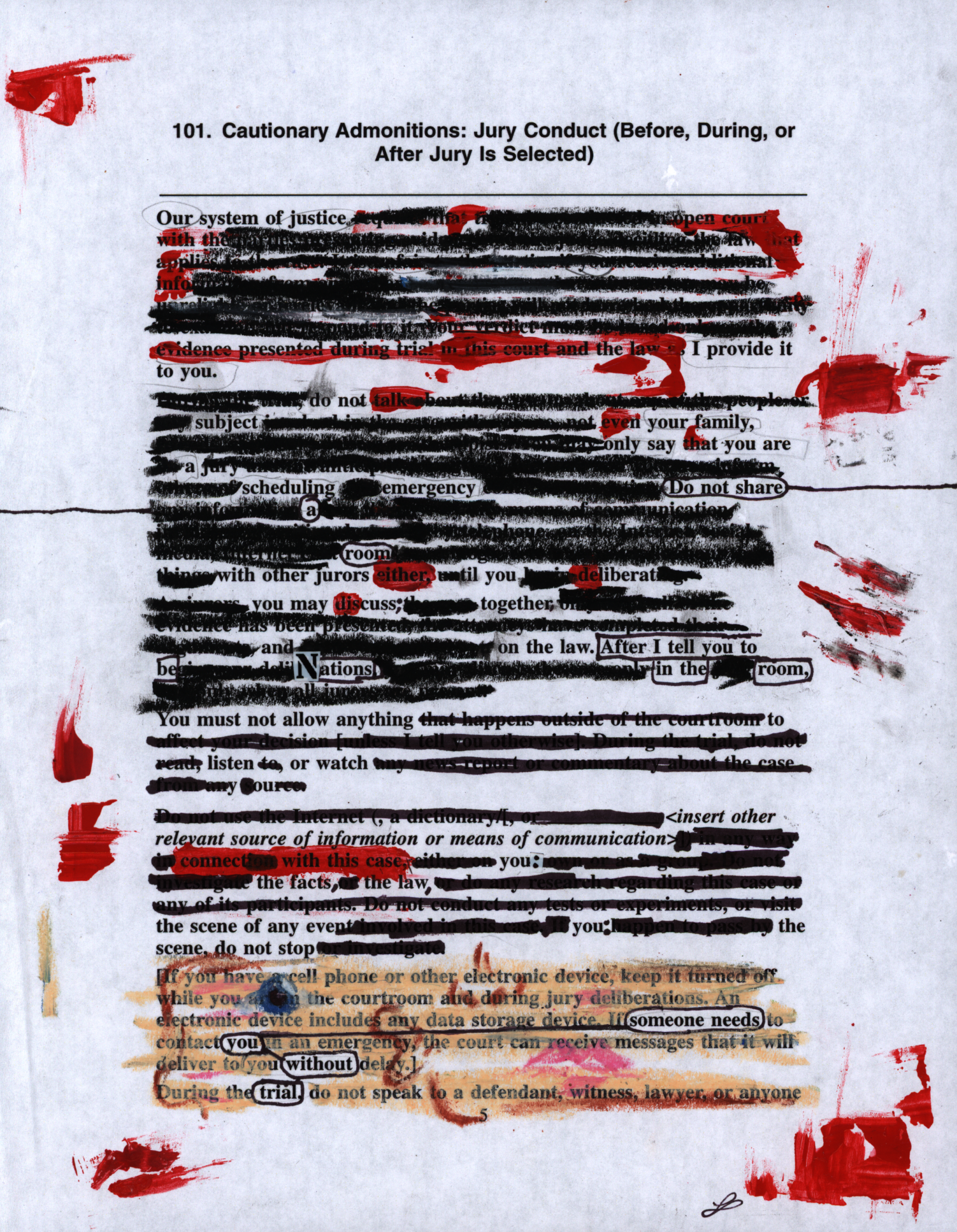
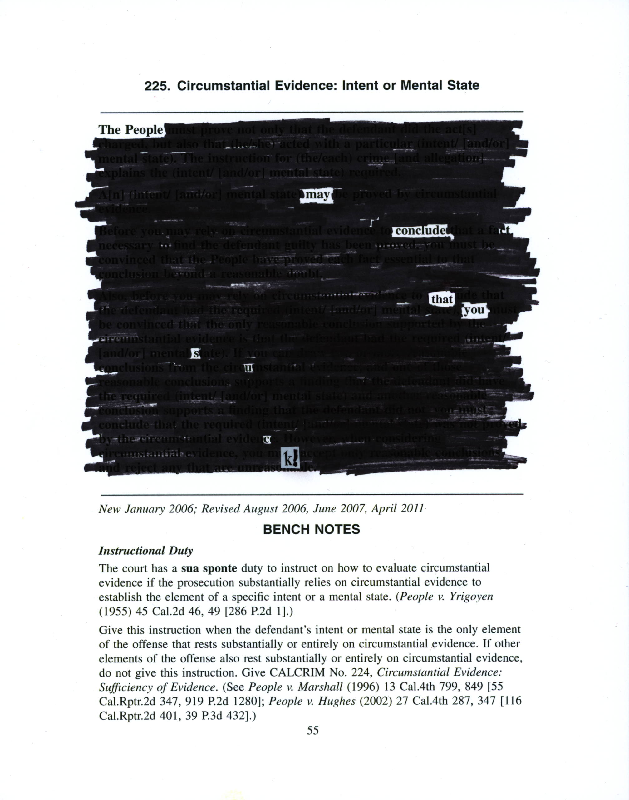
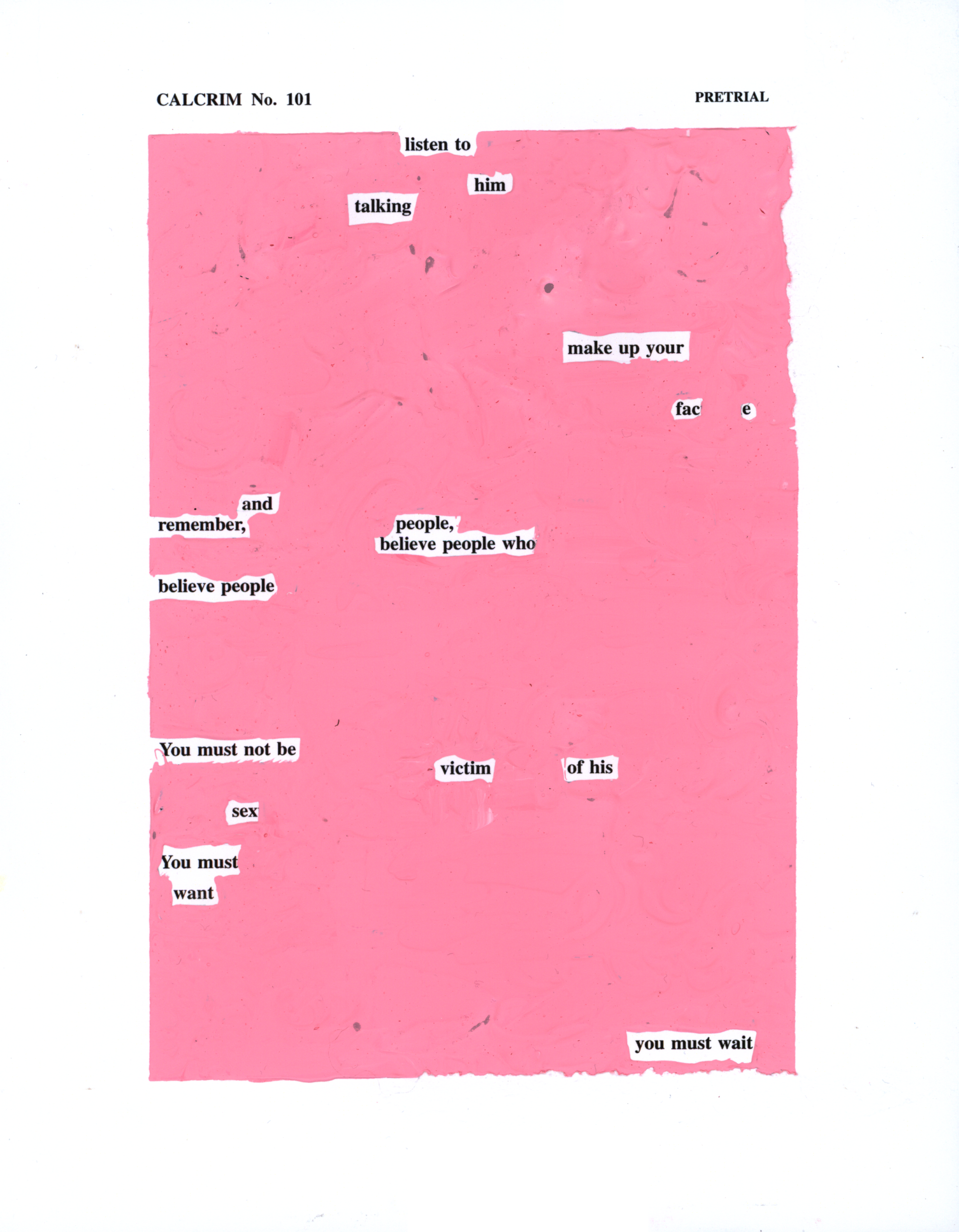
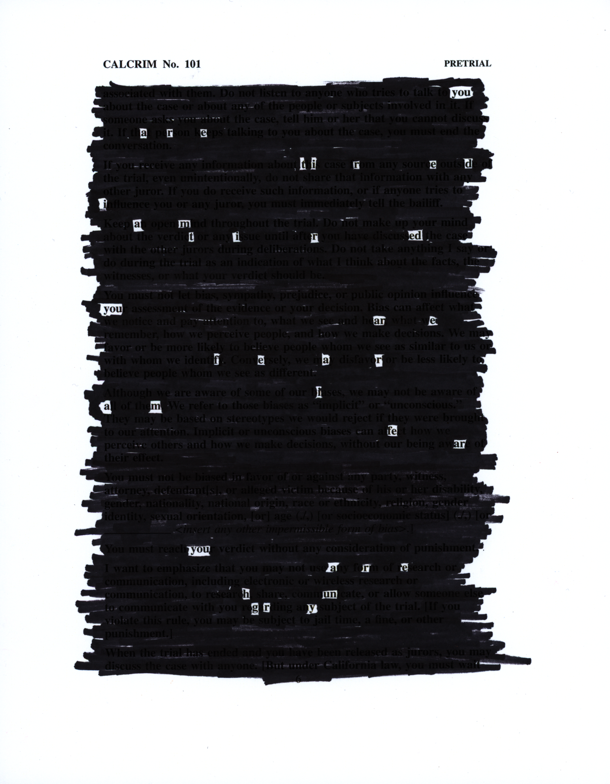
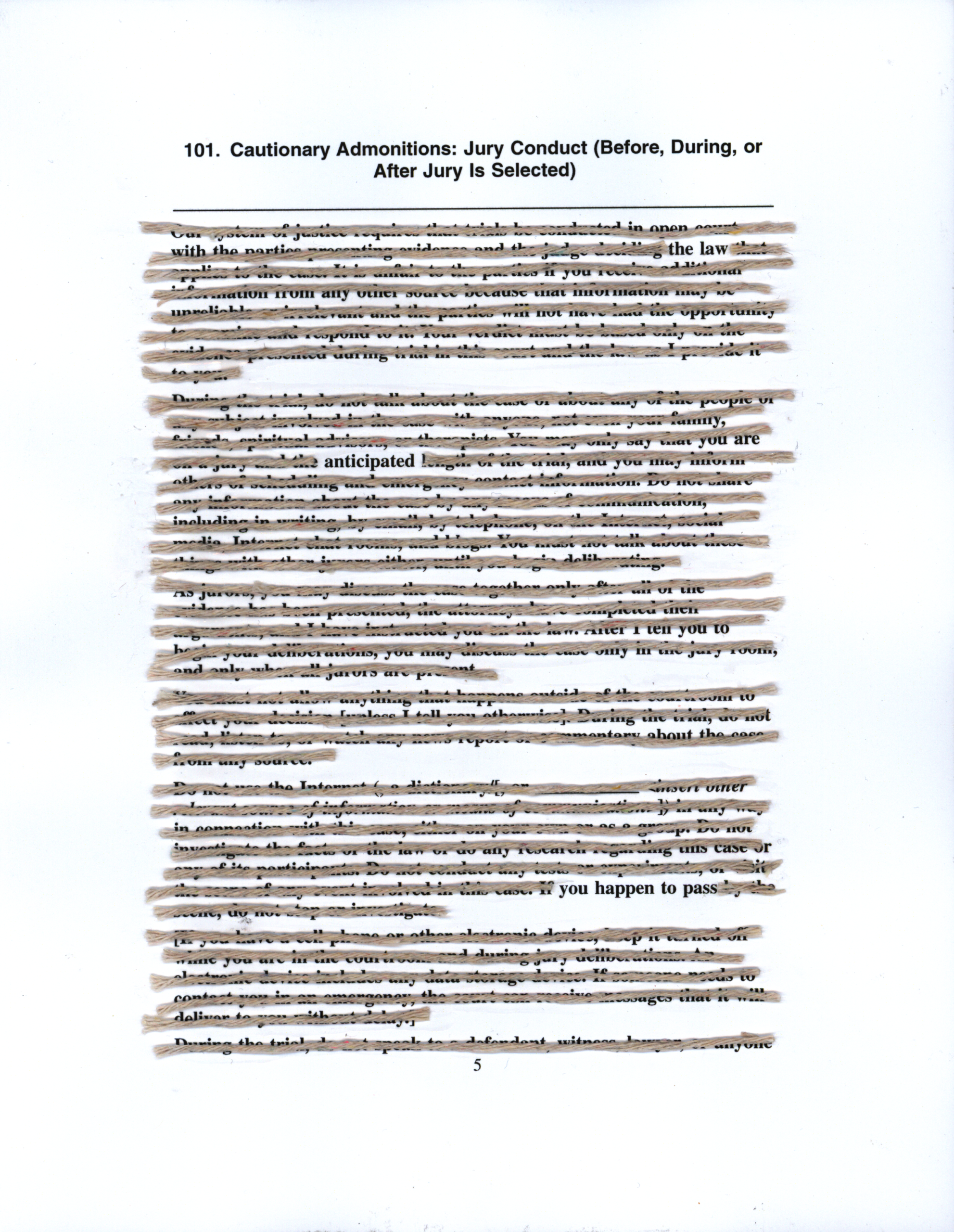
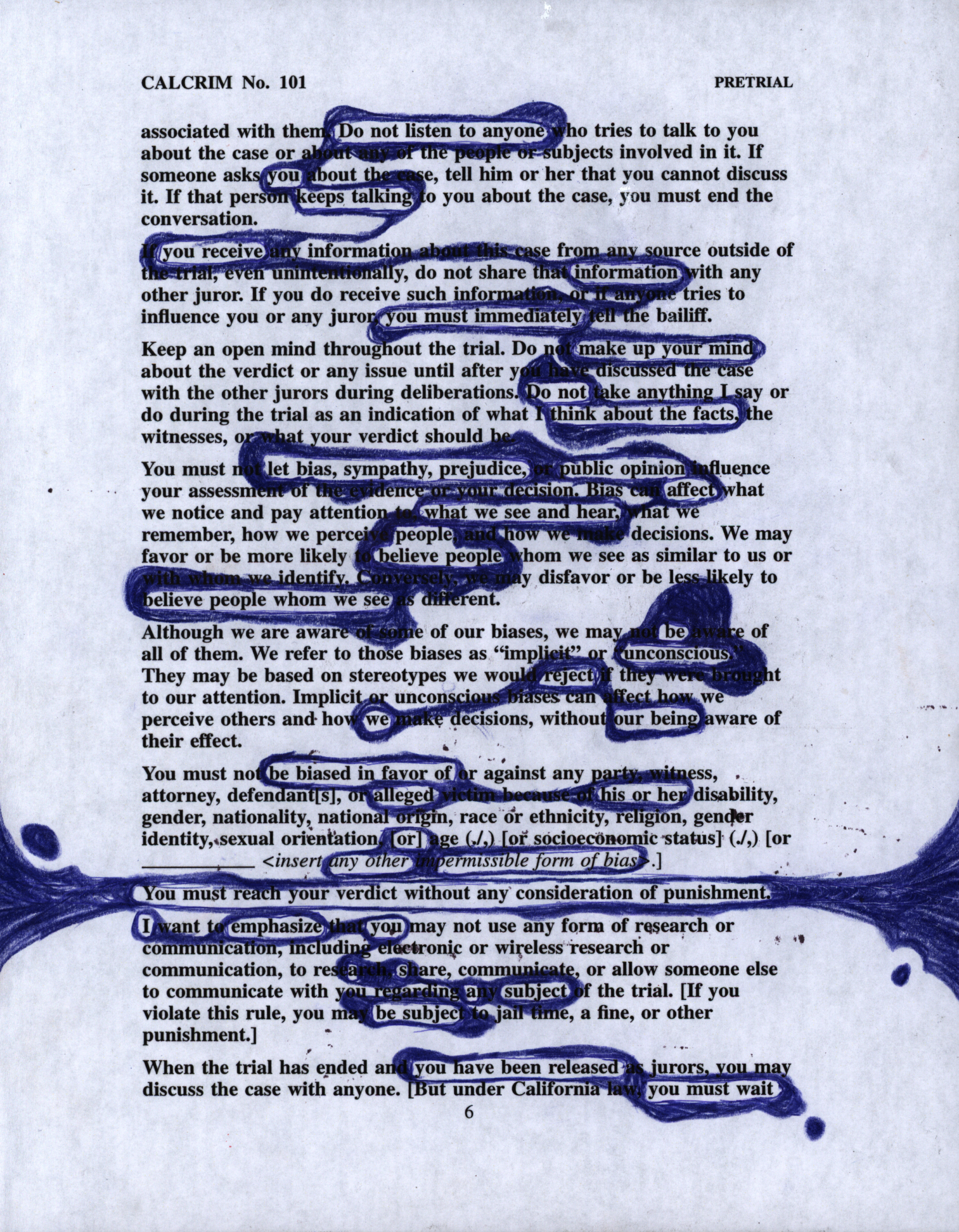
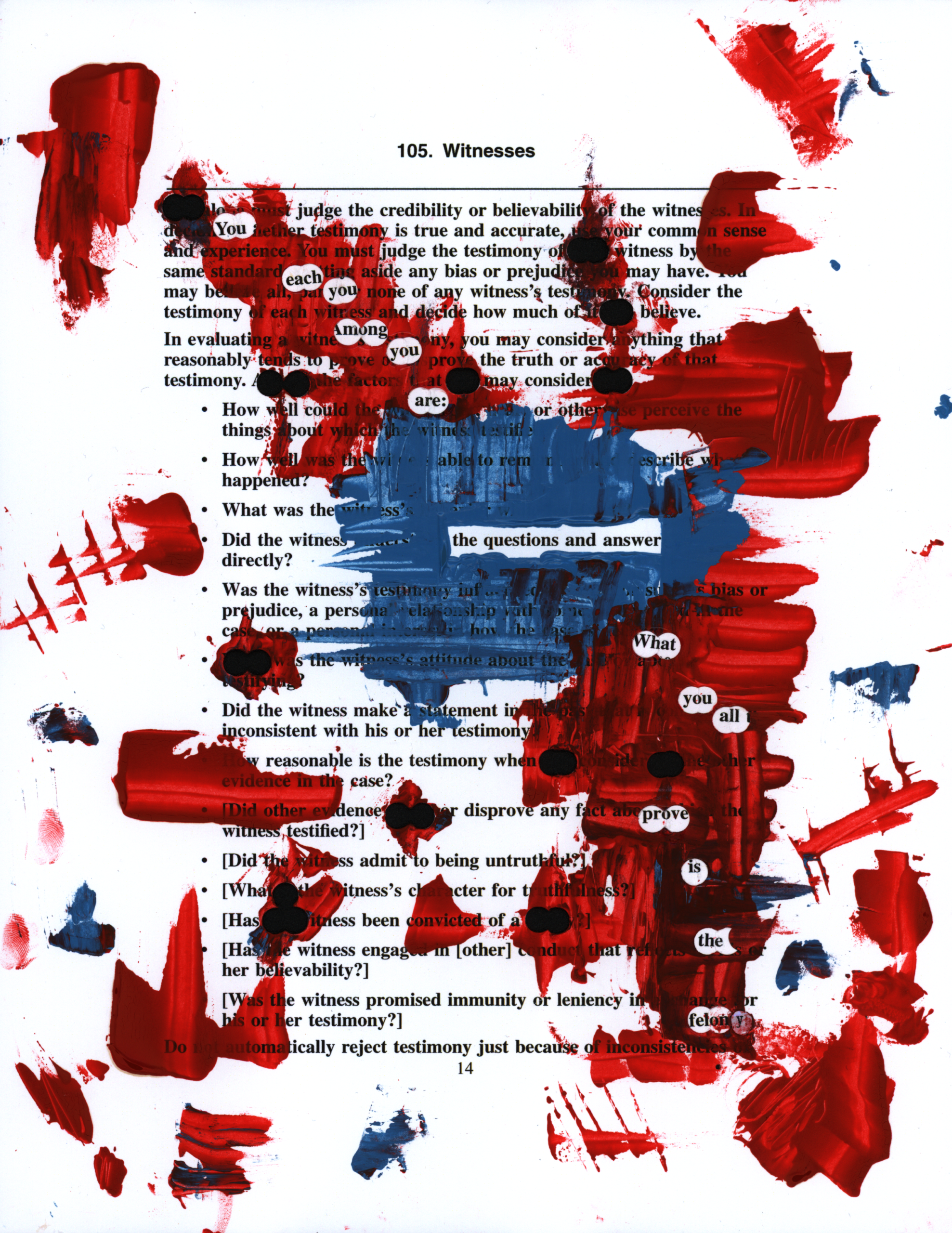
Jury instructions, instructions given to a jury who are about to witness and deliberate on a case, have been curated over thousands of years of discourse in the public forum. California’s most updated version is handily available at https://courts.ca.gov/system/files/file/calcrim-2026.pdf. Sometimes, when reading these instructions, I feel I can reverse engineer a time when people used every tactic banned in the book to make decisions of justice. When a document has been entirely shaped by practitioners and participants of the law, it ends up filled with what I am way too excited to call “people words.” People words—you know those signs out in public which have more language than needed to communicate their message but are endearing for just that reason. Signs that say “Please Stand Back From The Ledge.” Thank you for asking so politely, Sign!
While these documents are covered in people’s fingerprints, they are simultaneously inherently anti-human. These instructions ask people to discard nearly every decision making tactic we have learned: internal bias, background knowledge, discussion with loved ones, research and so on. These documents attempt to isolate the judgement of a crime from the society in which it was committed. So… in this project I aimed to ask where is the human and where is the anti-human? I tried my best to yank out the peopleness (or anti-peopleness) through visual, shape, and poetry elements. I experimented with the voice of each document, either extracting the voice that was already whispering through the page or projecting my own human voice onto the page (i.e. “I am tired” because I was #tired), picking out the people’s words. And the poems have ended up with various characters, intentions, and agendas. This is very much the beginning of this project for me because this practice of black-out poetry, if you can’t tell, is such a jolly good time. This is my collection, Bodies in Law, please enjoy!
Miley Quach & Quinn Wang - Age Progression: Layers of Life
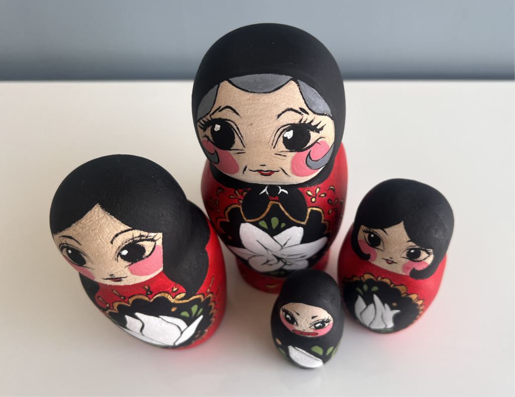
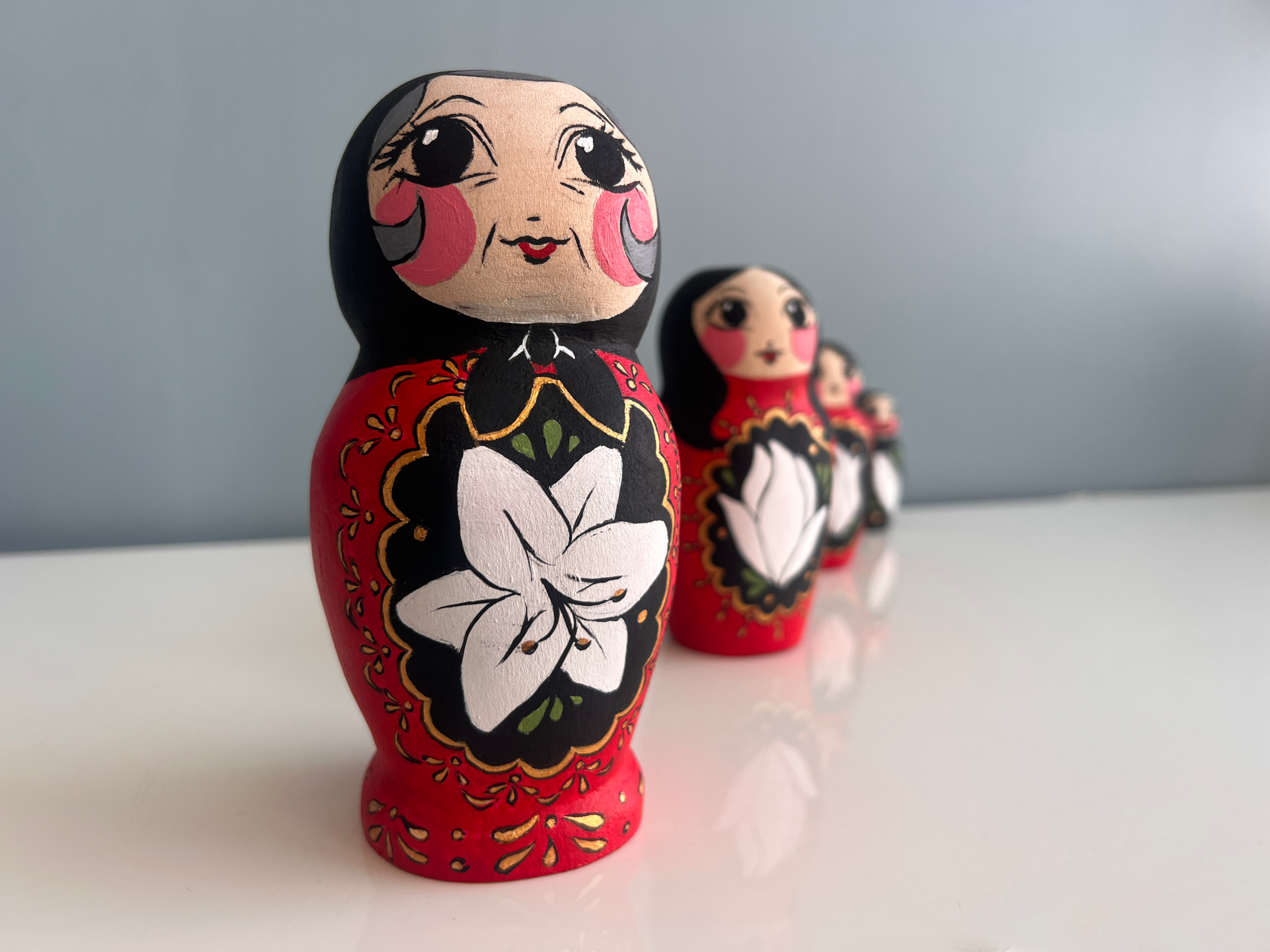
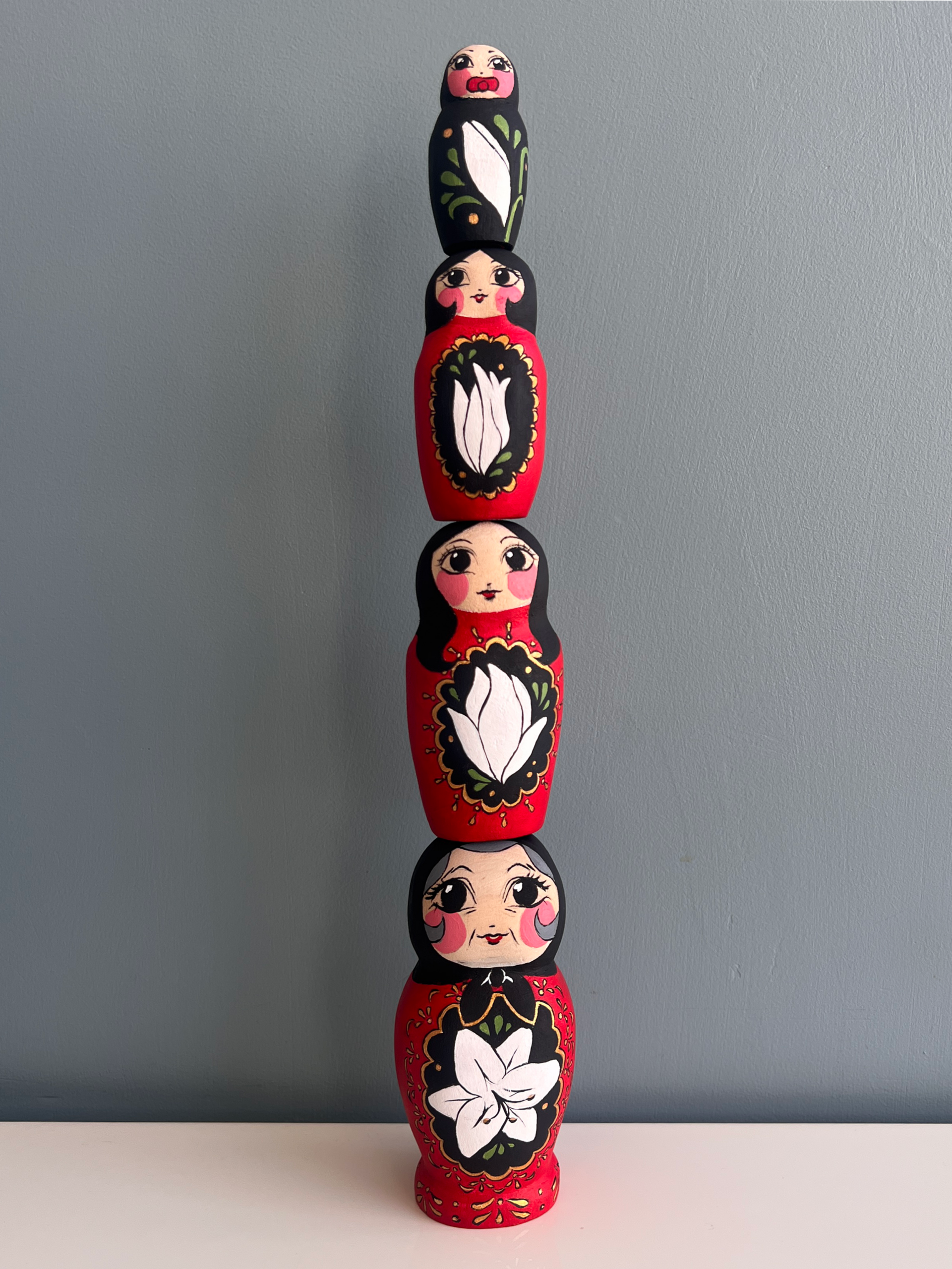
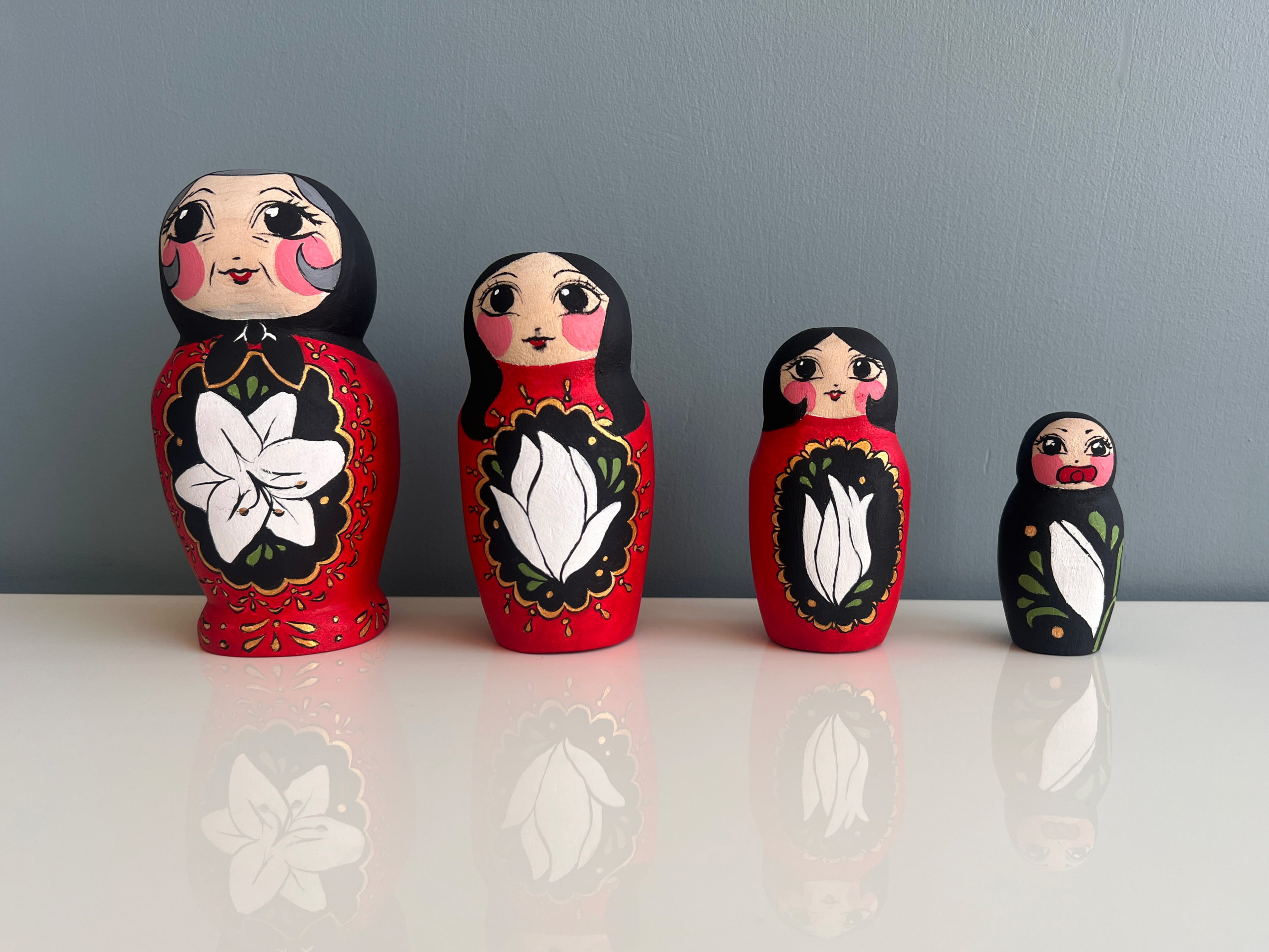
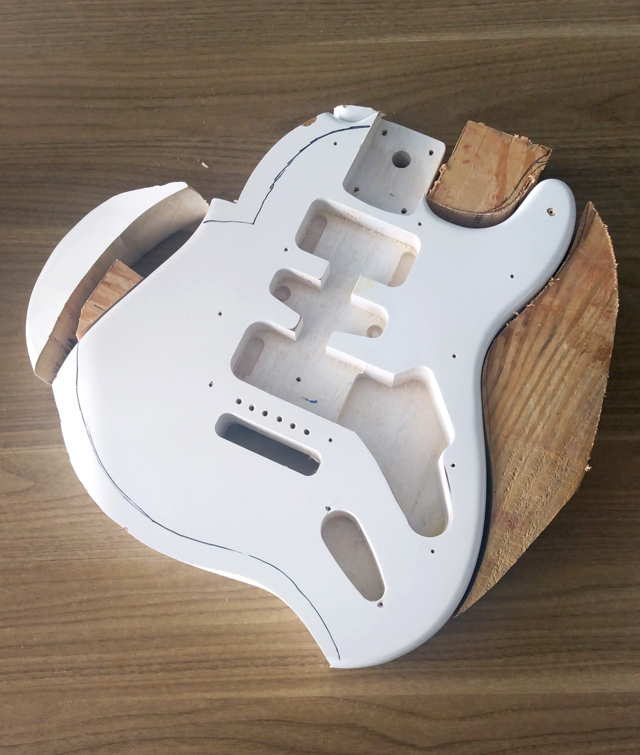
This project was made with our blood and sweat, but no tears. Literally. It took a lot of whittling and sanding to get here, but we finally have a set of four nesting dolls! We wanted to dedicate these to our futures, now that we have graduated and have a sense of moving forward with our lives. Although the dolls don’t fit inside one other like actual nesting dolls, they represent symbolic growth and the idea that as we age and change, the previous parts of our lives remain inside us. We hope we age better than the largest doll, though,
Stella Schulte - The Machines in Your Stomach Have Everything To Do With Your Dreams
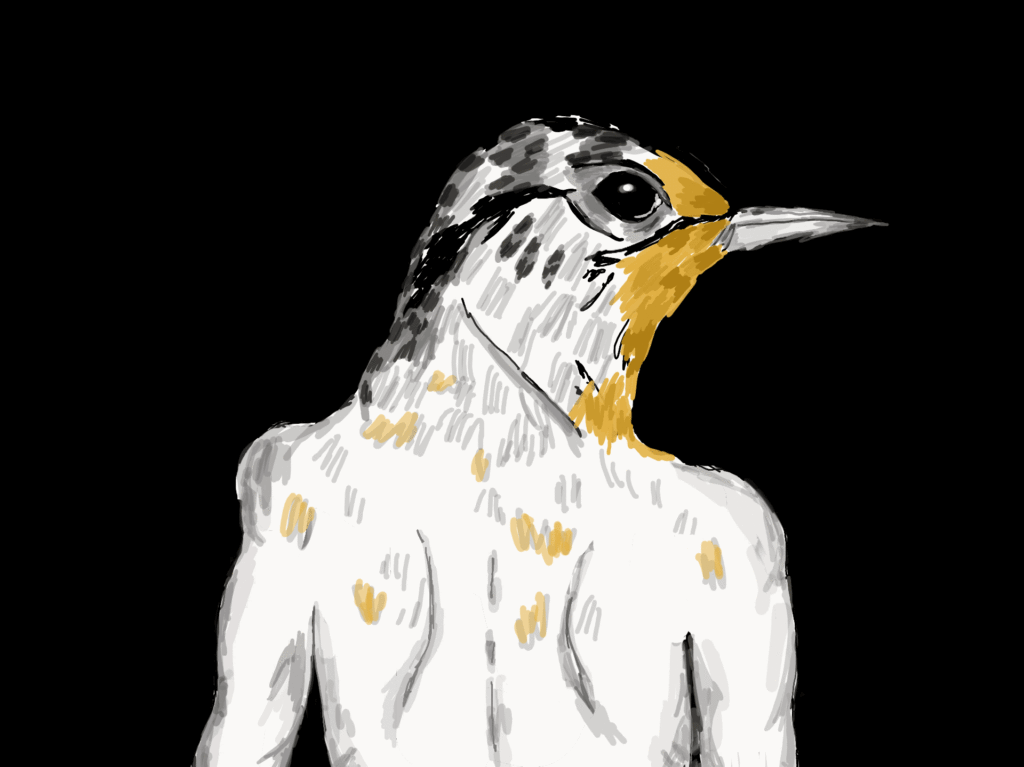
Sometimes, when I am trying to fall asleep, I am kept up by a gnawing voice in my head telling me that tonight I will have a heart attack and die. Before long, my fear of a silent death by cardiac arrest snowballs into visions of my subsequent burial, cremation, or departure of my dead body by a flaming boat sent out to sea. But each following morning I awake, still very much alive, and wonder how I could have gotten so carried away with the wellbeing of my blood-pumper.
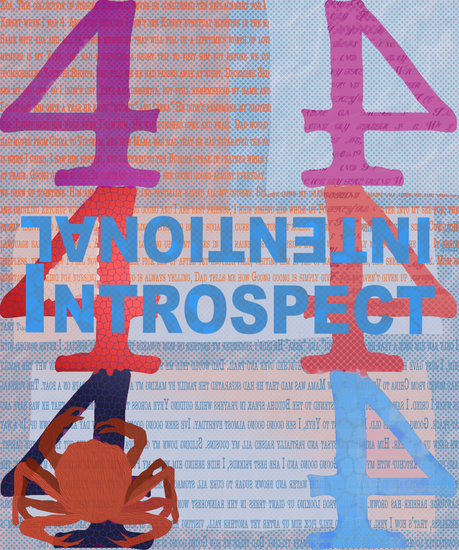
It was on one of these nights that my worrying was interrupted by the song The Machines in Your Stomach Have Everything to Do With Your Dreams by Califone. It moved me, and I could feel my heart pushing out of my chest to beat in harmony with the music and I started to cry. I could see pictures in the sounds: a spiny back, bird head, dog teeth, and my mom, whose presence next to me while I sleep seems to be the only cure for my ‘heart problems.’
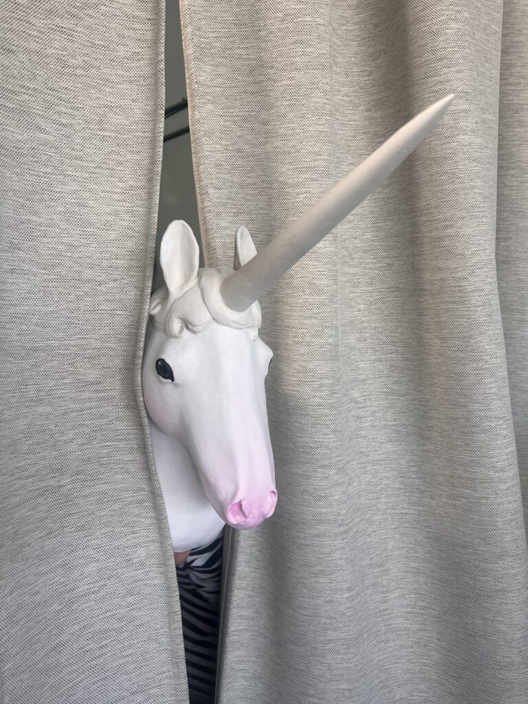
Lena Toner - LIFE IS FRAGILE
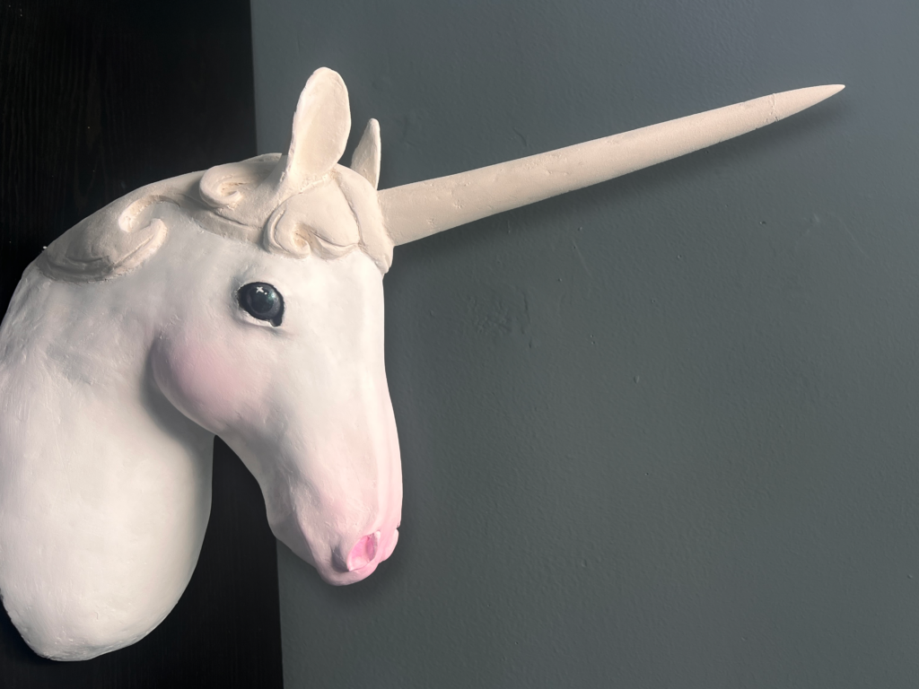
It’s a sin to kill a unicorn. Probably. I wouldn’t know, because this one isn’t made of flesh and bones and hair. What do you think would happen if you were to kill one? I think it must follow you, to do something so terrible, to stain your hands with the blood of the innocent. The body of the unicorn probably has magical properties (although, I’d bet they were more magical alive). It’s probably the opposite of a good luck charm, which I guess is just a bad luck charm, but why would you keep a bad luck charm on you? A bad luck charm would probably attract storms instead of rainbows and bugs that bite and gnaw instead of bugs that flutter and dance. But, you know, just to reiterate, none of this applies to me. Because I didn’t kill a unicorn (and I wouldn’t, if I ever saw one, to any unicorns out there reading this).
Zoe Vernier - Brain Food: Served!
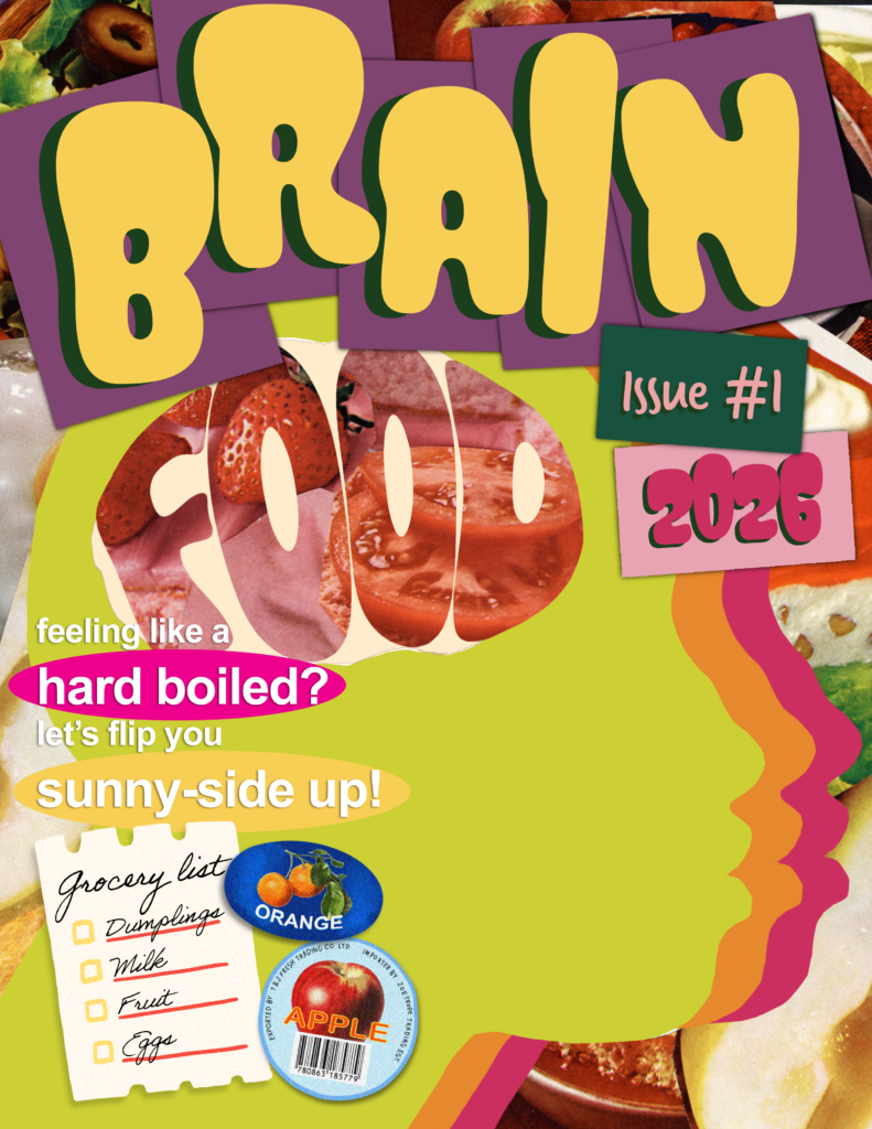
Zoetropia here! Summer is finally here and so is my latest installment! The latest additions to my ongoing magazine are two freshly-baked articles, titled Dairy Bones and Freedom From A Freshly Cracked Egg. The composition of Dairy Bones was heavily inspired by Swiss Design, a minimalistic design style that focuses on clarity and geometric formats. The design style stood out to me because I wanted
While I did burn through some batches, I’m truly proud of the recipe I created, cooked, and taste-tested in the end. After hours of blood, sweat, and seasonings, I’m thrilled to inform you that the first issue of Brain Food has been released this summer! Enjoy!
My featured article, Freedom From A Freshly Cracked Egg: A Yolky Perspective On The Internal Imprisonment, explores the depths of how external oppression and imprisonment can strip one’s internal thoughts of self and the cloudiness of the future they once envisioned. Here’s my favorite takeaway from that interview that I decided to add to the article: “Freedom is a funny thing. You don’t realize you’re truly free until you spread your wings wider.”
Listed below are the credits and acknowledgements I give towards the valuable lives that contributed their time, perspectives, and personal narratives to make this magazine:
Gala the apple
All of the dumplings I had the honor to get to interview
The wise young egg cracked into a bowl.
The guy on the cover whose brain is made of food.
The fork model I hired for the back of the book (You did an outstanding job!)
P.S: Brain Food is now officially available wherever fine groceries are sold.
P.P.S: Orange you glad I didn’t use so many food puns this time?
Priya Chichester - The Funky Modern Car
Where did all the unique cars go? Modern car design has become bland and uniform, and has lost the artistic design aspects that made cars compelling to the eye. The average new car is just another clone of the next, with companies aiming for a sleek and minimal look that never seems to be executed well. With this project, I created my own car design in hopes to prove to myself (and others) that unique cars can still exist.
Through this design, I not only try to solve the issue of ugly cars, but also try to teach myself the basics. This car may not be physically/mechanically accurate or efficient, and is in no way a comprehensive approach to design, but the ultimate goal was to create a few solid and presentable sketches of a car body that stands out from other modern cars. My sketches include a side view, as well as a forced perspective front and back view that are all made to scale by hand. The colored sketches are intended to show shaded detail rather than the desired color, as I wanted to highlight the complexity of the car’s details.
I learned that designing a car is a big job, and takes much more into consideration than I had known, even without considering the interior or mechanics. The many intricacies leave so much room for creativity, so overall I believe innovation and aesthetics should be better reincorporated into current car design rather than trying to fit some bland and monolithic standard.
Sherri D'Silva - The Power of Love

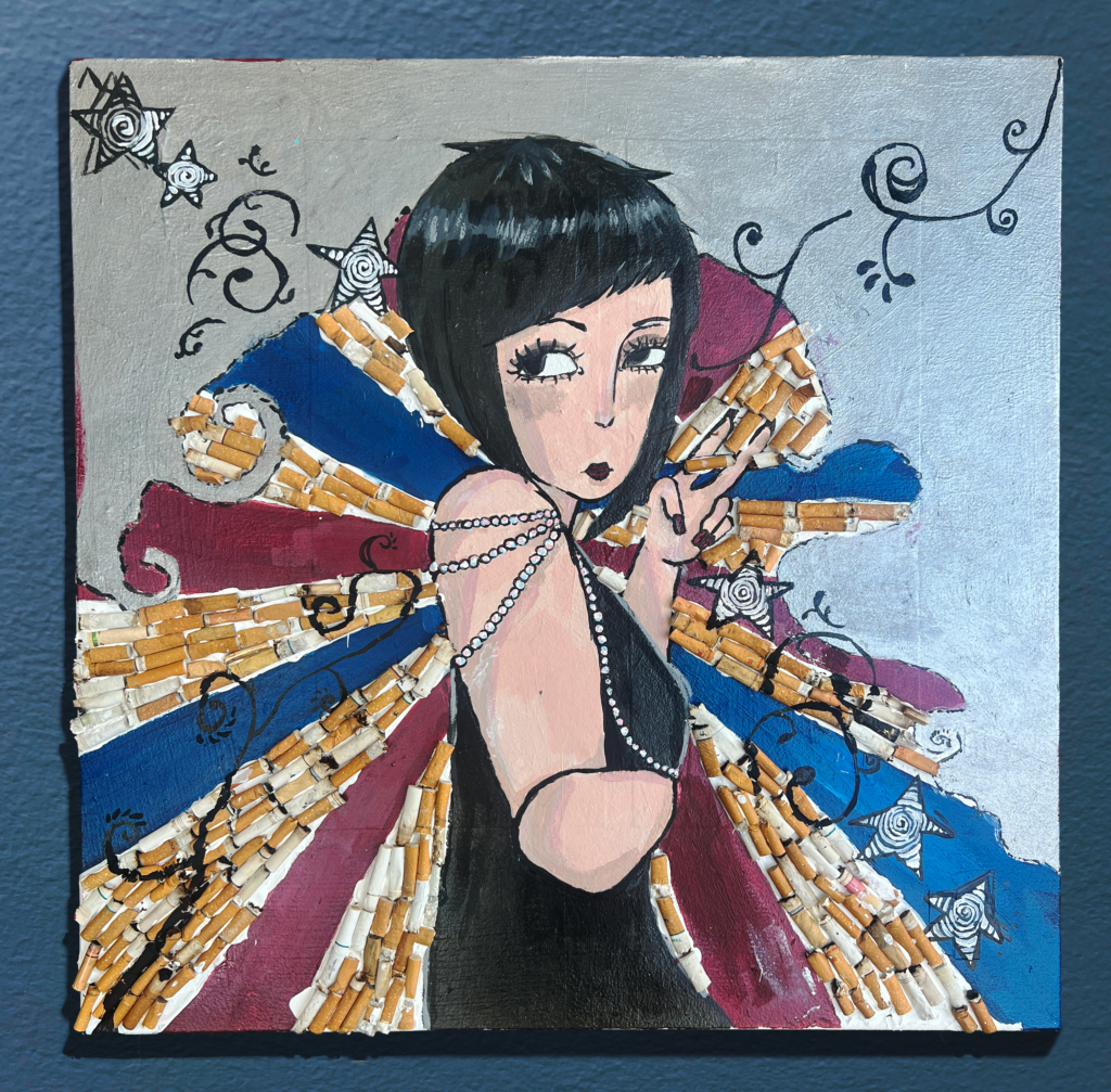
Giovanna Lorizio - Perfume Won't Cover The Smell
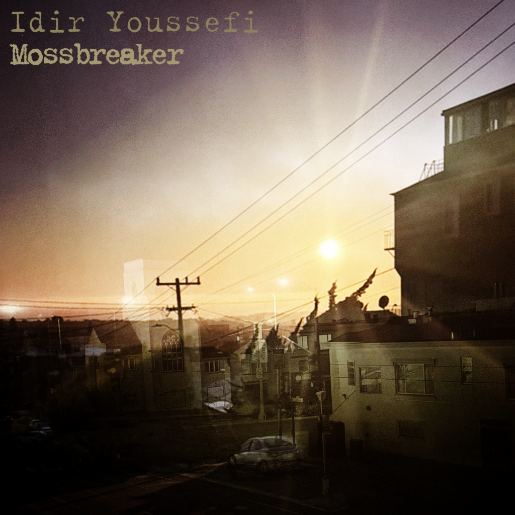
Idir Youssefi - Mossbreaker
Simone Basmajian - 15 Artifacts of Girlhood
From the personal collection of Simone Basmajian, this exhibit showcases a remarkable spectrum of objects that are both mundane and precious. One might find any of them in the jewelry box of a certain child from the early 21st Century. From cheap plastic beads and stretchy string to gold adornments once belonging to girls who have long grown up, we are taught of the cyclical nature of growing up: incredibly unique, while also being remarkably similar.
What lies ahead is a journey through time and girlhood via jewelry. By the time you are done, the hope is that this display will give you a meaningful glimpse into life as a child in the 2010s.
Zoe Cannon - Home in the Sunset
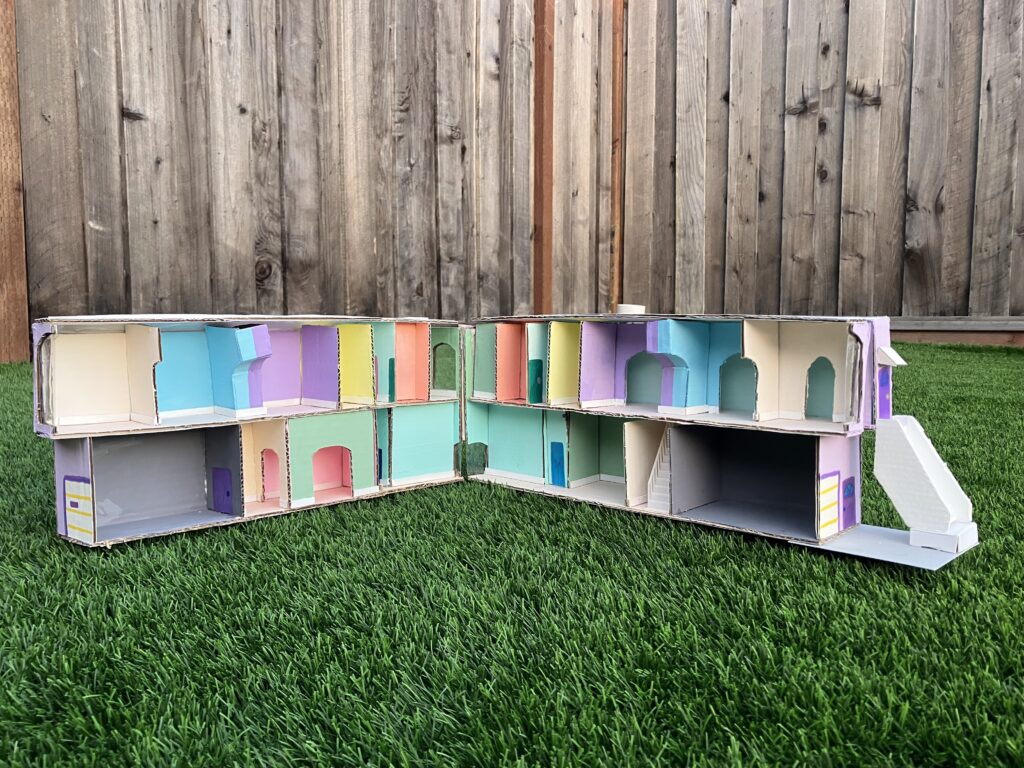
Raley Cheung & Aislyn Lee - The City As A Set
When watching movies growing up, there were times where we’d recognize the setting of a certain scene, which created a much more personal relationship to the story in the film. As a visually beautiful and unique city, there are a ton of movies that are filmed in San Francisco and we thought it would be really fun to go around the city and visit locations in those films ourselves. Throughout the short film, we visit iconic filming locations and see how the locations have changed, inserting ourselves into these iconic locations that are often hidden in plain sight.
Jane Welch - The Dead Moon
The Dead Moon is a high fantasy novel-in-progress that combines elements of adventure, action, thriller, and mystery. My story includes human heroines and heroes alongside mythical creatures that include vampires, werewolves, dragons, shapeshifters, elves and other creatures that you’ll need to read in order to discover! I’ve been working on my book since the pandemic and have completed nine chapters which are all included below. Enter the world of Hynafal…
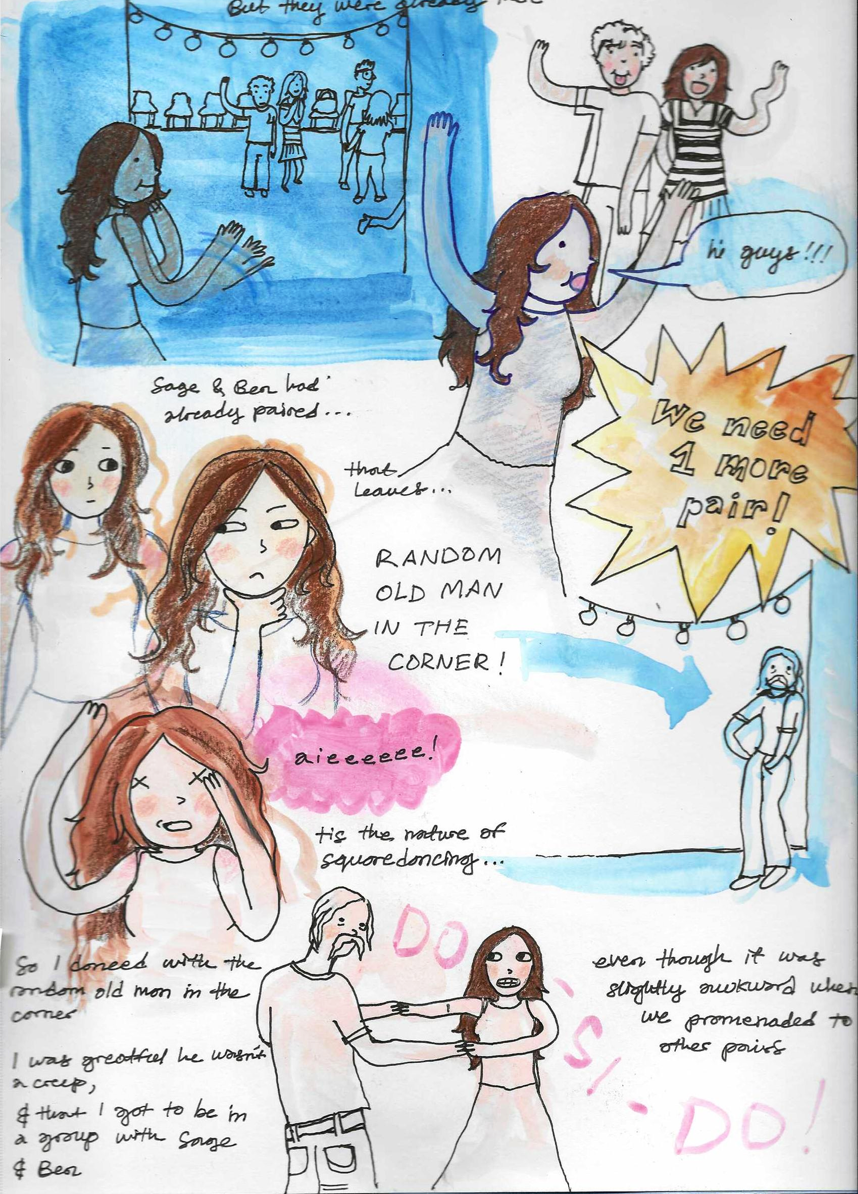
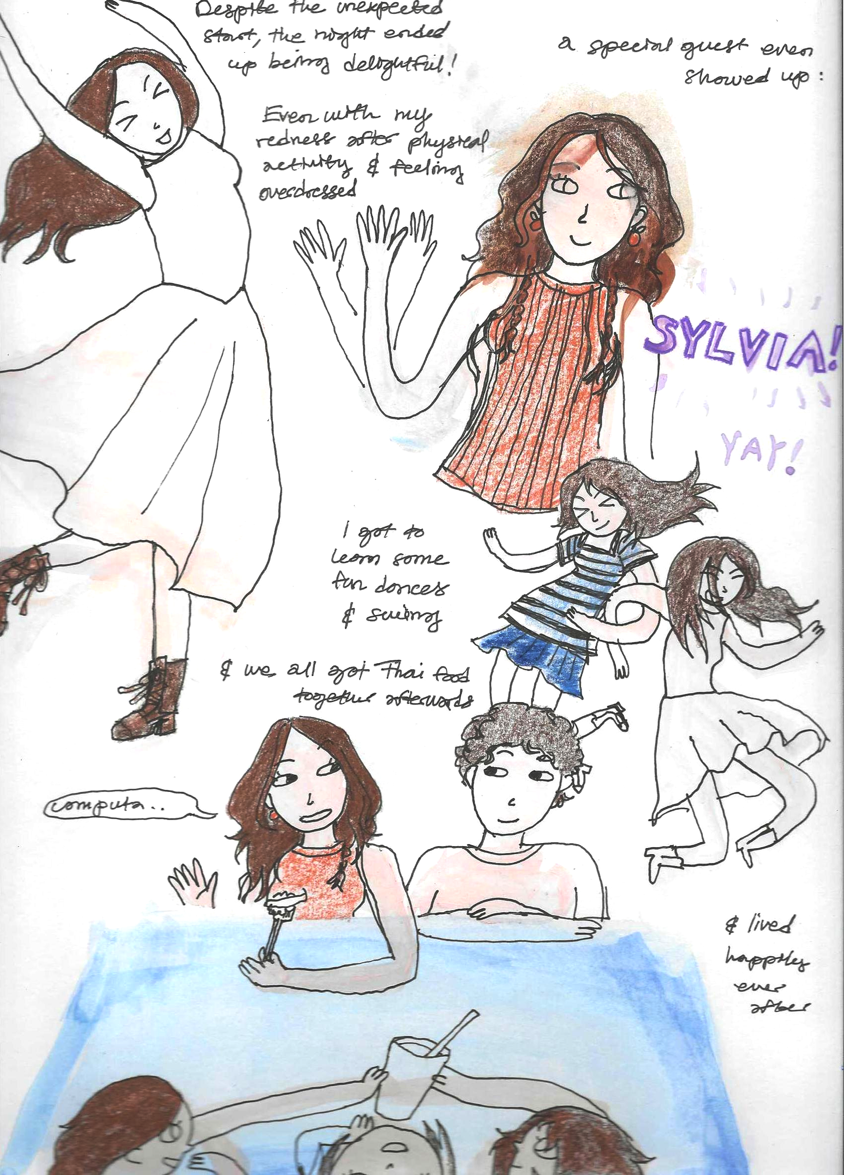
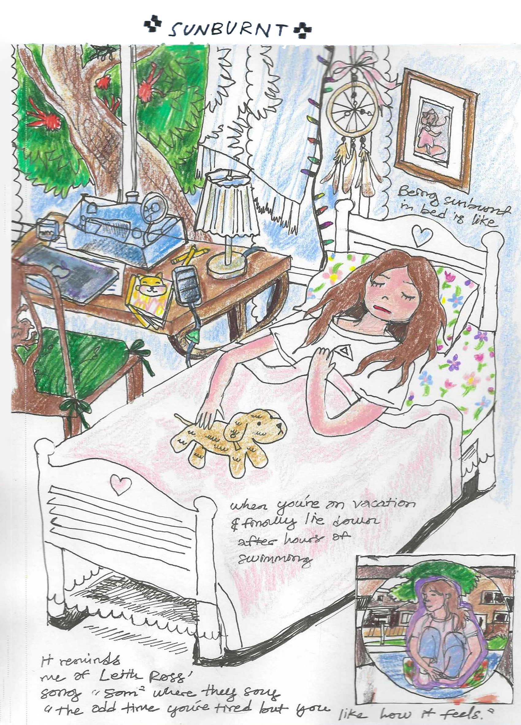
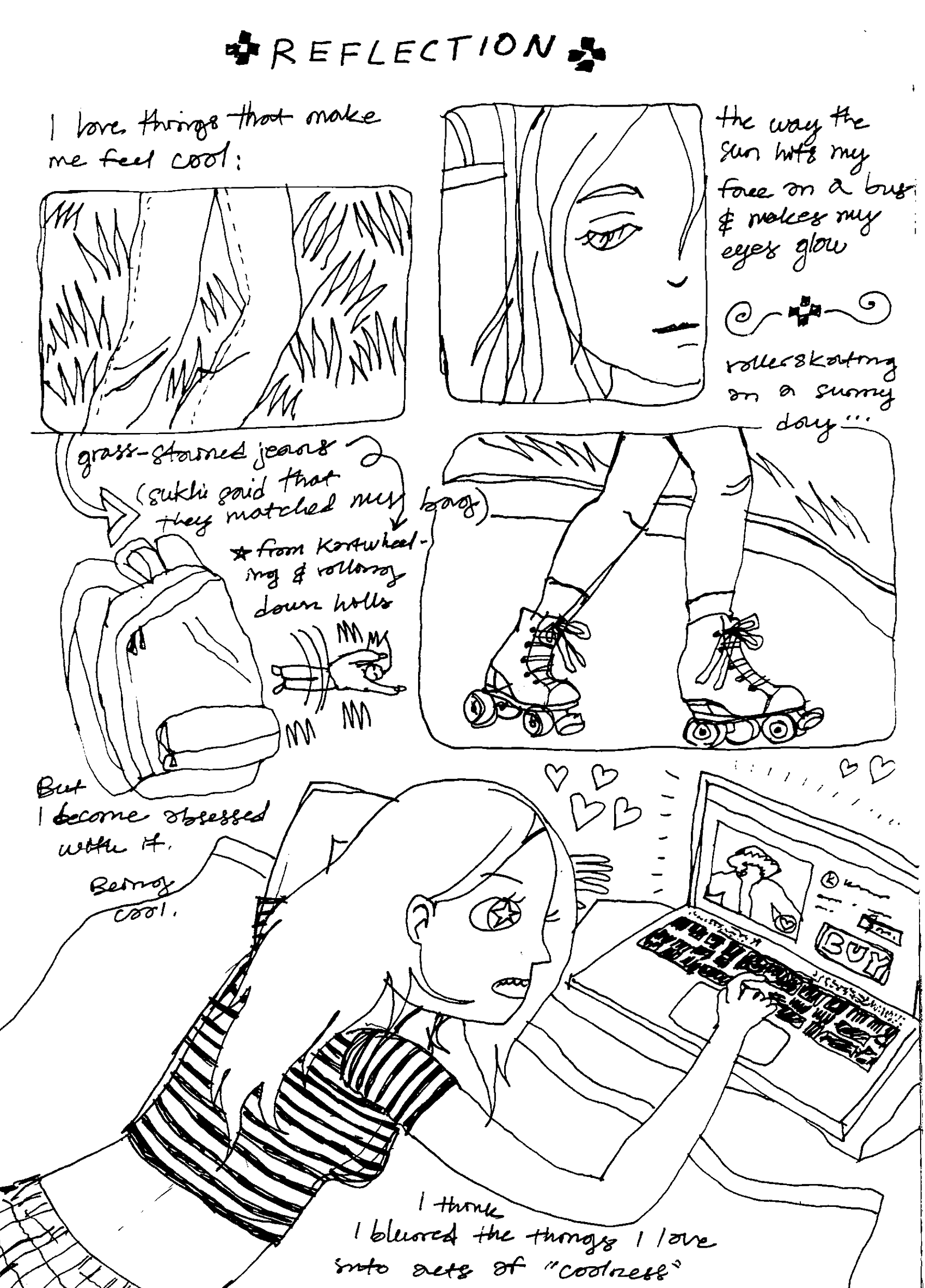
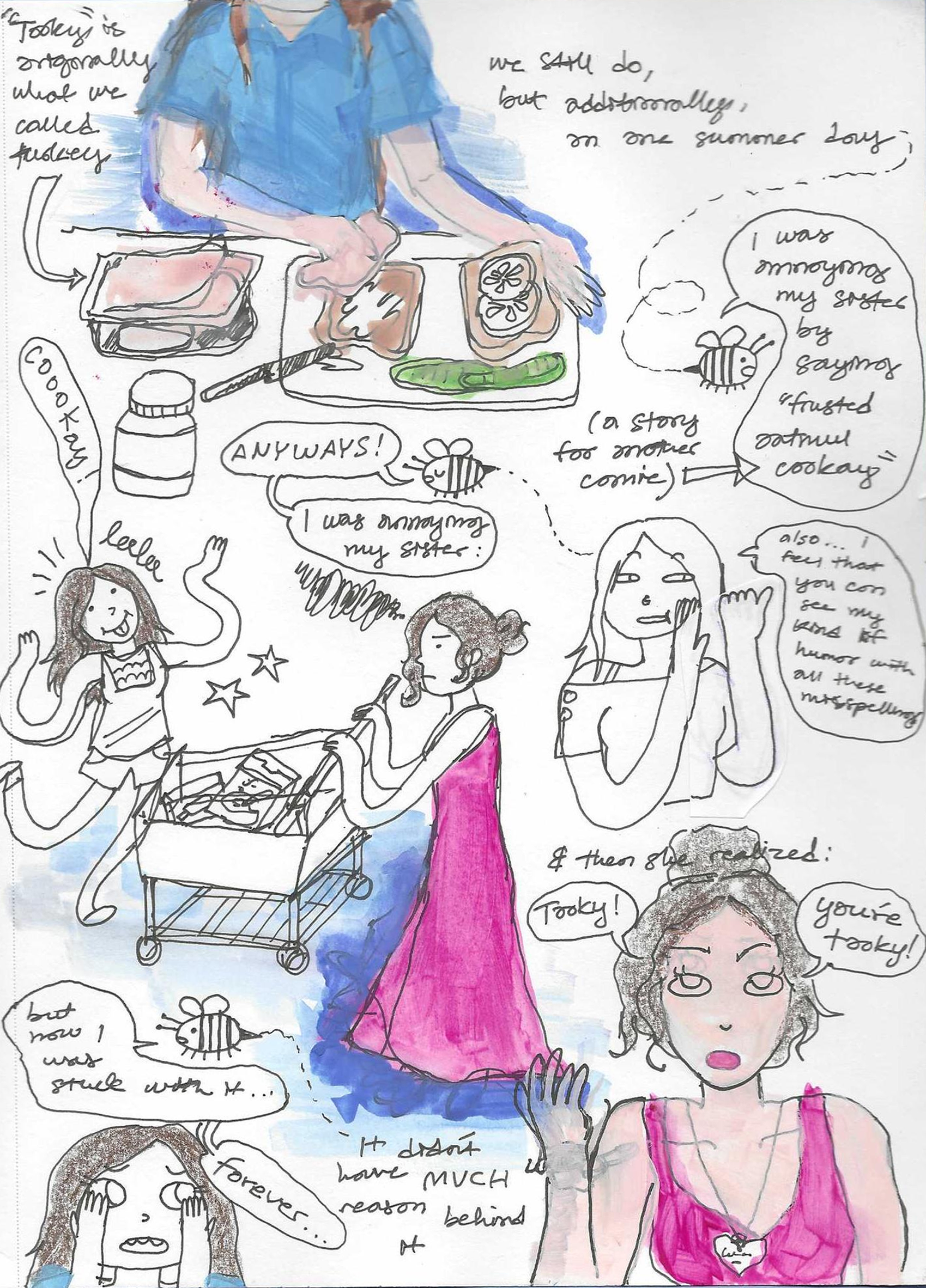
Josephine Beebe - Sentimental Lady
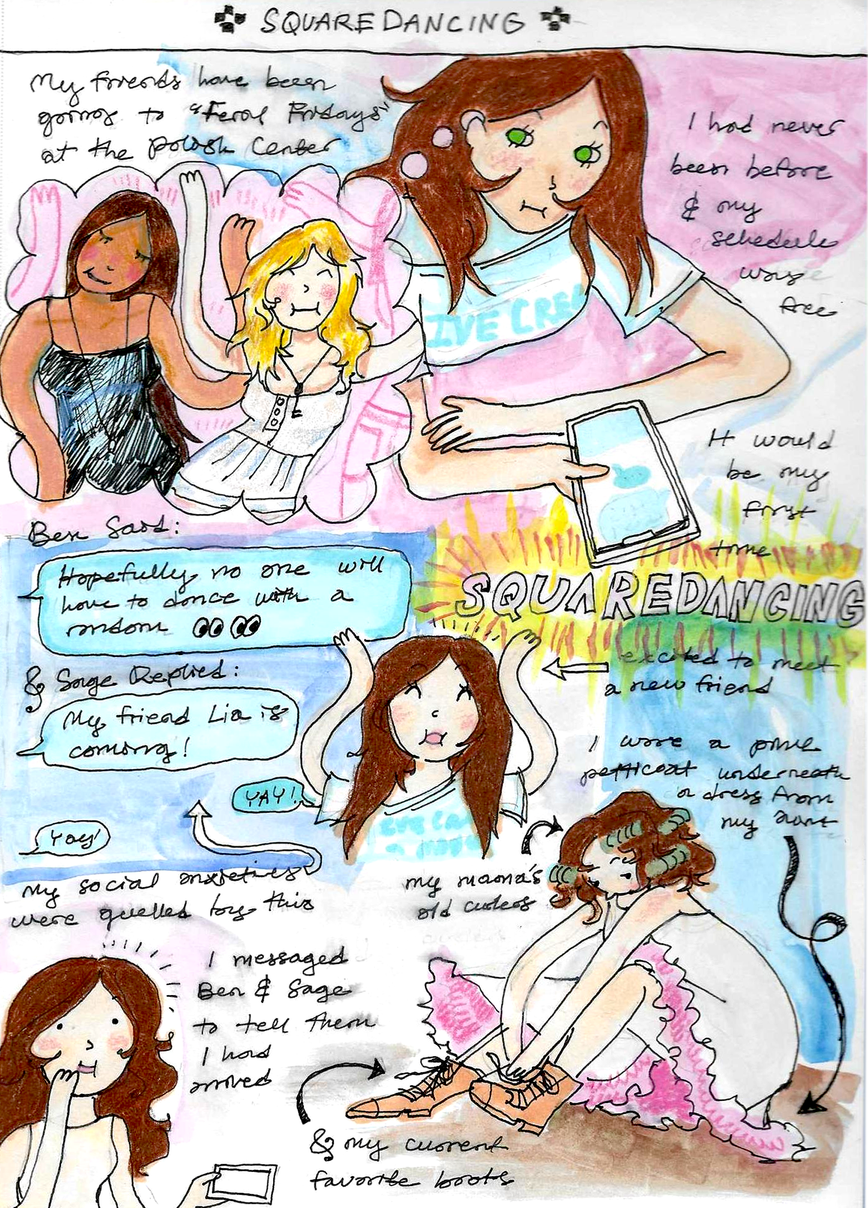
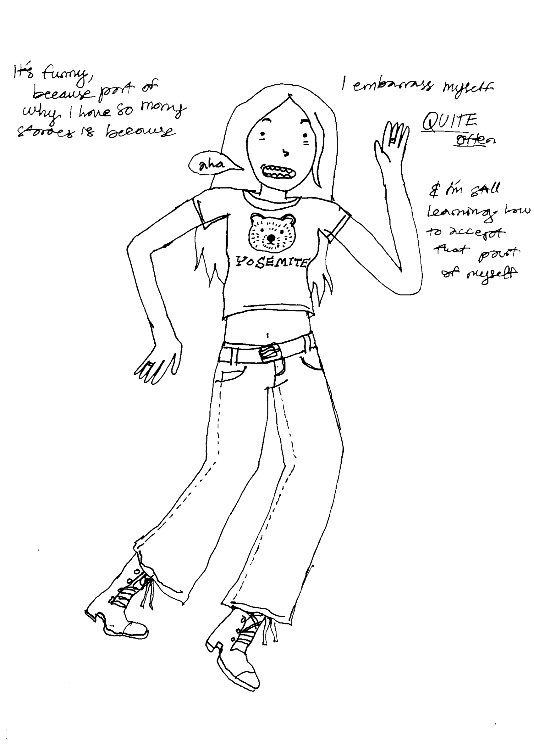
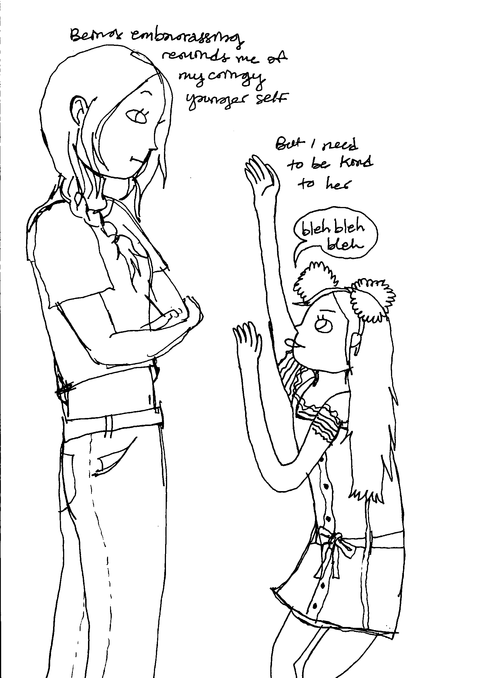
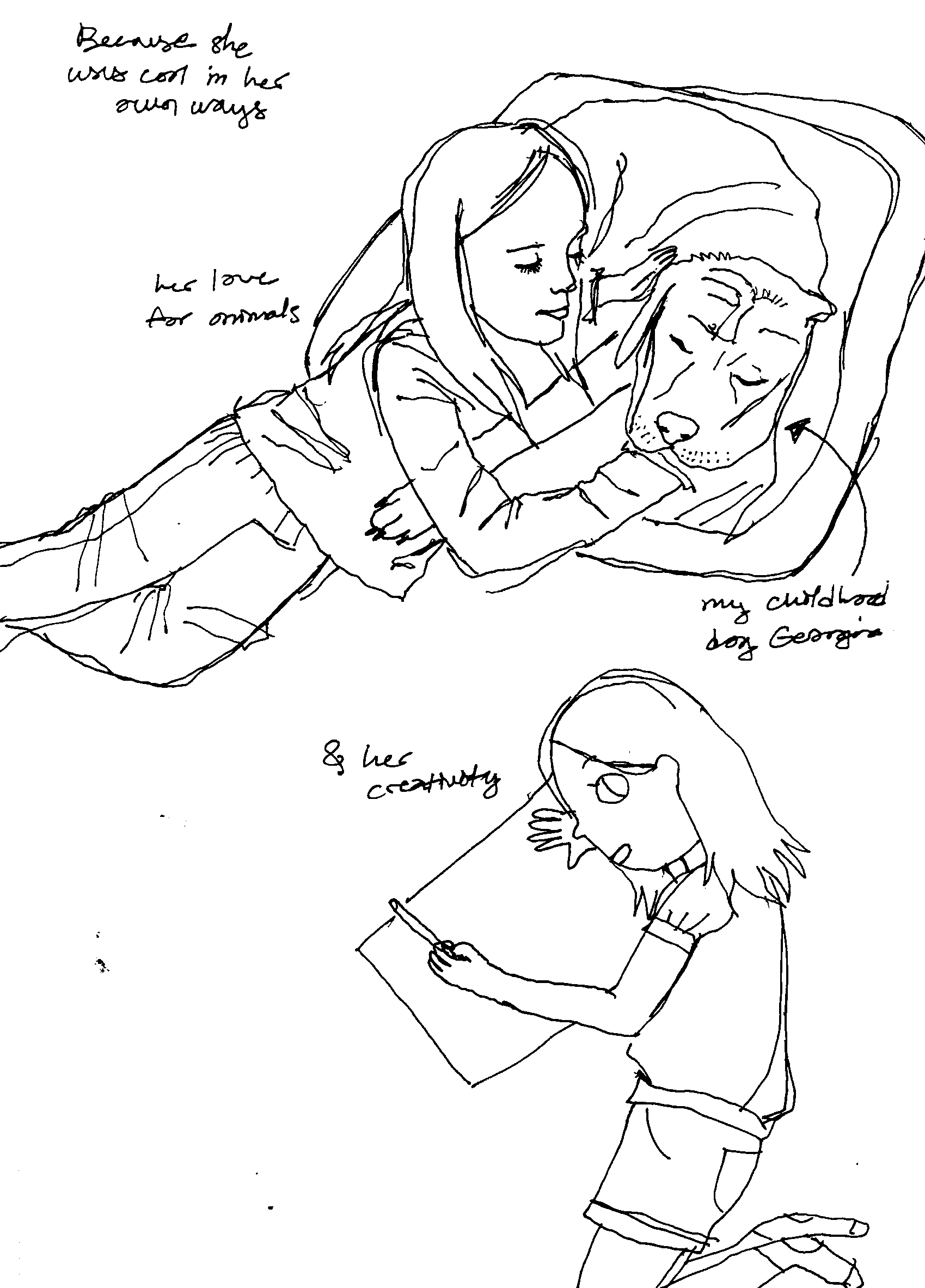
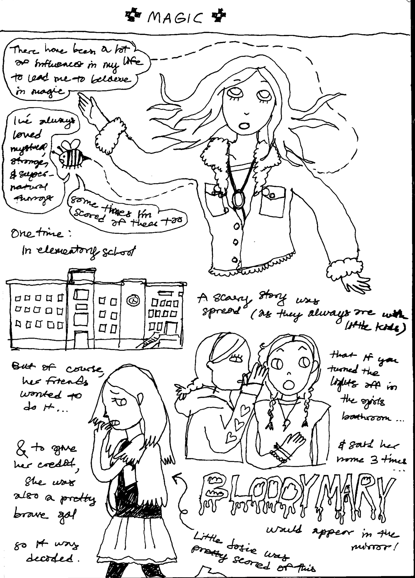
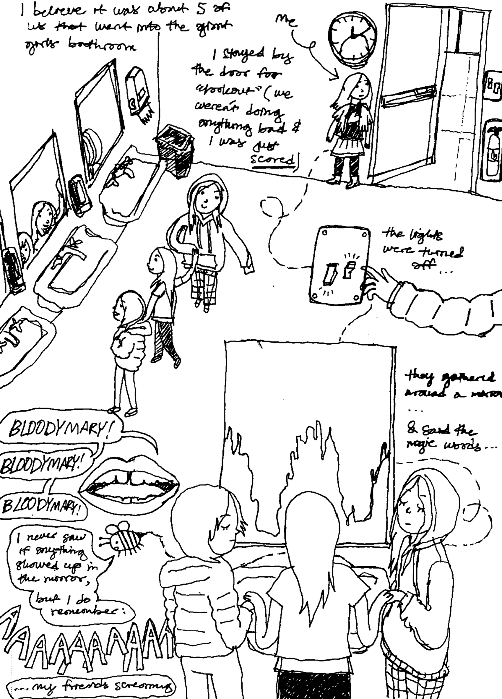
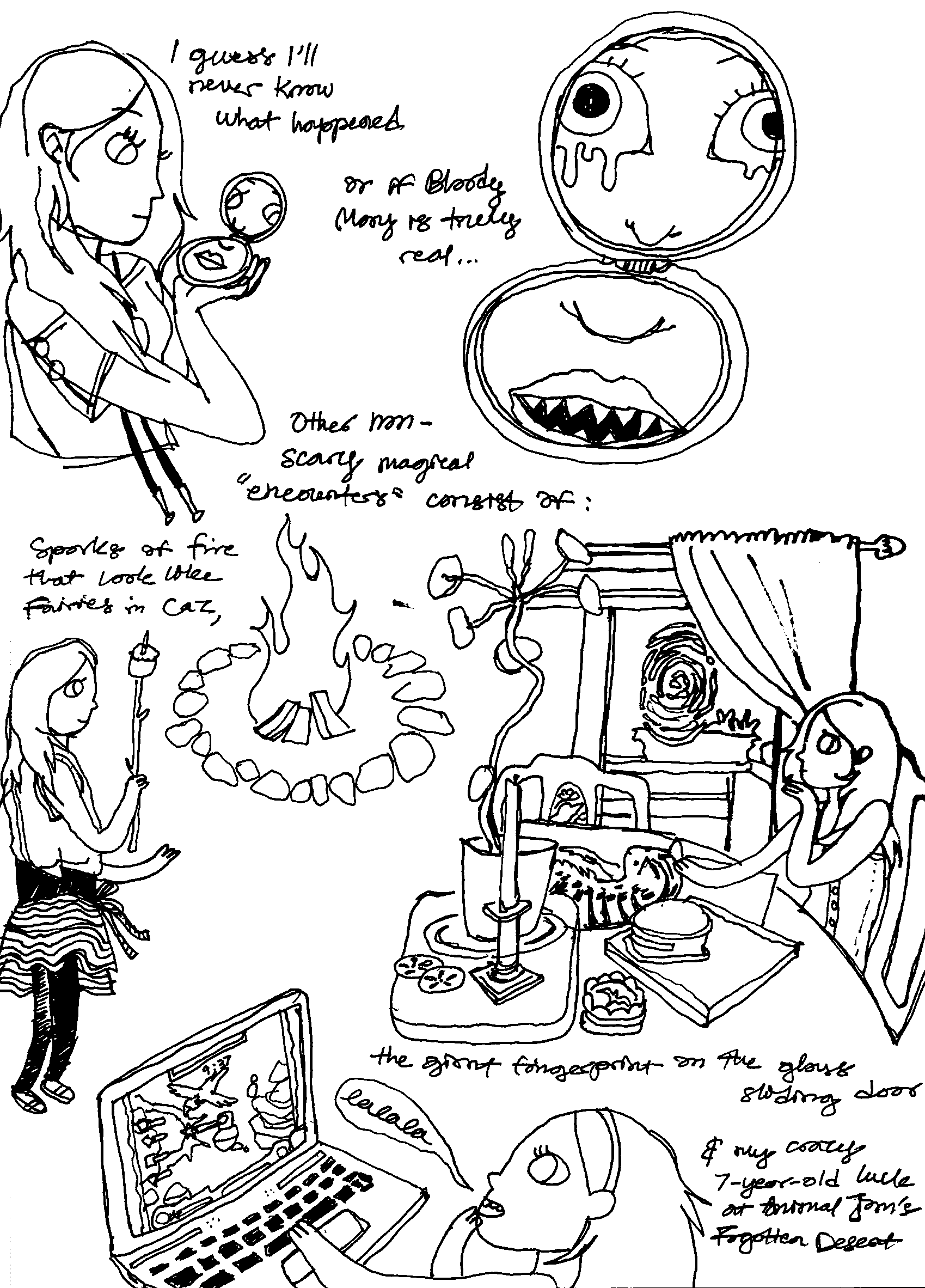
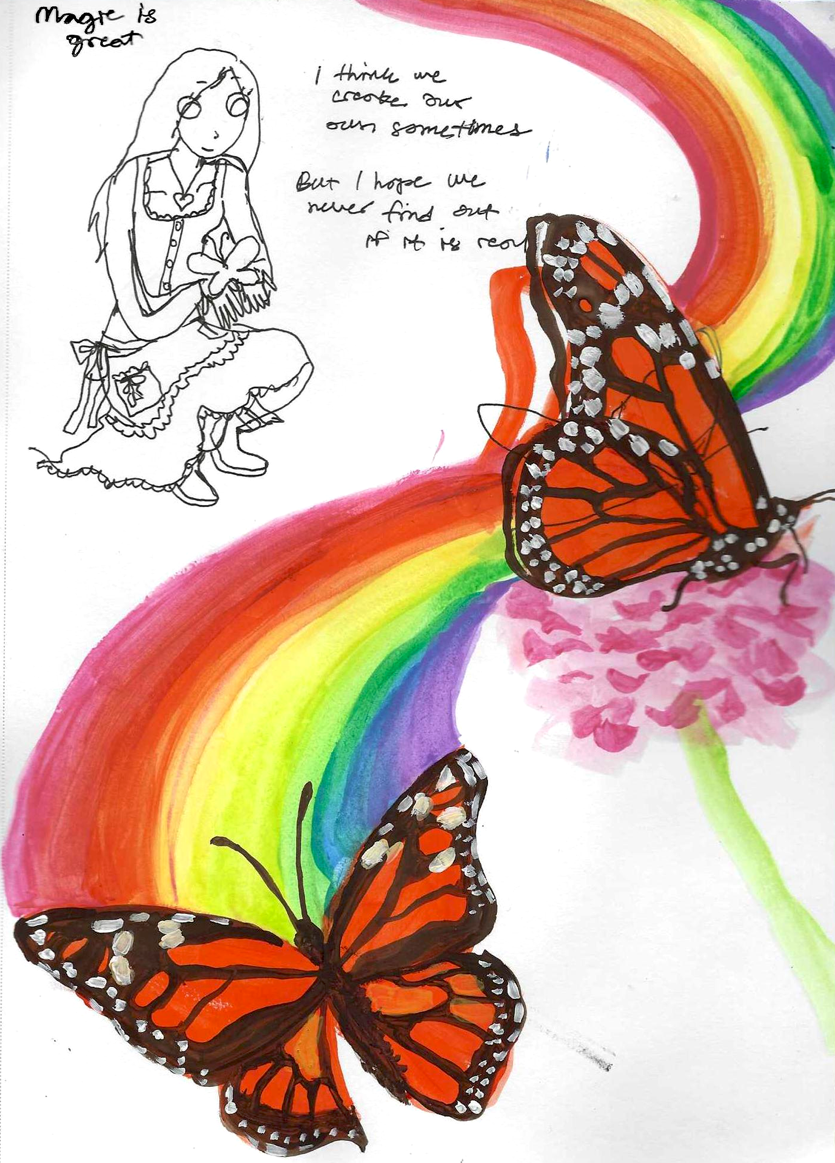
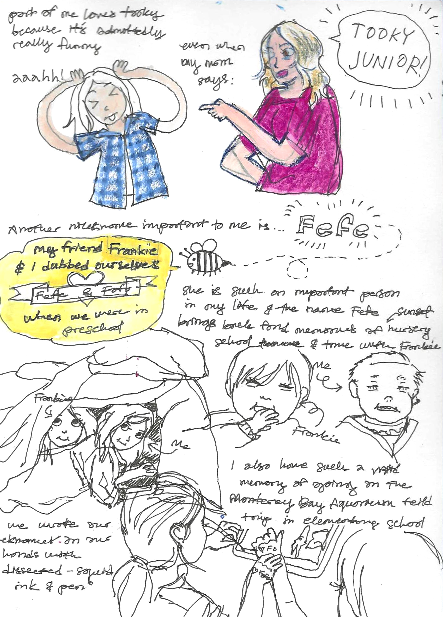
Comics have always been important to me. I think that they are a very special way to go about storytelling, and as a person who loves hearing and telling stories, I wanted to capture some of that magic for myself. My project made me recall the details of buried memories which I hadn’t revisited in a long time. Uncovering unintelligible ideas in my notes app that I jotted down on nights where I couldn’t fall asleep was just as intriguing as illustrating the comic itself. My hope is that some will enjoy and relate to my big pile of memory mush.