Every couple of days here at The Wave, we like to have an activity or a workshop or something to help everyone flex their different creative muscles, to get out of their headspace, to draw inspiration from new mediums, and to just plain have fun. One of our most personal and interactive activities is our chart-making activity. One of the best parts of this is that it’s somewhat open-ended and loose, so that it’s really open to the creative interpretation that our Wavers are so fluent in.
With the constant takeover that memes have had on the Internet, it’s inevitable that meme culture and humor has seeped into the different types of charts, diagrams, maps, tables, graphs, and graphics used in everyday life; in fact, many memes on the Internet have originated or at least been derived from charts, graphs, and diagrams.
Some of the most popular of these include March Madness-inspired flowcharts, field graphs like the one seen to the right, the brain enlightenment scale (kind of), “Who Would Win” T-charts, modified versions of maps and regions, “Types of Headaches” charts, and, of course, the simple Venn diagram that is so simple and easy to use and create. Some that may themselves not be charts, graphs, or diagrams but are instead derived from them include “Tag Yourself” lists, short videos (Vines, for example) that have been labelled with character names to reflect a franchise or series, punnett-square-esque Dungeons & Dragons alignments of random things, compilations of images mimicking the “Are You A Robot?” tests used when signing into sites, among many others that have and have yet to sprout from the meme meccas of Twitter, Instagram, and Tumblr.
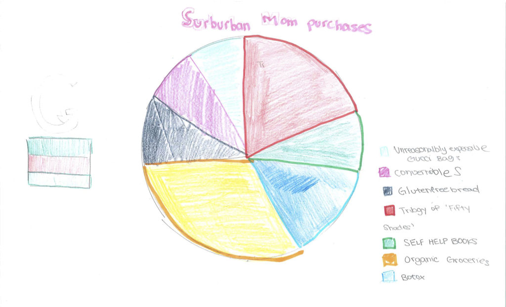
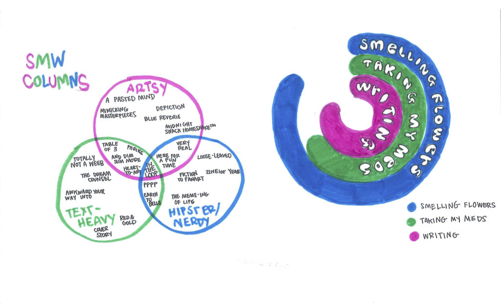
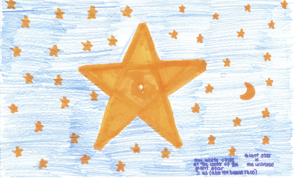
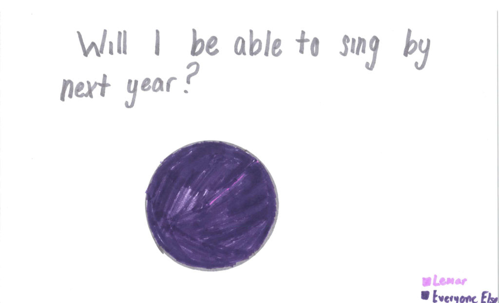
The disparity in motivations and focuses of fun charts in this cycle’s rendition of the activity is very interesting. While the initial and loose intent of the activity is to channel humor, and while many do that, many also strive in a different direction. Instead of humor, some lean on artistry and color rather than humor, some lean on a heaviness of text to convey the context and content of the chart, and some even fall in the middle. Despite this, all have their innate qualities and are all so different that they an hardly be compared.
Some Wavers even decided to do more than one addition to the chart activity.
Enjoy all of the wonderful contributions to this activity, compiled below!